8 UI Design Tips to Elevate Your Visuals
- Updated on 4 Jan 2024
- 8 min

Polina Hrudieva
UX/UI expert
UI design in web development is the visual layout and presentation of all elements on a website.
Effective UI enables users to quickly and efficiently complete actions with full control.
That’s why following strong UI design principles is critical. It’s also essential to understand the difference between UX and UI design.
Successful UI design becomes invisible to the user. It adeptly foresees the user’s next action.
The user interface presents elements and structures that enable users to act successfully and effortlessly. Visitors barely notice the UI.
In this blog, I’ll share tips I’ve learned as a graphic designer about applying simple best practices to help you create more intuitive, user-friendly interfaces.
8 Tips for Great UI Design
For a novice designer and many users need to understand what does UI stand for? It is simply the ‘looks’ of a website. In reality, it is so much more.
It consists of concepts from visual design, interactive design, and information architecture.
Also, building interfaces and communication points that make task-accomplishment seamless, intuitive, and familiar.
But what makes a difference between effective and useless UI in MVP design?
Let’s consider 8 tips.
1. Put UX Research First
In user interface design, everything starts with the user.
To create websites that users find easy to use, study how users behave and interact with websites. Learn their workflows and processes and see how they approach their tasks.
The more you know your users, the more you can anticipate their needs and take care of them effectively.
User research enables you to know how, when, where, and why they will use your product to solve the pain.
Our experienced UX design consultants can assist with every step of strategy and research, ensuring a solid foundation for success.
This kind of data will help you figure out the user journey more organically and intuitively.
2. Set Clear UI Expectations
Consistency and familiarity is an important concept of UI design.
Users have become accustomed to accessing and interacting with websites in a certain way.
They want the menu on the top of the site. They know a site will always have an ‘About’ section. And they know that by clicking on a brand logo will always take them to the Home page.
If a site’s UI design is different than what they are used to or expect, it can be a risk.
They may be encouraged to try it for a while. But any hurdles or frustrations in the process can shut the whole thing down. Customers will leave, possibly never to return.
Make sure your site contains familiar elements in familiar places. A good approach to start testing to use prototyping.
When you are experimenting with the design, make sure to let the users know which button will perform what action before they click on it.
E.g. a tiny popup balloon containing instructional copy. In many reading apps and websites, hovering over the heart icon near a title pops up with words such as: Click to save in Favorites.
Such an instructional copy can manage your user’s expectations quite effectively.
Similarly, let users know when they are about to take any action that can’t be undone. For example, deleting an email, a page, or a website. Ask them if they are sure.
If they are, they’ll go ahead, if not, your effective UI just saved them from an accidental click.
3. Optimize for Speed
The UI design is a point of interaction and communication with your users.
When I click on a link, I expect it to open. When I press a button, I expect it to change colors.
A process of give-and-take and action and response dominates the UI design.
As users engage with redesign your website, make sure the website is swift and prompt with its responses. The scrolling is smooth and breezy, positive actions are highlighted, and all the links are clickable – in under 3 seconds, tops.
According to the SEO guru, Neil Patel, and page load and bounce rate statistics, most users (47% of them) expect a web page to load in no more than 2-seconds.
Every extra second, expect to face decreased numbers of page views and lower customer satisfaction rate, which will eventually lead to a loss in conversions.
Slow response websites not only frustrate the users, but they also make people doubtful as to whether the thing is working in the first place or not.
You do not want to be associated with such doubts. Manage your site’s load speed as well as element response times, accordingly.
4. Mind the Layout
The UI design is all about clicks, taps, and scrolls.
You’ve got to make sure that every time a user clicks on your website, it’s the click that turns into a conversion. To make that happen, pay attention to your site’s element placement and size.
Always keep the size appropriate and placement spacious enough. It’s necessary to avoid click-mistakes. Also, make the frequently-used buttons – submit, send, start – more prominent and bigger than others.
Same with main menu lists. Place them higher up in the hierarchy than additional menus such as categories.
This aspect of UI becomes even more important when designing responsive websites. To get a real hang of the whole thing, start researching good web design more and more.
You’ll train your eye to detect effective User Interfaces whenever encountered.
5. Keep it Simple
In all the projects that I’ve worked on, I’ve found this advice to be always successful. There’s nothing that a simple UI design won’t fix or make better.
With a simple design, users’ cognitive processes do not get overwhelmed.
They find it easy to make decisions, perform tasks efficiently, and no unnecessary elements are nagging.
A novice designer may create user interfaces that were high on design, a visual galore– but functionality-wise, there were a lot of issues.
Simple web design is actually the hallmark of an experienced, seasoned designer, and it’s a hugely difficult task to accomplish. Adding icons can help improve the quality of the text and make it more unique
With a simpler design, you have to rely a lot more on your creativity and design knowledge than superficial visual trappings.
So, as you start working on your next UI design, go for a simple interface.
Strive to create a design that facilitates function. Allow people to check-out as guests when shopping online.
Instead of hiding the menu, make it more streamlined.
To make blog categories more accessible, instead of littering them all over the page, try using a grid to give the layout a structure.
With these simple tweaks (that require a lot of thought and a handful of Eureka! moments) you’ll be able to nail down the effectiveness in UI design in no time.
6. Design for Accessibility
No UI design can ever be truly effective if it does not cater to the needs of a wider range of audiences. Including those with various accessibility issues.
A large segment of such an audience consists of users that have various sight-related challenges. Such as different forms of color vision deficiencies (CVD), reduced visions, blurred vision, and age-related vision issues.
User-interface for these audiences cannot be color-central like most current UI designs are. To help users with vision, sight, and CVD issues, it is critical that the UI design is a union of colors and icons.
For CVD audience specifically, colors alone do not convey sufficient information.
For example, if your system alert notification is designed with colors alone (green and red), a person with red-green color vision deficiency will have a hard time figuring out which button to click.
Similarly, and on a less-grievous scale perhaps, eCommerce websites that do not display color information with text labels do a disservice to color-blind users.
If we talk about people who suffer from reduced or poor vision, greyscale websites especially are a nightmare. These sites look aesthetically pleasing but are not up to the usability standards.
With poor contrast ratios, smaller and faded typography, and grey-on-white themes, browsing these sites for anything longer than a few seconds can become a source of headache for those with vision issues.
To create effective UI design with accessibility in mind and uncompromising visual beauty, pay attention to these best-practices:
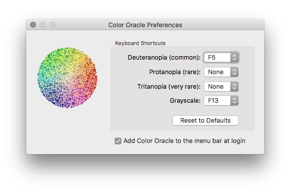
- Educate yourself on which color contrasts are better and worse for CVD and other differently-abled audience. You can use online contrast and color checker tools to help you: Color Oracle, Sim Daltonism, and Contrast Checker, etc.
- Always label the colors in your product images/descriptions if you run an eCommerce store.
- Make sure your links are always underlined as only color change can be missed by the color-deficient audience.
- Add patterns, textures, and change of shapes to complement colors in your data visualization charts and graphs.
- Make sure the primary buttons on your site are appropriately distinguished from other buttons. As a good resource that helps you understand accessibility design, here is a useful link.
7. Build Responsively
Aiming to be useful for all categories of people, TrustMyPaper has built its website based on contrasts, rather than color variety. Market research indicates that this year, the number of global mobile phone internet users will compromise of nearly 64% of all internet users.
Google has, for long, started the mobile-first indexing of websites on its search pages, further moving its attention to mobile users versus desktop users.
This shift has propelled all the businesses that want to maintain their good SEO and strong conversion rates going to start creating responsive websites.
A responsive website is an interface that does not compromise its layout quality no matter the screen size it’s being viewed on.
It’s a fluid design that rearranges and readjusts itself to fit into any screen that it is accessed on.
It keeps the structural as well as the visual quality of the interface intact while providing optimal viewing of the interface no matter the screen size or device type.
While responsive design does not inherently fulfill the web accessibility guidelines, the newer and modern UI design is becoming more inclusive.
We see many examples of sites that are not only responsive but accessible, too. For example, Walmart, Esquire, and Reformation, off the top of my head right now.
Naturally, in the long run, such sites will be the ones with more traffic, a wider range of it, and potentially more conversions.
If you are designing a UI with an aim that it converts traffic, it makes logical sense to employ design strategies that work for a lot of people and a lot of devices.
8. Train Your Design Eye
None of these tips will be of any use if you aren’t investing practice and research into it. Make it a habit to spot good design when you’re browsing the sites. Look for features that work on a site and those that don’t.
And see how you would have done it differently.
Also, invest your time and whatever resources you can into user-research. Talk to your users in different design stages. They can be your best source of information as you continue with your work with an MVP development.
Notice how they interact with your UI and if there are any loopholes that you can fix, elements that you can improve, or hurdles that you can eliminate.
Also, think of surveys and focus groups. The latter can be especially helpful in collecting conflicting points of view that will ultimately help your design.
The surveys are the most economical and affordable user research options. You can also survey your colleagues for your basic research and then think of investing some funds into it to get some hard facts that can drive your design process and give it solid footing.
Last but not the least, practice. Honestly, this is the best advice I can give you. Practice won’t make your perfect but it sure can bring you closer.
What’s Next?
Crafting flawless UI is an ongoing process of learning from users and providing interfaces that meet their needs and actively improve their experiences.
Get in touch if you’re looking for dedicated UX/UI designers to elevate your visuals.
Our team lives and breathes design principles just like these to create interfaces users love. We conduct rigorous user testing and research to build UIs that are intuitive, pleasing, and effective at converting visitors.
Let’s discuss your project and see if we’re a good fit!