Elevate your brand's digital presence with SpdLoad
We create user-centric interfaces that elevate your solution
Custom UI design services that deliver intuitive layouts with seamless visual consistency across platforms
Get A Free Estimate


Project Initiation Style Configuration Validation Cycles  Usability Testing & Iteration
 We kick things off with a collaborative approach to define clear design goals, KPIs, target audiences, and key project criteria. This helps us conduct thorough user research to craft UI solutions that are optimized for both user satisfaction and your business objectives.
Our team designs customized UI assets such as layouts, fonts, icons, and components, tailoring them to match your brand’s identity. We also develop detailed style guides to maintain consistency across all elements. Every visual detail contributes to a creative and intuitive user experience.
We create high-fidelity mockups that reflect the final design and dive deep into elements like color, typography, and imagery. Through iterative review cycles, we fine-tune these elements to make sure the design is visually engaging and easy to navigate.
After validation, we build interactive prototypes that simulate user interactions and application flows for user testing. We provide all necessary UI kits, assets, and style guides, offering flexibility to adapt the designs as needed while focusing on usability, creativity, and meeting your business goals.


Discover how SpdLoad created Gigl, a platform to find talent for London bars, restaurants, and hotels.


See how we expanded customer’s existing team with a front-end developer at an EduTech startup.

Explore how we transformed mental health care with Aya, a user-friendly platform for psychotherapists that enhances communication and data management.

This case study highlights how our team created a mobile app, web platform, and admin panel to streamline the hiring process.

See how we developed a centralized HR platform designed to streamline the recruitment process for hiring managers and recruiters.
We create user-centric interfaces that elevate your solution


“Early-launched LegalTech platform acquiring first clients in 3 months”

“A cross-platform design tool for SharePoint, Microsoft Teams, and SAP”

“After launching, the client raised funding with the support of H&S Investments”

“A user-friendly home warranty software focused on transparency and customer choice”
“From manual consulting workflows to a scalable, automated marketplace”

“Scalable MVP that helped founders raise Series A funding”
“Scheduling-first pet care marketplace with real-time tracking and chat”

“Our efficient project management delivered a 20% faster turnaround”

“Unified web and mobile system for therapist workflows and patient data”
Final UI design Screens
High-quality, polished screens reflecting the final design.
Style Guides
A detailed guide outlining design elements such as typography, color schemes, and components for consistency across your project.
Interactive Prototypes
Fully clickable prototypes that simulate user interactions and application flow.
Asset Files
All necessary user interface files for your design, including images, icons, and components for development.
Documentation
Clear documentation covering the features, design system elements, and usage guidelines to ensure a smooth handoff to developers and future updates.
Drop us a line and we'll get back to you immediately to schedule a call and discuss your needs personally.
Most AI projects that land at SpdLoad start pretty much the same way. A team has already spent two...
read more If you’ve been thinking about bringing AI into your business, you’ve probably already...
read more
If you’re a non-technical founder, you’ve probably been here before. You have the idea,...
read more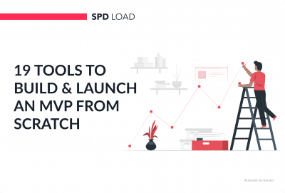
A few things happen when you launch your MVP. Some founders get a flood of signups and realize...
read more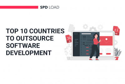
The global IT outsourcing market is on track to surpass $400 billion by 2027. Yet the majority of...
read more
There’s a version of the MVP story that gets told a lot in startup circles. It usually sounds...
read more


