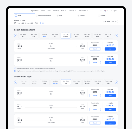
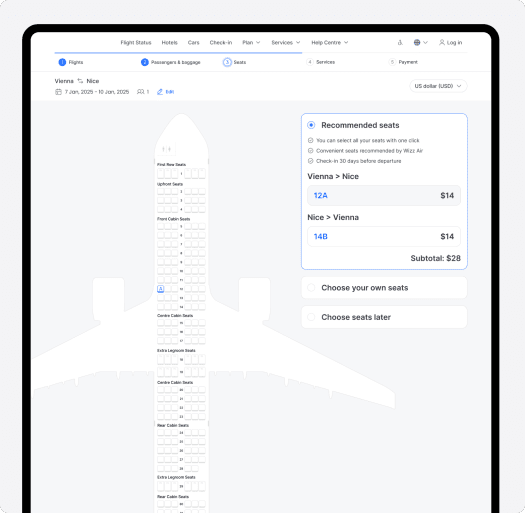
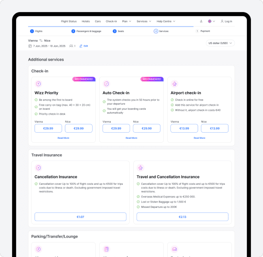
Flight Booking Website — Conceptual Redesign
This is a self-initiated conceptual redesign of the Flight Booking website. We created it to explore how the airline’s digital experience could be improved through better UX, cleaner visuals, and a more intuitive booking flow