

Clubhouse Redesign
The Case Study


What're the Next 5 Minutes
of Scrolling About?
Clubhouse was a resounding success with investors and users even before its release on the App Store.
But what's the problem of a short-live hype around the app?
One of the main reasons for the fading of the new Silicon Valley's rockstar is poor User Experience design.
That's why we decided to fix this flaw.
Here's our version of how should Clubhouse look like in a better world.
But first, let's figure out what's wrong with the current app.


How Did We Identify
Users' Pain Points?
Before we started, we conducted a series of exploratory interviews with current users, both newbies and advanced right in a Clubhouse's room.
We aimed to identify the key drivers to enjoy the use of Clubhouse as well as the UX issues from the first-hands.
These findings helped us to outline the scope of work and got design work off the ground.
Nelson RayNewbie
The app is useful, there is a lot of diverse content and interesting speakers, but at the same time discouraging.
Jane CooperNewbie
It really pisses me off already - when new people come in, they repeat what we talked about 15 minutes ago. And it happens all the time/
Cameron WilliamsonNewbie
Trolls can easily go about their trolling because Clubhouse does not allow users to report harassment or other violations of its terms of service.
Ulric HoldenAdvanced User
The best way not to get lost in the maze of content and gain access to interesting rooms is to create or join a club. Not only is the current sorting inconvenient, but it promotes total trash.
Kathryn MurphyAdvanced User
Giving a voice to everyone is always going to raise questions around the credibility of those who deliver a message. There is no way, and some would argue there shouldn’t be a way, of curating or censoring the content.
Marvin McKinneyAdvanced User
I do feel that Clubhouse can be a little more anxiety inducing than most other apps. You can be put on the spot and called out to speak. I am actually trying to host less panels and talks because the app gets stressful for me as an introvert.

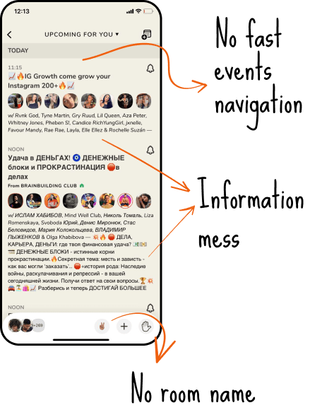
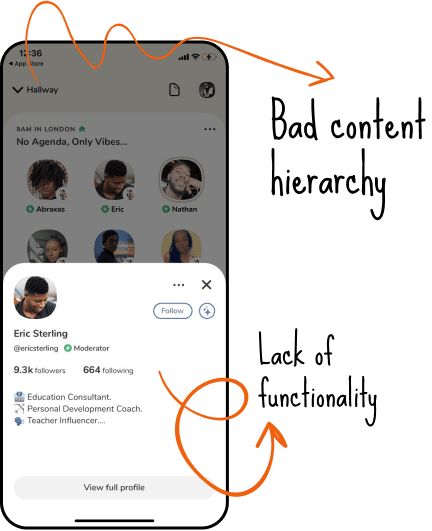
What Problems
Did We Discover?
As a result of the interviews, we identified several blocks of problems:
- Unintelligible and overwhelming navigation
- Lack of hierarchy of information
- Misleading icons and buttons
Let's Start With a
New Onboarding
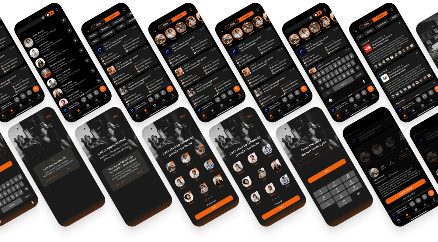
Our version of Clubhouse is user-centered and user-friendly.
How do we know?
Take a look at a new onboarding to find out.


Now, let's get back to the details of redesign process.
The Redesign Process
Step by Step
01Redesign
User Flow Chart
For products that are already in use, user flow charts help determine what’s working, what’s not, and what areas need improvement.
It helps to identify why users might be stalling at a certain point and what you can do to fix it.
In our case, we use this approach to mapping out the movement within an interface to clarify what options the user has on each page to accomplish a task in a user-friendly and effortless way.


02Redesign
Wireframe’s Design
Before UI design gets under way, we designed wireframes. It helped us to provide a visual understanding of a page early in a project to get the target audience's approval.
The next step is to get the creative phase off the ground. Let's check out how we did it.
Aa
Gordita regular
Gordita bold
EF600F
CCCCCC
F9F9F9
181818
03Redesign
Home screen


New Homepage
We changed the home page according to the target audience survey's results and analysis:
- Added a new top navigation bar to simplify interaction,
- Reorganized the main menu to expand functionality,
- Got rid of misleading icons,
- Made room cards more informative and clear,
- Added a block with active friends at the top that leads straight to the room.
04Redesign
Room screen


New room page
What did we change in the room page?
- Implemented a new content hierarchy,
- Visually separated the speakers and added friends,
- Added horizontal scrolling for more compact
- Placement of all blocks.
Also, while redesigning, there were rumors about adding donations to the Clubhouse, so we decided to add this function to our project too.

05Redesign
Explore page


New explore page
To improve the explore page, we added a quick top navigation bar to separate clubs and people in the search process.
It made the search more native, faster, and clear for the users.
Summing Up the
Results of the Work
The redesigned version of the Clubhouse is more straightforward and friendly to use.
Naturally, we do not have access to existing product metrics.
But we are more than sure that the redesign would significantly increase the User Retention Rate and Lifetime Value, and others.
We hope you enjoyed our work :)
Got an exciting idea you need designers for?
Contact us or take a look at some of our other work to see if we're a perfect fit for you.