How To Design an eCommerce Product Page For Success Of Your Startup
- Updated: Nov 14, 2024
- 11 min
Digital shopping for products and services has risen tremendously over the years.
Some of the principal reasons for opting to make purchases online as opposed to in retail locations are convenience and comfort, cost savings, and free delivery.
However, what makes online buying stand out more is the layout, content, and functionality of your website and product pages.
Thus, if you are building a brand from scratch or a budding entrepreneur, new to the world of digital marketing, then one thing you should focus on is the design of your eCommerce product landing pages.
One of the biggest myths that you might hear is that the homepage of your website is what creates an impact on your customers.
In reality, product pages are perhaps the most vital sections of your online store.
A visually appealing product page can increase sales and drive engagement and traffic.
Simply adding product images, providing a few specifications, and then sitting back and waiting for revenues to emerge is not a dependable strategy.
No matter how terrific your product is, you must showcase it to your audience in a manner that encourages them to pay attention.
Thus a good user interface becomes essential because if your users can’t get past your website, they’ll never know how great your products are.
Mind you, an ecommerce product page does more than just describe the item.
It fosters connections with online shoppers, providing them with every encouragement to reach for their credit cards and buy the item.
But how do you design ecommerce product pages that convert this well?
Transform your ideas into reality with our team
Building a startup is challenging but rewarding. This guide shows how to start a startup from scratch.
Best Practices For Ecommerce Product Pages For Success
In this article, we have highlighted a list of 13 best practices for your eCommerce platform product pages that will help you climb the success ladder with practical examples on the internet.
Looking to launch an eCommerce business? Check out these eCommerce startup ideas for fresh inspiration.
Let’s get started.
1. The Impact of Powerful Visuals
First perceptions are critical in the modern world.
Given that people are visual beings, it’s critical to understand the importance of both your website’s overall design and high quality product photography.
A well-designed ecommerce product page with top-notch graphics can instantly establish confidence and trust with your consumers.
The following elements are all part of strong and captivating visuals:
2. Beautifully Crisp Product Images
The most effective images and videos are those that faithfully depict the product.
While any product might seem fantastic in a picture, it’s crucial to remember that your photographs should be beautiful and clear, match the overall design of your website, and reflect the reputation of your business. 
3. 360-Degree Shots
360-degree photography is the best option for your e-commerce platform as it gives a complete view of the product details and a better purchasing experience.
For example, Nike uses 360-degree shots to give buyers a look at what their sportswer looks like.
This way, site visitors get to see the closest thing to trying out the clothing. 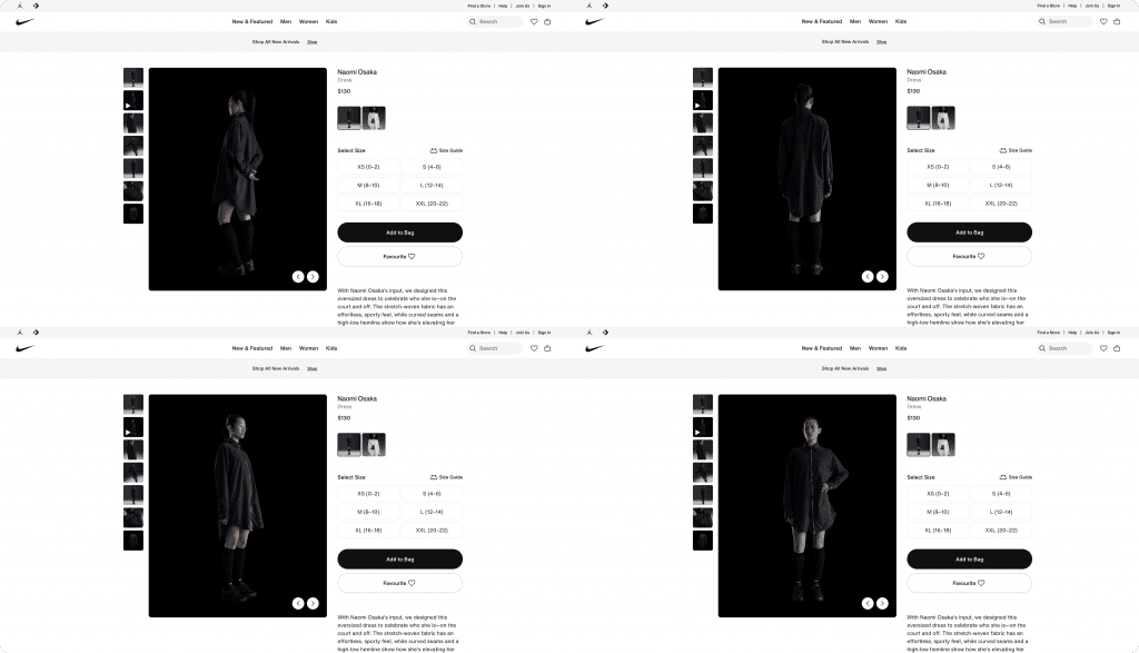
4. Compelling Product Videos
Another way you can elevate your ecommerce product page is by adding product videos.
Videos are the most effective approach to lower bounce rates out of all the options.
Product videos keep viewers interested in your material for longer, reducing bounce rates.
Look at a company like SkinnyMeTea.com.au.
They use a product video to show what the product looks like plus how to make use of it.
Other ideas include creating user-generated content like unboxing videos, testimonials, demo videos, etc.
5. High-Quality Images
Any time you share high-quality visuals with your consumers, it is going to make your product page far more engaging than if you are stuck with blurry ones.
If your images have a low resolution, use an image quality enhancer to make them look more professional.
6. Addictive Product Descriptions
Well-written and detailed descriptions are a crucial aspect and practice in building your ecommerce product page.
Customers increasingly demand to know how and where the things they buy are manufactured and acquired, in addition to apparent information like product purposes, quality, raw material, product availability, and packaging.
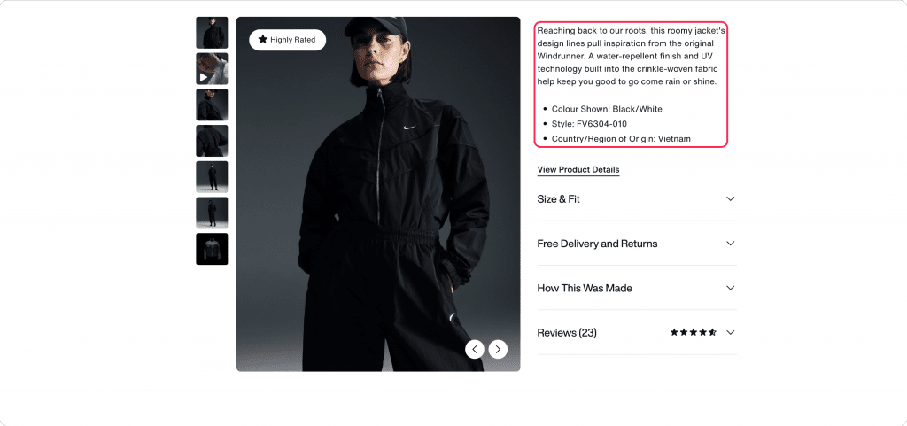
This concise yet informative product description by LuckyMag Magazine is an example of how to provide considerable detail in a short and engaging manner.
Any extra information is just mentioned in the form of bullet points by the side.
Creative copy or narration, depending on your expertise and product, can considerably improve product descriptions.
A compelling product description includes the following two categories: creative titles and keyword-rich descriptions.
7. Creative Titles
The first thing your clients will see when they view your product is the title.
The title should provide users with a sense of what your product is all about.
A title is there to clarify any confusion and aid customers in envisioning what to do with it.
In the above example, the title of the product, even though short, gives a clear picture of what buyers can expect.
Make sure you also optimize your product title for search engines, including the keywords your potential buyers use.
8. Keyword-Rich Descriptions
When you set up a property, you thought about how users would find your website, found out your keywords, and now you should operate with them properly.
The description is where you include the key information that buyers need to know about the product, like its cost, what it is made of, its usage, etc.
Also, include a section on “how to use” the product.
This can be in a video format or a step-by-step visual process.
You can pick inspiration from SkinnyMeTea on what their “how it works” section looks like. 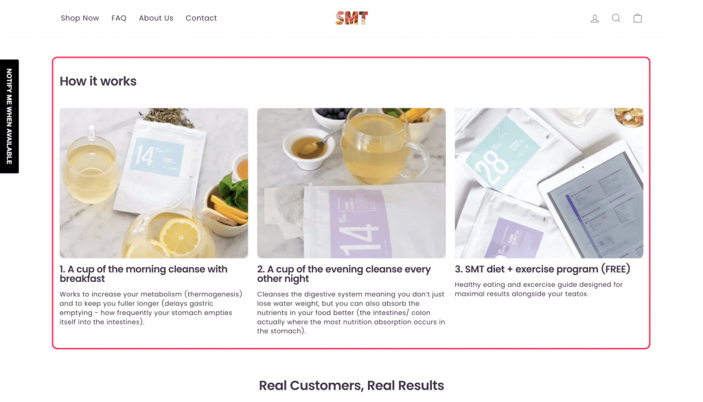
9. Pricing Information
All compelling product pages must include the product price, except if you offer a custom service.
Ecommerce businesses that sell services like consultation, done-for-you, and custom services, can decide to remove price information on the page.
However, if you run an eCommerce store that sells products with a fixed price, you need to include pricing details when you create product pages.
Also, if you sell a physical product, make sure you include your estimated shipping price calculator on the product page so as not to catch the buyer by surprise when checking out.
Shipping services like FedEx have a shipping calculator you can add to your eCommerce store to estimate the shipping price.
Whatever shipping service provider you use, check if they have a shipping calculator which you can install on your eCommerce site.
Finally, you can also include information on the payment methods you accept, such as Apple Pay, Google Pay, cards, etc.
If you haven’t added multiple payment options, see how to integrate Apple Pay into your app.
10. Reviews And Ratings
Every ecommerce product page should have a review and rating section for social proof.
Ratings and positive reviews left by previous customers encourage people to buy particular products or services.
In other words, the layout of your product page must allow customers to leave effective reviews and ratings and simultaneously check the previous ratings left by other consumers.
One of the product page examples we would like to show you is this page.
Here, customers can leave a review and these reviews are displayed on the product page. 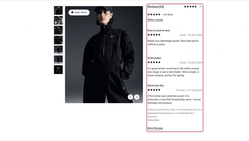
It is also common for eCommerce stores to send you an email inviting you to leave a review after purchase or answer a quick survey.
This is something you can replicate on your eCommerce website.
11. Shipping & Return Information
Having a shipping and returns policy on your ecommerce product page is essential to keep clients happy and ensure that they will buy from you again.
It is important that your consumers know everything about the shipping and returns policy, including the shipping process, alternatives, costs, the regions to which you ship, and any other crucial information they should be aware of.
You can manage your client’s expectations by clearly outlining your delivery policies.
Where do you put this information on the product page?
Based on some of the best product page examples we’ve explored, there are a few ways you can do that.
First, you can have a separate page for your shipping and return information and then link to it from individual product pages. 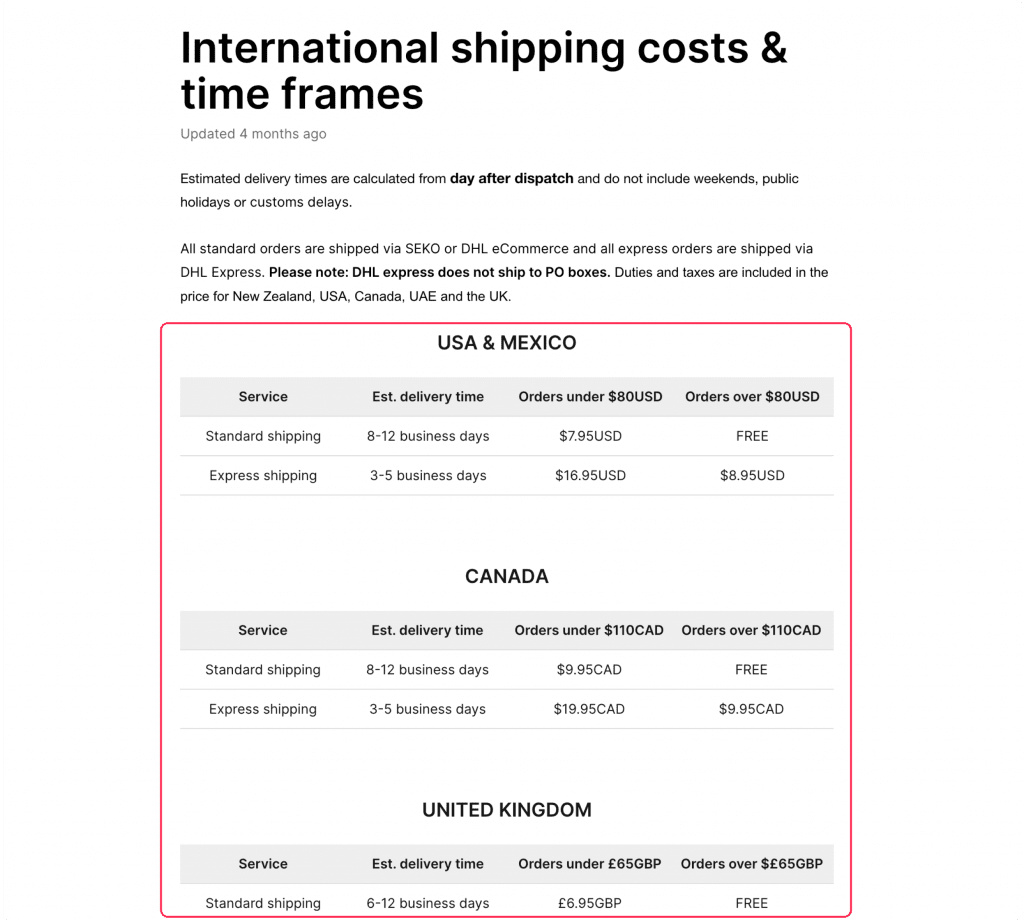
Secondly, you can add it as a pop-up on the product page such that it pops up when the link is clicked.
PetSmart, for example, uses the pop-up style to display additional information on its product pages.
A popup containing more details appears if you click the “details” links. 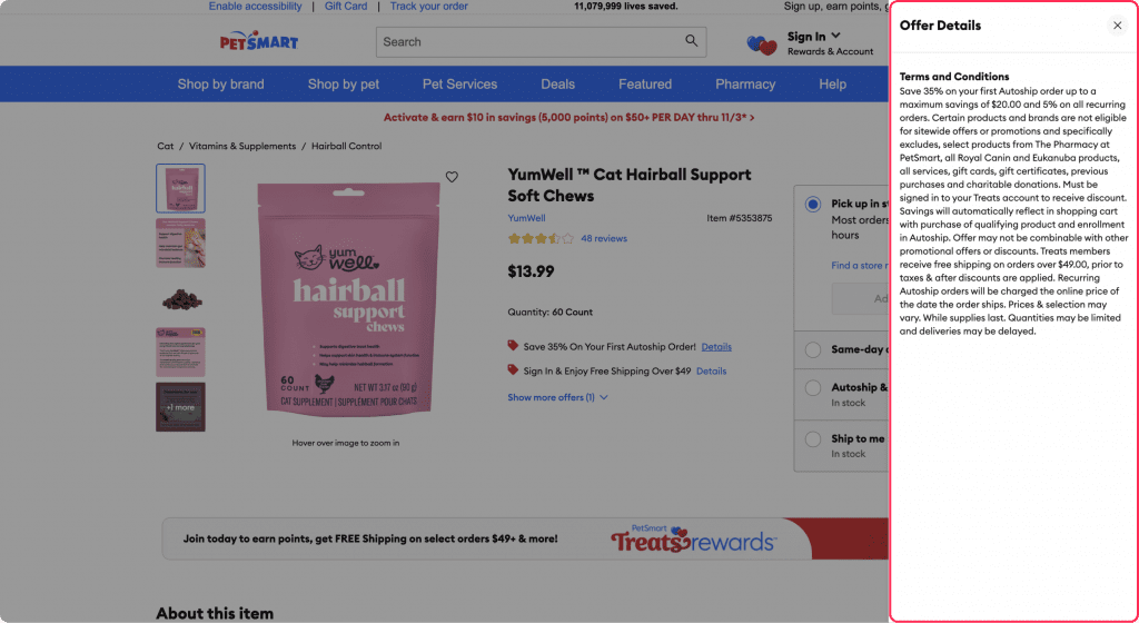
You can also use this same pattern to display shipping and return information on your product pages.
Not only does this help customers shape their expectations but it also protects you from legal cases.
12. Personalizing The User Experience
Giving your users a more customized experience will make them more likely to shop on your website, increasing the average order value.
For example, if you have some physical stores and inventory locations, you can streamline store operations both online and in-store, providing them chances to experience shopping simultaneously.
This not only helps enhance customer experience but also boost sales for your business.
eCommerce personalization raises engagement by enhancing how customers like to engage with your business.
Better data can be utilized to present the products that customers want in enticing and contextually appropriate ways.
One popular way to personalize buyers’ experience on your product page is to recommend products that fit their current needs.
Amazon does this well by recommending additional products for customers to buy before and after making a purchase. 
The best part is that the recommendations are very personalized based on the data they have about you and the product.
Another way to personalize the experience is to add an abandoned cart pop-up on your product pages to convince ready-to-leave buyers to complete their purchase.
13. FAQs And Live Chat
Adding a live chat and FAQ section on your product pages elevates customer service and engagement, fostering loyalty and trust.
Importance of FAQs: You can directly respond to queries that actual consumers have asked you on your FAQ page.
You can start by compiling a list of inquiries that have previously been made by your customers and are relevant to others.
These inquiries can be located in email threads, comment sections, or direct chats with consumers.
Looking for effective marketing tools? Here are some top email marketing software platforms to consider for your business. 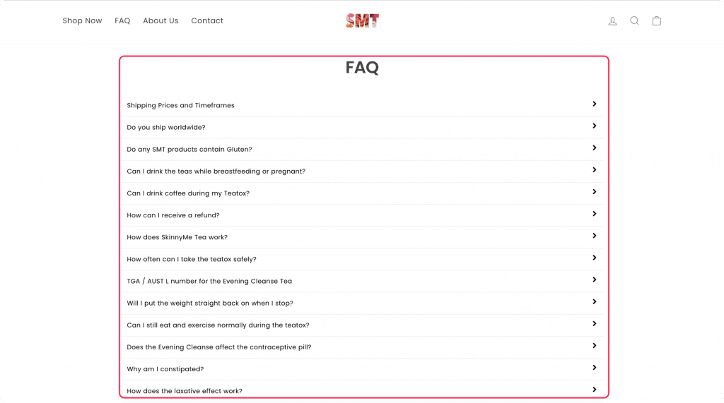
You can also allow users to ask questions about the product or the brand like PetSmart does. 
Live chat is the other alternative to answer questions that are not in your FAQs section.
14. Stay On Top Of Your SEO
An essential requirement for e-commerce platforms is SEO.
In order for potential customers to find the things they require in the SERPs and choose your site to engage on, your product pages must rank higher than those of your rivals and must be shown adequately.
Think of all the times you bought something online.
You will remember that you rarely check items that are displayed last on your search engine results.
When designing your product pages, ensure it doesn’t hinder the search engine optimization of your pages.
- Optimize your product title tags
- Add alt texts to your product images
- Use your heading tags correctly
- Add your keywords to your product descriptions,
- Use SEO tools to simplify some tasks, etc.
15. Lightning-Fast Site Speed
The speed at which a site can load is one of the numerous ranking factors that Google uses. Faster site speeds don’t always require a lot of difficult procedures.
When designing your product pages, monitor your page speed.
Use the Google Pagespeed Insights to see your website speed and also get suggestions to make your site load faster. 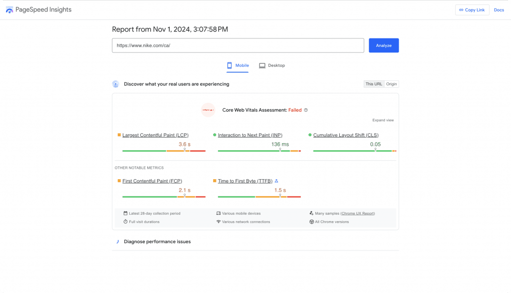
Follow the suggestions to boost your site speed.
And if you run a large eCommerce store, I recommend you invest in a VPS hosting plan to keep your website running quickly.
16. Mobile-Friendly Product Pages
Studies indicate that mobile devices account for more than half of all website traffic.
They are no longer only used as a tool for product research; more customers are using them to make direct purchases.
Two out of every three mobile users claim to use their device to buy things using shopping websites or applications.
Nobody likes a website with slow-loading pages and missing functions, but sadly mobile buyers encounter this issue all too frequently.
Imagine you need to buy something, and the website takes minutes to load.
You likely won’t wait, except that’s the only place you can get the product.
Improving the user experience on your website by making it mobile-friendly is essential to attract more satisfied visitors.
To ensure that your eCommerce website is mobile-friendly,
- Include a search tool.
- Reduce pop-ups or if possible, eliminate them completely,
- Make texts legible.
Fuel your startup's growth with tailored mobile apps.
17. Eye-Catching Calls-To-Action
CTA is an essential element of any page, not excluding the product pages.
It serves as a reference point for a potential customer, telling them what to do next.
On a typical eCommerce product page, the CTA can be to “add to cart,” “buy now,” or “Continue to checkout.”
When designing your product pages, decide on the places you want to add your CTAs.
The location of the CTA also influences its performance.
You can place your CTAs as a sticky bar at the top or bottom of your page, as a full-screen pop-up, as a popup on the side of the page, etc.
Although there are studies on where to place your sidebar, I recommend you run an A/B split test to know what works for you.
You can use our A/B test calculator to monitor the success of your hypothesis.
18. Don’t Forget Upsell And Cross-Sell
Upselling encourages buyers to shop for a comparable higher-end product than the one in the discussion.
On the other hand, cross-selling encourages customers to purchase relevant or complementary products.
Upselling and cross-selling are frequently (and incorrectly) interpreted as unscrupulous tactics used to extract more money from customers.
To “help clients win,” however, upselling and cross-selling should be used as a strategy.
It involves giving advice that might better satisfy a customer’s immediate needs and assisting them in making a decision after being fully informed of their possibilities.
Whether cross-selling or upselling is the ideal technique is a complex question with no simple solution.
A/B testing is the most effective method for choosing.
Cross-selling and upselling are effective tactics that can speed up the decision-making process for consumers.
19. A/B Test Everything
The bonus in designing a product page for your startup is A/B Testing.
You shouldn’t rely on gut instincts to determine whether cross-sell or upsell options will satisfy your customers.
To find out what works for each of your various visitor segments, A/B tests multiple upsells and cross-sell techniques.
Then, you can use the strategy that results in the greatest increase in sales.
Looking to enhance your site? Here are some examples of good web design to follow.
Summing up
E-commerce has contributed to advancing technological changes in customer habits, particularly because the platform has made it possible to reach a larger audience and conduct convenient transactions online.
It is predicted that worldwide eCommerce sales will increase, and hence it is critical to consider how to design eCommerce websites to increase conversions.
For more insights, check out these 6 best practices to scale your e-commerce business.
In this article, we have explored the key elements that can elevate your product pages.
Following the above-listed best practices and design examples helps you enhance the functionality and appearance of your e-commerce website.
To build an effective landing page for your startup, it is important to keep the following points in mind:
- Your e-commerce design should prioritize the user experience.
- Laptops are no longer the only devices that can surf the website.
- Determine the browsing habits of your core demographic.
Thinking about launching your own eCommerce app? Start here: how to develop an eCommerce app.


