How to Make an Interactive Website Your Visitors Will Love
- Updated: Nov 12, 2024
- 10 min
The internet is a black hole, with over 1.92 billion websites (and growing). So how do you stand out from the crowd and make an excellent first impression?
It all comes down to providing the best user experience for your visitors when they land on your website.
With an interactive website, you can engage and excite visitors from the moment they hit your page by encouraging them to take action through quizzes or watching a how-to tutorial.
Investing in an interactive website is a surefire way to reduce bounce rates, grow your email list, and boost sales. But it can be more challenging to design than building a simple, static site.
You’ll need to consider how many pages you’ll have, how much content will go into each page, what navigation structure works best for your audience, and if you’ll use any animation.
So if you’re interested in designing an interactive website to stand out from the competition but don’t know where to start, this post is for you.
Let’s dive right in.
Wondering how long it will take to launch? Check out the average time to create a website for a realistic timeline.
Elevate your brand with our custom website development and design services — let's build your dream site together!
Elements That Make Your Website Interactive
Have you ever been to a website that felt like an endless sea of text?
Some websites are just so dense with information that it’s hard to keep track of what’s going on and where you should be looking.
To avoid this dreaded fate, try incorporating these elements to make your site more interactive.
Design
Good web design is the first step in creating an interactive experience for your visitors. It’s essential that your site is easy to navigate and has clear calls to action on every page.
Your design should be clean and focused on your customers’ needs. Don’t distract them with unnecessary elements.
Luxury Presence, a real estate SEO company, does an excellent job using a black background with white lettering to create a clean, sleek design that matches its brand identity and prevents any confusion when a user visits its website. 
Color
Color plays a vital role in drawing attention, emphasizing certain things on the page, or even conveying an emotion.
YUPLAY is an excellent example of an interactive site with eye-catching colors and graphics that draw attention to the right places.
The color palette they use not only gives the website a fun personality that matches their niche but also helps users identify their current offers, as well as their one-time deals and most wanted games.
Red indicates the games with the most significant discounts, followed by purple and blue. 
Images
Using images can help break up text and get your message across quickly and efficiently — but only if they’re high-quality images relevant to the topic.
Images are versatile — you can use them as backgrounds for text (like this example for DISH TV packages), hero images, or even buttons. 
Layout
The layout of your site matters because it helps establish a brand identity and gives visitors an idea of what kind of content they can expect from you moving forward.
A good website template also makes your site easy to navigate and easy to understand.
Take the lead from Olipop on this element. They add a simple navigation menu at the top left corner of their homepage with only three options. There’s no place for users to get lost.
They also added a more prominent CTA button to the homepage to encourage users to begin shopping and secure their flavor of choice. 
Animation
Animation is another way to draw in and engage users on your site. It can help explain concepts quickly and clearly, or it can just be fun.
Add interest and spark attention from users who might not have otherwise been interested in what you have to say.
For instance, Writesonic uses animation to scroll through the different audiences that benefit from their AI writing tool instead of listing it out in a boring, bulleted format. 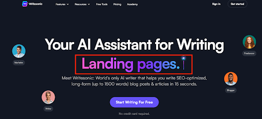
Tutorials
When you’re trying to get people excited about something new, nothing gets them more excited than learning how it works.
Tutorials teach users how they can use your product or service or even explain what makes you better than the competition.
Take this video from Copy.ai, for example. They run through a tutorial about how to use a slogan generator powered by AI to create an unforgettable slogan in seconds.
In fact, AI’s impact is growing rapidly, and you might want to explore these AI statistics that highlight the trends you need to know.
Not only do they offer this tool for free, but they also explain how it works and how it adds value to a copywriter’s workflow. These are all effective strategies for pushing leads to the bottom of the sales funnel. 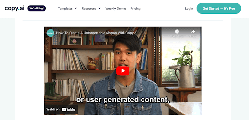
Games
Games are fun and engaging, and they can have a broad appeal — not only to children but also to adults who want to take a break from work and relax.
Games increase engagement and reduce bounce rates while giving users something fun and entertaining to do on your website.
The best example of a game in action is when you lose an internet connection on Google. It turns into a dinosaur game that holds people’s attention until the connection comes back to life. 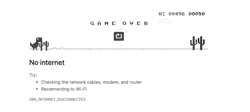
Quizzes
When selling products online, it’s essential to keep your customers engaged and move them closer to the purchase decision.
One of the best ways to do this is by adding a quiz to your website that enables you to provide personalized product recommendations to convert more customers.
With a quiz builder, you can easily create interactive quizzes to engage more customers and boost conversions
Take HIMS, a telehealth company selling ED meds online, as a prime example. On its landing page, you’ll find several questionnaires through which users can answer a few questions to understand their condition better and get the proper medication for their needs.
This user is more likely to convert into a paying customer because the quiz shares the product they need to help address their medical concerns. 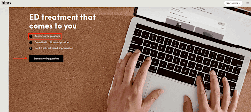
On the other hand, the example of DoFasting is quite similar, but you can find that they use quizzes in their blog articles. It simply interacts with the reader in a personalized and catchy way. This quiz has been a tool helping them convert their readers to app users.
Videos
Another great way to engage users is with videos, especially if they’re videos that relate directly to your business or brand.
Videos are a great way to give people information that they might not be able to get anywhere else. Or use motivational speaker videos to inspire your visitors, as Wordable does in the example below.
On top of that, you can also try adding natural-sounding voice-overs using text-to-speech software to make your videos more engaging. 
Interactive vs. Non-Interactive Websites
An interactive website isn’t just a place to post information about your company and products. It’s a way for you to engage with your customers and create meaningful relationships.
Interactive websites engage users in a variety of ways, including:
- Giving control over how they access different parts of your site
- Offering multiple points of entry into information or services
- Providing tools that visitors can use while they’re on your site (such as quizzes, calculators, and games) to create a personalized experience
Non-interactive websites display information or images in a way that’s easy for visitors to read or view quickly. Once they find what they are looking for, they bounce.
The benefits of having an interactive website are numerous, but some of the most important ones include the following:
- Increase audience engagement
- Encourage users to spend more time on your website
- Improve conversion rates
- Build brand awareness
- Reduce bounce rate
- Provide a personalized experience
- Build loyal customers
How To Make Your Website Interactive
The cost of developing a website isn’t cheap.
But you don’t need to hire an entire development team to add some flair to your site.
Follow these eight simple steps to turn your boring, static site into a beautiful, interactive masterpiece.
1. Develop The User Experience First
When making your website interactive, put the user experience first.
User experience (UX) is more than just your website design. It’s about the entire journey users take when interacting with your brand online — from how they find your website to how they navigate your content and even how they feel after they leave your site.
So when creating your site, map out what you want your UX to look like. Once you have all the details hashed out, you can start working on the actual building process.
Measure twice, and cut once. Getting these factors right ahead of time will help you create a much better UX than thinking about it later in the game.
2. Include Plenty Of Visuals And Images
A picture is worth a thousand words.
Images can help you make your website more appealing, and they’re also a great way to illustrate points or tell a story. You should use pictures wherever possible on pages to break up long blocks of text and reel in your user’s attention. 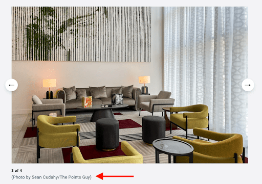
You can add a carousel or carousel slider if you have multiple images.
Using them properly can increase user engagement and make the experience better by allowing visitors to quickly scroll through multiple images on all devices.
3. Use Easy-To-Read Fonts And Colors
Pay close attention to the fonts you use on your website and ensure they’re easy enough to read. Fonts are often one of the most overlooked aspects of web design, but they play a crucial role in how people perceive your site and its overall look and feel.
Color is another crucial aspect of web design that can affect how visitors engage with your content — and helps make sure people can find what they need quickly.
Here are some tips for choosing colors:
- Choose contrasting colors for text, so it’s easy to see against other elements like images or backgrounds (e.g., black text on white background).
- Avoid using too many different shades within a single page — this makes it difficult for visitors’ eyes to focus on any one thing at a time.
- Leverage color psychology to help encourage users to take action
4. Make Your Site Easy To Use
Keep it simple with a clear and consistent layout, a simple design, and an exemplary user interface (UI).
A great way to ensure that your website is easy to navigate is by creating a simple navigation menu that gives visitors quick access to the pages they are looking for. 
Take Nlyte, a company offering enterprise data center infrastructure, as a perfect example. Their visitors can quickly find what they are looking for by using a well-laid-out navigation bar at the top of the page.
For instance, clients in the financial services industry can simply hover on the “industries” menu to find the specific page that details the solutions for their industry sector. Easy as pie.
An intuitive site structure helps users find what they need much more quickly than one that’s cluttered or confusing.
5. Go For A Responsive Design With Mobile-Friendly Features
More than 50% of internet traffic comes from mobile devices. Don’t miss out on capturing this audience when designing your interactive website.
Add mobile-friendly features such as a responsive design that optimizes the user experience on smaller screens and adds mobile touch gestures like swiping, pinching, and dragging. 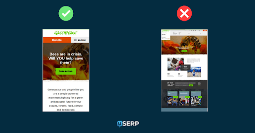
6. Make Your Website Accessible For Everybody
Make your website accessible and give an alternative path for those who can’t see images or hear videos.
You should always strive to make your website accessible to people with disabilities.
To do this, use alt text for every image on your site so screen readers can pick up on the details. The text should be descriptive and not stuffed full of keywords.
For example, if you have a blog post about the best cat food brands and you include an image of a cat sleeping peacefully, your alt text should read “Tuxedo cat sleeping on a green sofa” rather than just “cat” or “cat sleeping after eating the best cat food brands.”
For videos, consider adding video transcripts or closed captions so those with hearing impairments can still enjoy your videos to the fullest.
And finally, add keyboard shortcuts to help visitors who need extra support with their hands when navigating your site or filling out a form.
Also, make sure your interactive website is kid-friendly to prevent being flagged by parental control tools.
This helps ensure everyone gets the same digital experience without limiting accessibility to anyone.
7. Connect Your Website To Social Media
Social media buttons are a great way to help your website visitors connect with you on social media. They make it easy for them to follow you and share content they enjoy, so your website can reach more people.
It’s also a great way to increase your brand awareness because when people share content from your site, their friends will see it and become more interested in what you offer. 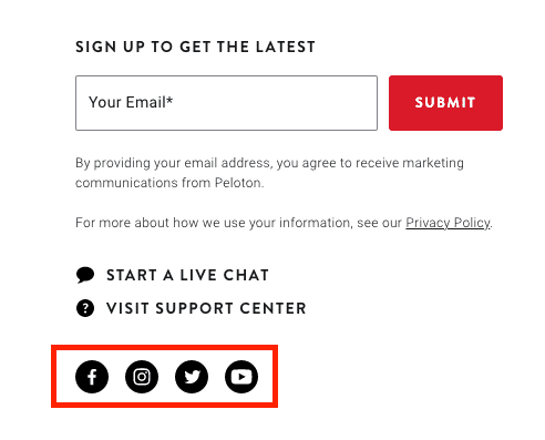
You can add social media buttons in the header or footer of your site that links directly to your specific social media pages, like Facebook, Instagram, Twitter, YouTube, and more.
Ready to build the next big social platform? Learn how to create an app like Instagram.
8. Enhance Security On Your Interactive Website
Website security is a must-have in this digital era, especially if you’re asking for personal information from your users through interactive features on your website.
Start by investing in a SaaS hosting provider that includes an SSL (Secure Sockets Layer) certificate to encrypt the connection between your visitors’ browser and your website’s server to protect their data from hackers during transit.
As an added layer of protection, ensure you follow data privacy laws by adequately displaying a cookie policy on your site. The last thing you want, after it’s all said and done, is a lawsuit on your hands.
Learn more about effective bot attack prevention strategies to safeguard your site and data.
Key Considerations When Designing An Interactive Website
- Make sure you know what kind of response you want and how you’ll use it.
- Consider your target audience and how much time they’ll have to interact with your site.
- Be very careful about adding outside elements, such as video clips or social media buttons, that can take focus away from the main website message.
- Make sure visitors know why they should interact with the content and what’ll happen if they do.
- Make interaction optional, not required.
Wrapping Up
Interactive websites are fun to create and can add value to your web presence, but they do take some time and effort to build.
Although interactive websites can be awe-inspiring, they can also be challenging to use, so make sure that each interaction also has value for your audience.
You can’t just throw together any old website and expect it to be successful, so make sure to take the time to do it right by following this simple guide.
Wondering do I need a website for my business? Find out why the answer is almost always yes.


