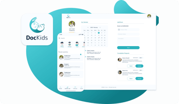
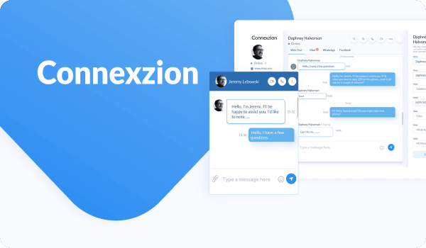
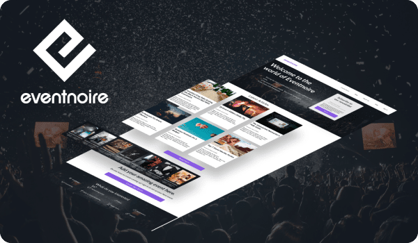
SpdLoad is the product development company
We build market-driven MVP for early stage startups.
To make you sure we will make fit to your project, we decided to show how did we work on our own product.

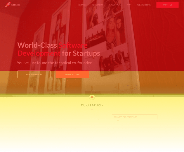
Initial request
The fall of 2019, we launched streamlined marketing activities. So, there was a task to update the UI — to make it modern and presentable. (Spoiler: we did even more and grew in numbers twice).
However, as we start working on this, we felt the lack of something. It was the last sigh of "intuitive marketing".
We decided to stuck to numbers and use the same approach as for our customers: analyse market, define pains and offer a top-notch solution. Let's take a look on what we've done.
Research stage
So, the research was based on 2 key areas: the old version of SpdLoad and competitors website.
The key insight we found at a glance was "We stuck in 2015". Why? You'll find out after the workflow part.
There are 2 steps we've done.
Analysis of competitors:
- Usability test based on 2019/2021 UX patterns and trends;
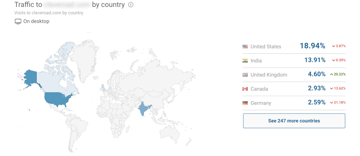
- Check of sources of traffic, user engagement using SimilarWeb;
- Analysis of SEO using Ahrefs toolkit: keyword planned and backlink checker;
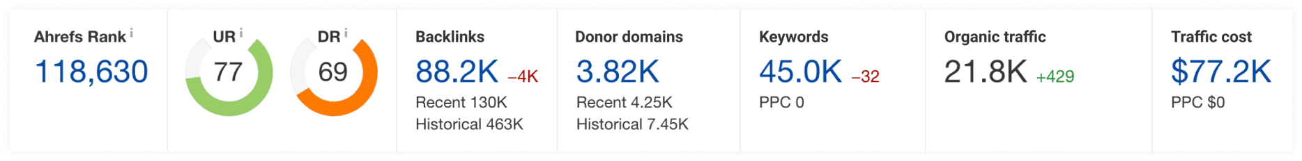
Competitor №1
1. Clear value proposition with strong positioning;
2. Engaging Call to Action;
3. Card-like design for services block;
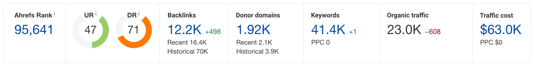
Ahrefs analytics
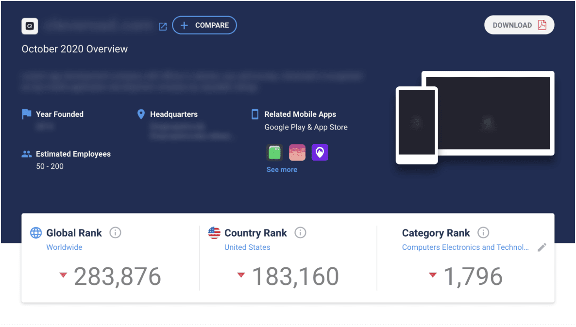
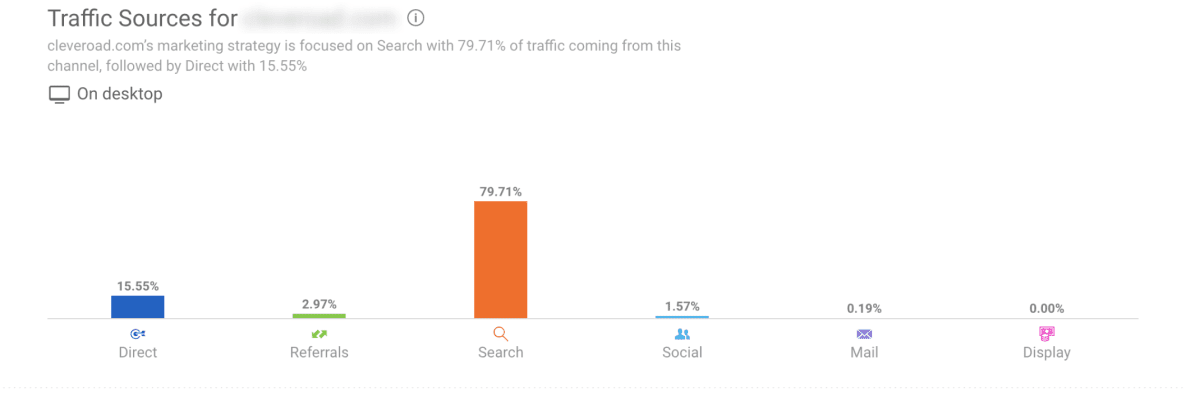
SimilarWeb analytics


Competitor №2
1. Engaging previews in the portfolio;
2. Customers' reviews with photosand videos;
Ahrefs analytics
SimilarWeb analytics


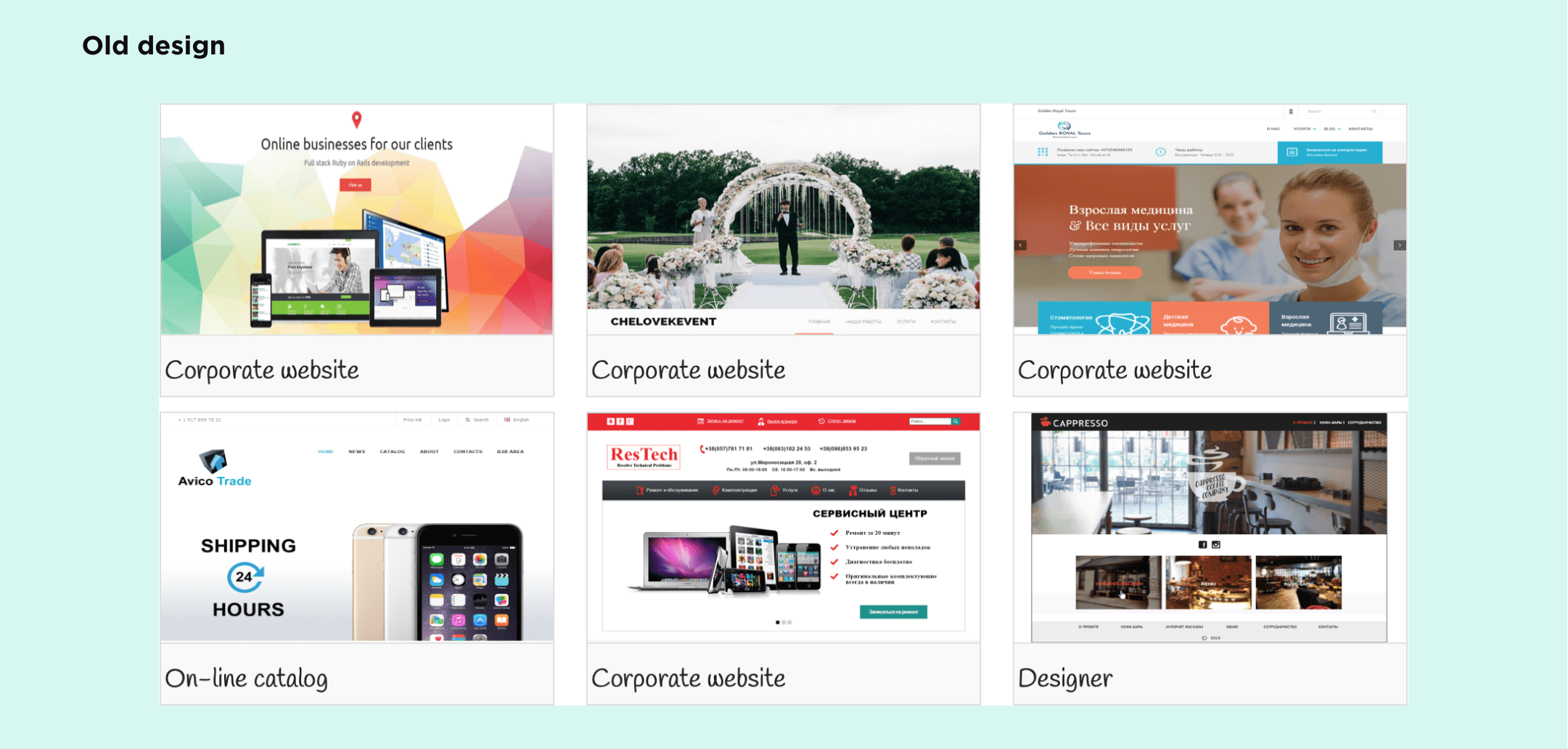
Reasons for redesign
In nutshell, there are 3 key reasons to redesign SpdLoad:
- The site wasn't Search Engine Optimized;
- Users weren't engaged in the content;
- Our site objectively looked worse compared to competitors' sites;
Analysis of SPDLoad (old one):
- We integrated Google's toolkit: Analytics, Tag Manager, and Search Console;
- We integrated HotJar;
These activities help us to identify the core pain points:
- Users weren't engage in content on landings;
- Users didn't use CTA forms and buttons;
- Users didn't read blog articles.
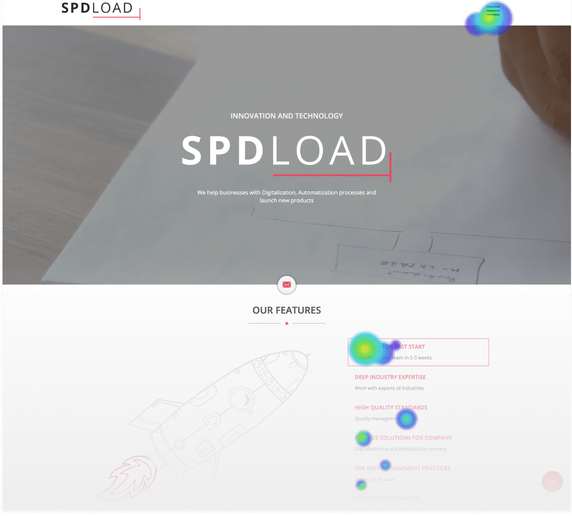
After that, we moved to deep interviews with target audience and designers. It helped us to complied a comparative map of the pros and cons of a website.
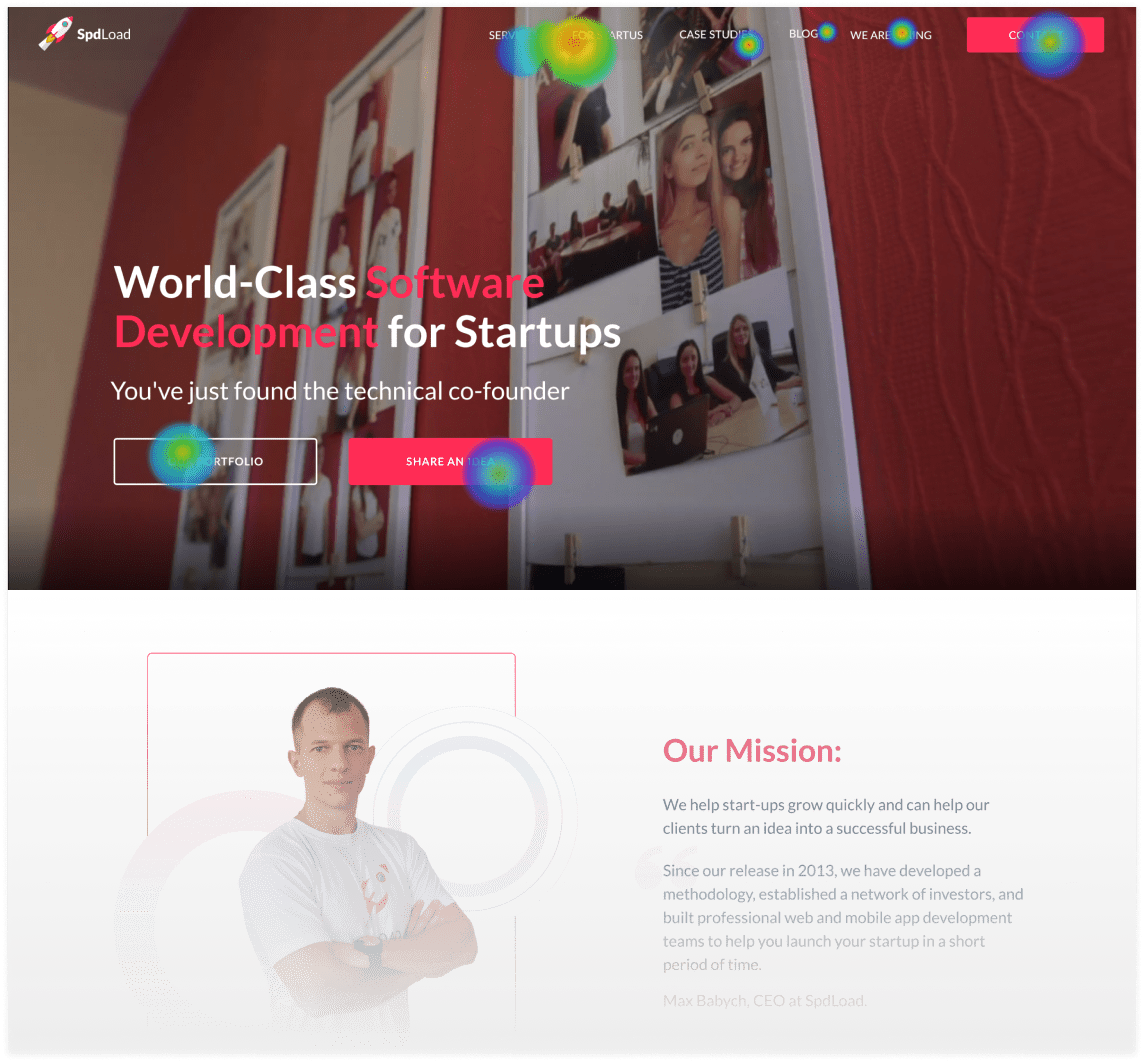
Example of heathmap
Scheme of heathmap on website
Example of a clicks heathmap
Scope of work
Before research:
- Update UI;
After research:
- Update information architecture;
- Improve on-market position;
- Create unique branding;
- Implement technical SEO;
- Improve of usability of website;
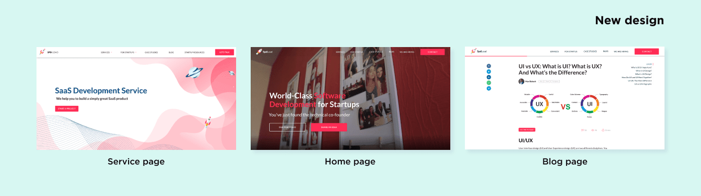
- Update the home page;
- Update commercial landings;
- Update of a blog section;
- Create UI kit;
Design stage
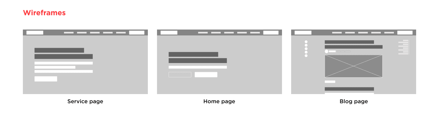
The design contained 3 steps:
-
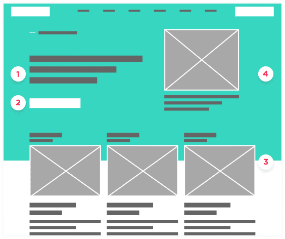
To build wireframes, we used 2020 UX patterns and key insights of Google Analytics. As a result, it helps us to build relevant user journey and design engaging pages.
-
Then, we created a UI kit, Also, we extended it with layout standards, fonts, animations and shadows.
-
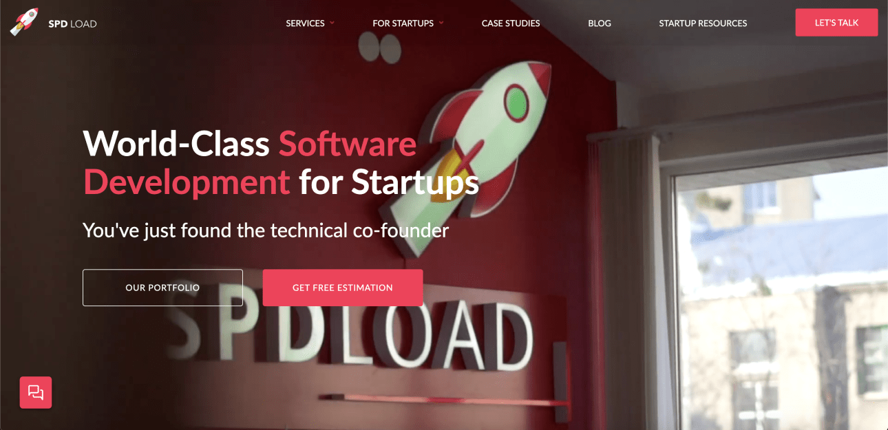
Then we implement design and start to collect design directly in our target audience and other designers. After a few more rounds of minimal improvements, we launched a new version of SpdLoad.
But it was just one more step to build a corporate website, that generates revenue.
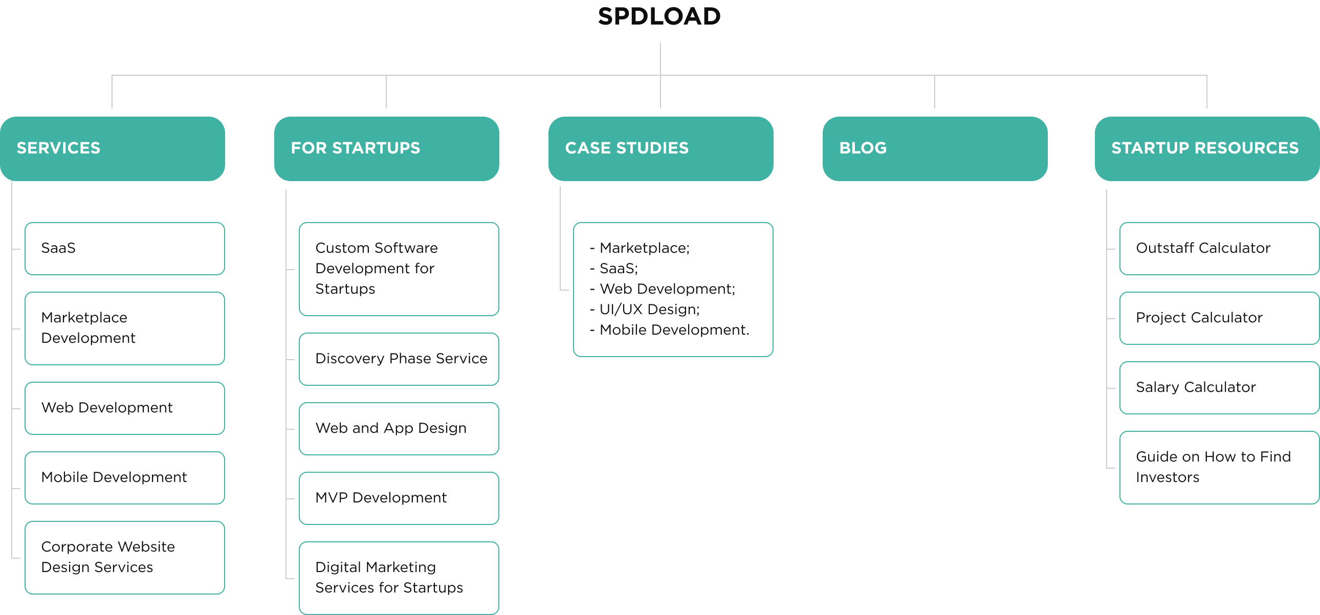
Before we prototyped the website, we pay attention to information architecture
There are a few reasons, we did so:
-
Sitemap is important for technical SEO;
-
Website structure is important for visitors' behavior;
An optimized website leads to higher ranking, but without engaged behavior signals, Google won't up rank the website.
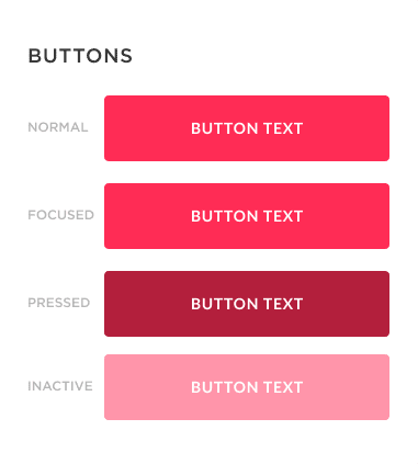
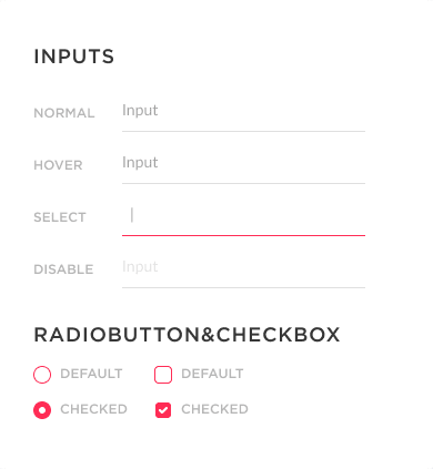
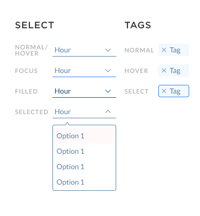
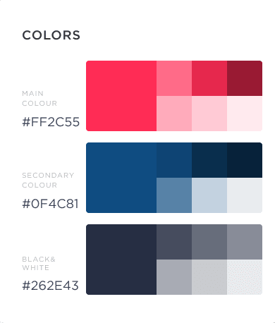
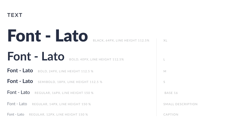
UI Kit
Case Studies
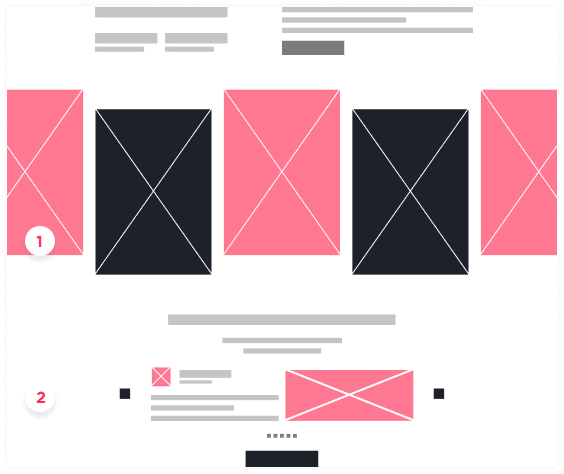
Another key improvement was the update of the portfolio block
We wanted to attract relevant leads by showing our expertise:
Thus we decided to reconsider the structure of the block:
-
Make the case study illustration more clear;
-
Added the title to describe the goal of the software;
-
Added the key challenges of the project;
-
Added clear Call to Action;
Thus we decided to reconsider the structure of the block:
We focus on storytelling in the format of the landing page.
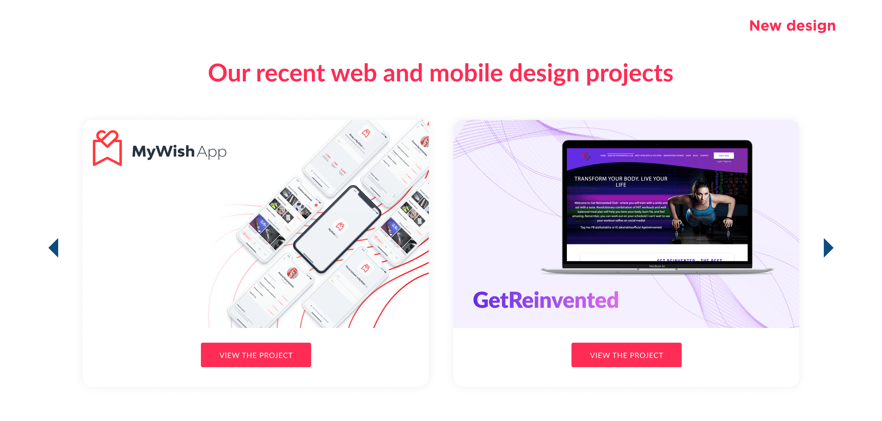
Our recent web and mobile design projects


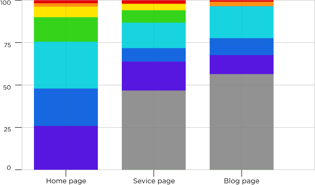
Heathmaps after redesign
Example of heathmap
Scheme of heathmap on website
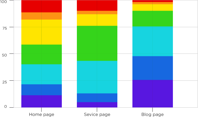
Example of a clicks heathmap
Numbers about the project
As we said at the first screen, we stopped any intuitive activities and focus on numbers.
There are 3 key metric about our website right now, the fall 2020 (and in compare to 2019):
- Ahrefs rating;
- Traffic;
- Conversion;
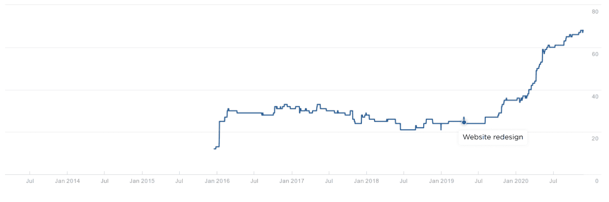
Ahrefs rank domain (last 3 months)
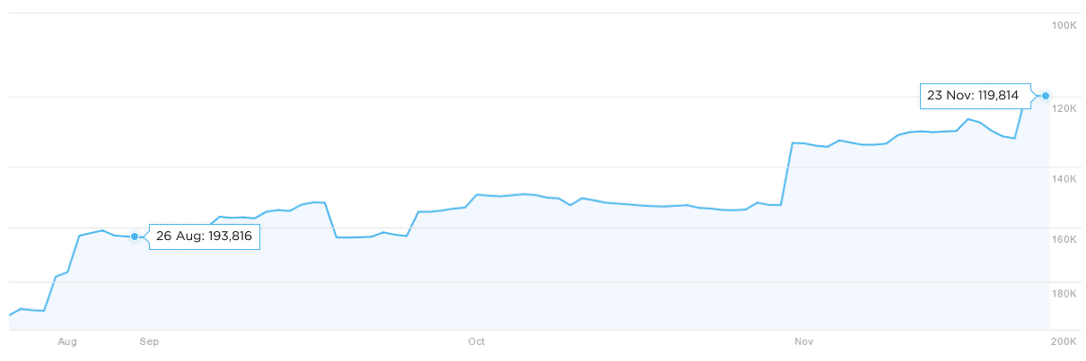
Ahrefs domain rating
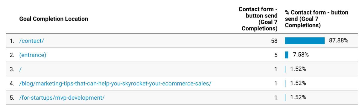
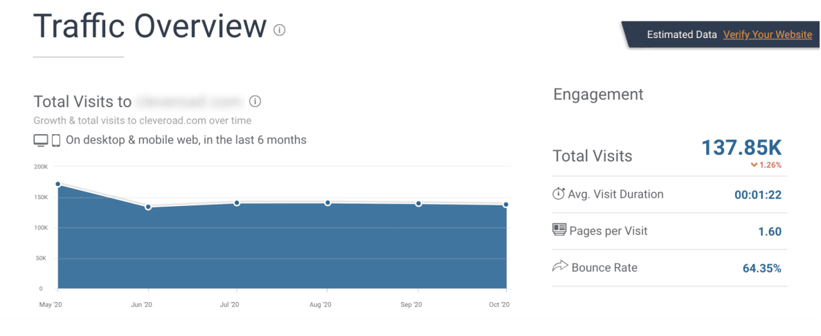
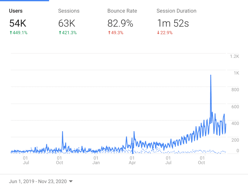
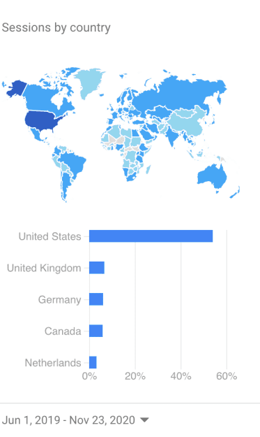
Google Analytics - Traffic Overview
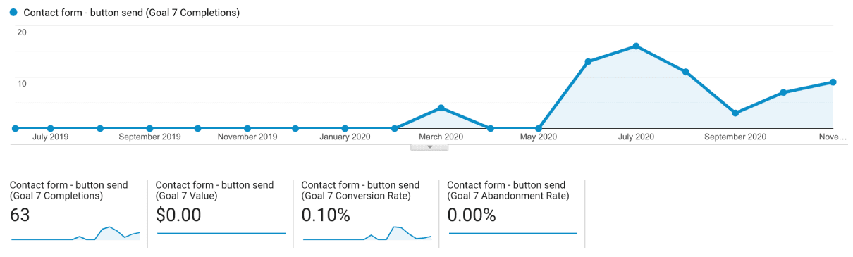
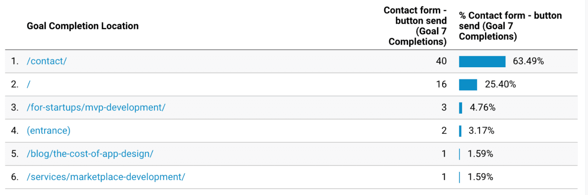
Google Analytics - Conversion Overview
In 1 year after redesign and launching marketing we have built a system of inbound lead generation in a competitive and expensive niche. The average check of lead is $40 000.
Thanks to the redesign, we were able to attract leads through content marketing - blog, as well as from the home page.
Late 2021 update results
Design update coincided with the update of the search engine google, so we also conducted technical optimization. As a result, we increased the flow of inbound leads by another 30% per month.