Mobile App Design Process: 4 Crucial Steps
- Updated: Nov 14, 2024
- 23 min
“People ignore designs that ignore people.” As designer Frank Chimero pointed out, creating a successful mobile app starts with understanding your users.
Before building a great user experience and interface, you need to connect with the target audience and validate your idea.
This guide will take you through a strategic design process to turn your app ideas into reality. We’ll cover:
- Refining your vision to solve real user needs
- Crafting intuitive navigation and flows
- Choosing visuals that engage your audience
- Picking the right tools for design and development
- Estimating realistic budgets and timelines
By focusing on user-centric design, you’ll avoid issues like abandonment and costly mistakes. With careful planning, testing, and improvement, you can launch an app users love. Let’s get started!
Want inspiration for your website? Check out these examples of good web design for ideas.
Get a professional website fast by outsourcing your web design. Get started with our expert team today!
The Essentials of App Design
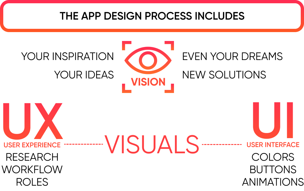
Creating an outstanding app requires balancing form and function – crafting both seamless user experiences and engaging visual design. Two key concepts drive this process:
- Vision – Identifying user needs and crafting a concept that intuitively solves problems. Your vision guides development.
- Visuals – Bringing ideas to life through graphics, layouts, and flows explicitly tailored to your audience. Strong visuals attract and connect.
This section will explore how to bridge the gap between vision and visuals with strategic design techniques. You’ll learn:
- Research methods to reveal true user needs
- Idea validation techniques to refine your concept
- Proven processes for translating ideas into intuitive user flows
- Creative approaches to select visual styles that resonate
With diligent planning and user testing, you can develop app designs that seamlessly transition innovative ideas into engaging user experiences.
Defining Your Vision
Now, there is no fixed route that you can take to carry your vision and help it reach the visuals.
The mobile app design and app development are different processes.
The fact that all the designers have different processes is one of the reasons why mobile app designs are so unique and fabulous.
Today, we are sharing the app design process we follow at SpdLoad.
From now on, everything you will read represents our unique design creation process.
Still, remember the vision to visuals journey?
As a note to that journey, we begin by understanding the vision of the application founder.
Because a founder’s dream to help the customers is essential to reflect in the application design.
Hence, the mobile app design process has to have a similar connotation.
Let’s talk about the vision first.
Vision brings cohesiveness into the design.
If not for vision, every application will amalgamate designing principles available in the public domain.
In other words, vision brings the element of uniqueness to the app design and development.
William Deming was an American engineer known for his theories and thoughts on the aspect of QUALITY.
He said that
“It is not enough to do your best; you must know what to do and then do your best.”
So, you might completely understand the 21st Century’s most extraordinary mobile app design process.
But the vision gives you a heading on what to do with your knowledge and app design process steps.
We are taking all this space to explain the importance of vision.
This is vital and will help position the rest of the guide in the right direction.
Choosing Impactful Visuals
Visuals are critical to UX.
In any product development process, UX is more important than anything else. UX is essential to meet the user’s needs, which we research through our UI/UX consulting services.
Let’s discuss the app design process steps now.
4 Stages of App Design Process
There are only four significant steps to every app design process.
- Understanding the Vision
- Discovery Workshops
- UX Design
- UI Design
After these steps, you will be able to execute the most authentic, relevant, and unique representation of mobile app design and development.
1. Understanding Your Vision
In the above section, the discussion about the vision was from the designers’ perspective.
Here, we want to help you remember that you need to have a vision before knowing how to design a mobile app.
We can also say that the vision of the founder brings life into the product.
Based on the vision, we have a story to share with you.
We got a client who wanted to create a dating application.
But, the problem was that too many dating applications were already available in the market, and the client wanted his product to be different, unique, and outstanding.
To create a better product than every other similar item, we trusted our app design process steps. We combined them with the founder’s vision.
Because ideas flow like a stream and before anyone else takes the better share of the market, act first and act fast.
For a designer, it is essential to source as much information as possible.
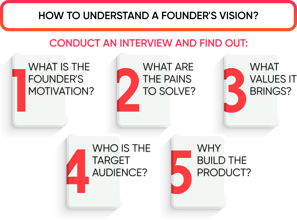
Some aspects that you should focus on include:
- Pain points the product will solve
- Target audience (age, region, preferences)
- Why build the product?
- What is the motivation behind the development?
To get an answer to these questions, make sure to conduct an interview with the founder.
In other words, you need to work with the founder, the business analyst, the developer, and other designers.
This is not a solo mission.
Every successful mobile app design process needs to be built with empathy.
In the end, you should be aiming to build fruitful cooperation.
It is important to work as a team as it can result in a better return on investment (ROI).
According to a survey conducted by Red Hat Mobile, teams that work together can achieve a 74% increase in ROI.
The same survey also shows that cooperation reduces friction and training and, most importantly, leads to customer satisfaction.
Therefore, mobile app design and development teams must involve all project stakeholders.
2. Discovery Phase
This is the second of the four app design process steps.
Customer discovery is your key to success, period.
Without understanding your customers, you cannot launch, market, sell, earn, scale, advertise, and so on.
Every part of the app design process is connected to this step.
After completing the product discovery phase, you will discover your product’s Product/Market Fitness. Learn more about our product discovery phase as a service.
And it is the holy grail for every founder/entrepreneur.
You need to build a product that will motivate users to spend their money.
But to do that, you must undergo a unique, complex, yet decisive exercise.
There are five aspects within the customer discovery workshop on how to design a mobile app.
- Identify your Customers or Audience
- Understand and Research your Target Customers’ Pains
- Identify the current and futuristic application development trends
- Analyze your Competition.
- Define the scope and prioritization of the screens.
These five concepts can be divided into two heads:
Search and Execution
Let’s talk about the search first.
Search means you need to first answer some questions concerning your customers.
Identify Customer Audience
Your app design process and development will change according to the end-users.
How will the customer engage with your product? It is important to understand.
To help you get a better idea of this, we have listed some questions that you need to find the answers to.
In other words, we want you to create a target customer and, with it, a target market profile.
| Question | Purpose |
| Who is your target demographic? | Identifies your target customer segment.
Age, sex, region, Marital status, education. |
| Who will buy your product or service? | Customer profiling. |
| What is the desired action you want from your target audience? | Helps advocate your product with the right language and format. |
| What is the ideal work profile? | Important to frame the right design.
For instance, a product for CEOs and one for managers will have a different motive. |
| Who will benefit the most from your product or service? | Helps to layout the sketch for customer personas. |
| What motivates a person to buy your product? | Important for copywriting and advertisements. |
| What kind of similar product are the customers using right now? | Assists to create a better product and get more traction. |
Once you have the answers to these questions, one thing will be clear.
And that is the kind of strategy you need to move ahead.
To some extent, these answers are pivotal in the mobile app design process.
Because they help frame specific, measurable, and achievable goals.
For instance, knowing the answer to the question, “Who is your ideal customer?” can help create the right design.
You may have already had an idea about your ideal customers when you built your idea.
For example, if you create an application to help people find the right school for their kids, you know that parents are your ideal customers.
What characteristics should we study in the parents we want to target? Surely, you cannot expect every parent in the city to benefit from your product.
Hence, answering these questions helps you narrow down your targeting and profiling.
In the advertisement world, too, you need to narrow down your targeting if you want to obtain quality leads.

Understand and Research your Target Customers Pains
This is all about creating a better user experience.
In the first segment on how to design a mobile app, we will discuss the questions that help frame the pain points.
In the second part, we will look to validate those pain points.
By understanding the customer pain points, you will be able to cover three things;
- Determine the product or market fitness
- Empathize with the customers on an emotional level
- Close more deals
Apart from the mobile app design process, these aspects are also beneficial for creating the right content and advertisements.
| Question | Purpose |
| What is the biggest issue you are facing right now? | Helps with features and overall app design and development.
You can also follow up with other questions like;
|
| How do you make any purchase decision? | Helps identify the customer’s journey to make a purchase decision. |
| What problems are you facing with the existing product? | Assists with creating a better product fitness profile. |
| What do you think about a solution that can help you solve the pain points? | Creates a framework about what the customer demands. |
| What features do you desire in the ideal solution? | Helps identify the ideal features list for the application. |
Once you have the answers to these, try to validate the solutions with these questions.
As a result, your previous questions need to be leading or open-ended.
Always leave a scope to follow up with another question.
| Question | Purpose |
| How much are you willing to pay for the application? | Helps with setting the price and also the mobile app design process cost. |
| What do you like and dislike about the existing application? | By asking what they like first, you are helping the interviewee frame the right mindset to talk about the next part, i.e., what they dislike. |
| How would you feel if the problems you are facing were not solved? | The next step in pain point validation under the app design process. |
| Can you specify what issues you face due to the problems you are facing? | Allows the developer, analyst, and designer to pinpoint the troubling areas. |
| Did you try switching to any other application? | It helps to know the market competition.
You will also find out whether the customer is using the existing application because they have no other option. |
We discussed user validation until this point in the app design and development.
This is also a part of the product/market fit regimen.
If you do not identify the target audience, you will waste your money and time on building a product that is unnecessary.
Another set of reasons why you need to build a target audience for the application design process includes:
- It helps with precision planning
- Resources prioritizing
- Keeps the focus crystal clear
- Helps with getting a loan or investment
You can’t reach and make an application for everyone.
But within your target segment, too, you cannot hope to build something that will be liked and used by all of them.
So, we do not want you to approach every customer like this is the last customer you will get.
These questions only help you build a framework.
Also, you cannot ask every target customer whether they need a new application.
Similarly, it is essential to make a story of these answers and infer it to create the right product.
You might also think we are talking about the application design process.
True.
But why are we talking about the product and its features?
The answer to this question will be self-explanatory once we complete this part.

Researching the Competitors and Industry Trends
Moving on with the mobile app design and development, let’s discuss understanding your industry.
By industry, we mean the segment of the market in which you will launch your application.
Research says that 72% of mobile application products do not succeed because they lack a strong business model.
To get a complete idea about these things, the right set of questions are as follows.
| Question | Purpose |
| How many applications are working in the market with a similar service?
Or Who are your Competitors? |
Allows creating a list of all the competitors. |
| What are the business models of these applications? | Helps identify:
|
| What kind of social media attention does the industry get? | It helps you create a framework for solutions needed to build campaigns. |
| What kinds of steps do your competitors take to move ahead? | It helps to know what kinds of strategies your competitors are using. |
| What are the gaps that you observe in the current competitors?
Or What are your competitor’s weaknesses? |
You will get a better idea of what to include in your product development. |
| What are the strong points or strengths of your competitors? | List down all the features that are great about the competitor’s products. |
| What are the opportunities and threats of your industry? | Companies are riddled with weaknesses and made strong with their strengths.
But when it comes to an industry, they are faced with threats and need to capitalize on the opportunities. |
| What are the distribution channels used by your competitors? | Helps identify promotion strategies. |
Another thing that you need to understand here is the way to get answers.
It is not that your competitors are sharing everything about their customers and their strategies in the public domain.
They won’t show off, just as you won’t do with your product.
How do we get the answers to resolve the application design process?
Start by looking at the competition’s owned content.
In other words, look at their website, blogs, social media channels, ebooks, case studies, and so on.
Try to get an idea about what your competition is doing and how they are able to position themselves in the market.
The next step is to check the reviews your competition is getting.
Today, Uber completes 14 million trips daily.
The idea was born out of a simple need: when someone wants a cab, they must wait.
We also came across a client who wanted to create a similar application.
Click to Ride is an on-demand cab service that helps users get a cab when and where they want.
The unique thing about this application is that it is customer-oriented.
While building the framework for the application, we researched the customers and industry.
After getting the customer profile and their pain points, addressing and building a better product was essential.
With Click to Ride, the users will get the drivers based on their previous choices.
This helps to give a seamless user experience throughout.
After getting to this point, you will have much knowledge about the customers and the industry in your hands.
Your roadmap to building the next Uber—find out about taxi app development.
In the last part of the research for the mobile app design process, we will talk about the screens and their prioritization.

Defining the Scope and Prioritization of Screens
Until now, you will have a lot of data on your hands, for sure.
All these answers and their stories can very quickly and easily make the mobile app design process complex and confusing.
The motive is to prioritize the way you move ahead with the app design process.
SpdLoad has been a proud partner of many startups, founders, and clients, helping them achieve what they desire.
The key is to follow a lean startup and customized development methodologies.
Truly, there is no one-size-fits-all approach here.
Just as every idea and every vision is unique, the product built on that idea also has to be unique.
To further communicate this aspect, we will talk about using the MoSCoW approach.
This approach is applied to:
- Ideate
- Build
- Test
- Measure
- Iterate or Improve
Using this lean startup methodology is to minimize the development lifecycle while identifying the viability of the idea.
The motive of the lean startup methodology is manifold:
- It teaches you how to drive a startup
- It helps you understand when and where to turn
- It signifies when to preserve and when to accelerate
Following this method will eliminate the uncertainties in the application design process.
Plus, you will learn to work smarter without wasting resources.
This is a part of the design process because, with the amalgamated processes relevant to a startup’s success, we have to consider everything.
So, by using this method, you are substituting hitting blind arrows with extensive planning.
You are not relying on any intuition. Instead, the process is based on customer feedback.
Most importantly, the lean startup process replaces traditional design exercises with an iterative process.
To reach the idea validation part, we need to generate the idea, build a product, test it, measure the response, and repeat it.
Repeat here implies if there are issues with the first cycle.
To reduce mistakes and ensure a better outcome, we can follow the MoSCoW approach.
Typically, MoSCoW comes into play when you are stuck on a project.
The prioritization methods under this approach will help you get unstuck and achieve coherence in the app design process steps.
MoSCoW expands as:
- Must-Have
- Should Have
- Could Have
- Would like, but won’t get
| Aspect | Meaning |
| Must-Have | These are the things without which the project will fail.
With our approach, you can list the features without which the application won’t work. |
| Should Have | Anything that you put under this may not be necessary, but it will make your product el-magnifico. |
| Could Have | These things are important from the perspective of UX and UI but are not essential from the project delivery aspect. |
| Won’t Have | Simply put, anything under this is not required. |
So, the MoSCoW approach is a simple yet effective way to set things in order and prioritize them.
This is it.
Now you know how to research app design and development.
In the next parts, we will talk about the importance of User Experience (UX) and User Interface (UI).
Customer and industry research might seem like it should be a part of the development process.
But it is pivotal in the app design process.
Within mobile app design, customer research helps understand user behavior and motivators.
This helps us understand Who Is and Who will be.

3. User Experience (UX) Design
UX means user experience, or what a user experiences when interacting with something.
The content that you see above helps identify the user journey.
But UX is pertinent to identify user’s needs.
The motive for implementing the UX is to build positive experiences for the user.
This, in turn, ensures that the customers remain loyal.
The relationship between identifying the customer journey and UX is interdependent.
In some aspects, identifying the right UX is essential to manage customer journey, while it is the other way around with other elements.
Within UX, we talk about user profiling and personas and identify customer preferences with surveys.
User experience dictates the usability of the application design and its process.
So, if your application offers a cohesive user experience to the customer, they will stick to it.
Another reason why you need to create user personas and get the right answer to all the questions above is exclusivity.
No user will engage with an application similarly.
They will have different opinions.
Crafting Custom Mobile Apps That Delight Users!
So, to fulfill the user’s desires, you need to create customer journeys, which then help deliver satisfactory UX.
There are three main aspects to User Experience in relation to the app design and development;
- User Journey
- Wireframes
- Prototypes

User Journeys
User journey creation is specific to UX.
We create user journeys to envision how a user will engage with the product.
This is essential in the mobile app design process for multiple reasons.
- Creating an itinerary of every screen/page/step
- Helps identify the features required to complete every step
- Create a hypothesis
- We create assumptions about UX but then have to validate them later
- Screen or page sketches
User journeys are developed with the help of mind mapping.
Marketers in the ’90s and ’00s were relying on linear customer funnels.
These methods were relevant according to their time.
But, in their defense, the customers also had a couple of ways to interact with a business.
Today, there are more ways to interact than a user can imagine.
Building user journeys with mind maps is a great way to visualize your customers’ stages of interaction.
Furthermore, in the event of how to design a mobile app, mind maps give us access to the end user’s mind.
Added to this, you will learn to empathize with your customers.
In the end, you will learn to understand how the buyers feel and what they want to feel.
These aspects are instrumental in giving the best user experience to the end-users.
Talking about the UX design and creating it are two different things.
Sometimes, the things we discuss with the team or brainstorm over may seem easy, but in actuality, they are a bit complex.
Almost every app UX design and development exercise feels the same.
But this thing is felt the most while creating highly user-oriented applications.
For instance, let’s take an example of a financial application.
Finance or wealth management is something that the users want to keep as private as they can.
When working on designing a financial mobile app, the executors may face some challenges.
| Challenge | Problem and Solution |
| Creating an Engaging Onboarding Process | Onboarding is the first stage of a user’s engagement with your application.
This is the first step of a long journey. So, while working through the app design, you need to take care not to overwhelm the users. This means that you should not ask or share too many details in the first stage of interaction. As you increase the number of fields in the onboarding sequence, the user takes on a cognitive load. Beyond a point, they will get bored and abandon. |
| Solution:
The key is to create a one-step sign-up. Make sure to design the onboarding process with a third-party login sequence. You can use here, Google, Facebook, or email sign up. But that’s it. Do not ask for more details. There is a reason why the majority of the sign-up pages are plain and white. The motive is not to make the users feel that they are not getting the right application. |
|
| Create A Gamified Experience | Every application design process has to understand the value of responding to a user’s needs.
This motivates the designers to find new and better ways to enhance the user engagement levels. It has to be simple yet enjoyable, and also take care of the user’s preferences. Creating a gamified UX can get out of hand very easily. It is challenging to stop with gamification. That is why you need to understand the process and motive before moving ahead. |
| Solution:
As a solution, set achievable and exciting goals. When you create a new account with a service, it shows your profile completion levels. Some services give badges for completing every step. Different service providers use different angles to approach the customers and make the process interesting. In the entire process, take care of the user’s motivation. For instance, in a financial application, you can provide rewards to the user for following a set behavior. An application that wants people to manage their finances better can give rewards for saving x amount of money every month. Such things are imperative to look at in the app design and development. |
|
| UX Writing | Working with financials, you are bound to come across some complex words and jargon.
As a creator, you have to understand the mobile app design process, but the users do not. And your knowledge of the product automatically urges you to write highly technical content. But all of this is not digested by the user easily. So, with a financial application, you cannot ignore the language. |
| Solution:
It is a strenuous task, but the UX copywriting team has to ensure that no complex term comes in the content. It is better to create a glossary of all the terms that are a part of the financial application and substitute them with easy words. Financial terms can be confusing and, at times, misleading too. So, it is imperative to spend some time on it and then move forward. |
We are at the stage of how to design a mobile app where all the theoretical and research work is complete.
Now, we will move to actually executing the application design process.
Two types of exercises are essential to complete the mobile UX app design process;
- Wireframes
- Prototypes
| Process | Meaning, Benefit, and Tools |
| Wireframing | The wireframe process is like the app design blueprints.
Just like a painter creates rough sketches of the painter initially, a UX designer creates wireframes. Simply put, you create a sketch that shows the placement of every element in the app design process.
The motive is to help the developers and the team understand the product while conforming with the user’s requirements. This is one of the reasons we go understand the user in the initial stages of the mobile app design process. However, note that the wireframes are bereft of any sort of colours, graphics, and other media content. This is just about their placement. |
| Benefit
Wireframes complement the user flows. Where user flows represent the process of how a customer will move ahead, wireframes puts the user flow process into a better perspective. Wireframes are meant to be simple, easy to understand, and intuitive. |
|
Tools:
|
|
| Prototypes | Wireframes help realize that the application will look good.
But the prototypes help determine whether or not the application will feel good. While creating prototypes in the application design process, you can add:
Just as you look at the samples of pre-designed rooms or kitchens, the prototypes help create an image of the application’s looks before actually developing it. Within the prototypes, neomorphism is a new age concept that has divided opinions. |
| Benefit:
Prototypes cement your wireframes while giving a real-life look at the application. The present era’s design tools help create functional prototypes. These are the designs that act and feel like the real application. In other words, prototypes amalgamate the functional and visual aspects of the app design and development. Most importantly, prototypes are essential to get feedback. This constructive feedback determines the real functional levels of the application. |
|
Tool:
|
After getting a sense of the User Experience and how to recreate the same with modern-day tools, we are left with the UI.
UI means user interface.
We can also say that UI defines the visual underpinnings of the app design process.
Unleash AWS's Full Potential with Our Developers.
4. User Interface (UI) Design
The most important thing to understand in UI is the UI Kit.
A UI Kit represents a library of different graphics and resources pertinent to the app design process.
Because of a UI kit, a designer can:
- Streamline the design process
- Save spending money and time on creating new components or graphics.
- Boosts the product performance
When it comes to adding functionality to a mobile app, one feature that is often considered is in-app chat. However, there is a debate over whether in-app chat or SMS is the better option for users.
Adding functionality implies that they can create a better product for the end-user.
Or how the end-user should not have to face any hurdles while using the application.
These can be in the form of:
- Smudgy button
- Foggy icon
- Too small clip boxes
Following these lines, the concept of neomorphism comes to notice.
Some designers feel that neomorphism diminishes the icon or button borders.
At times, it does not feel like the button is toggled.
So, to create a better visual, neomorphism is hurting functionality.
That is why it is imperative for every designer who is a part of the How to Design a Mobile App team not to focus on creating confusing designs.
A UI kit gives access to all the components essential to creating an app user interface design under one roof.
One of the greatest benefits of using a UI kit is that it helps you focus on other tasks during the mobile app design process.
Meanwhile, the UI kit will take care of the core graphics of the application.
In the end, it makes designing easier, smoother, and less time-consuming.

From Design to Prototype
UX and UI are parallel to each other.
Once you create the wireframes, the advanced levels of UI and UX come into play. Feel free to learn more about UI vs UX design.
Furthermore, after creating the wireframes in Balsamiq, you can switch to Figma.
With Figma, add the elements of UI and UX to create clickable layouts.
So, just like a user will engage with the application, these clickable prototypes help recreate that experience.
The benefit of this app design process step is that it becomes easier to implement the changes.
Because everything that you do here is non-coded.
So, when there is no coding involved, all you have to do is change some settings and check the new design.
Remember our ideate, built, test, and measure loop.
Well, these ready-to-go prototypes can help deliver better results of this exercise.
With the mobile app design ready, you can present it to potential customers and get their feedback.
This brings us to iteration.
Implement those changes and then repeat the process.
This is like a virtuous cycle. Everytime you end the cycle, there is something to learn and implement.
That is all, guys!
We are at the end of our discussion on how to design a mobile app.
This is how we execute the MVP development services at SpdLoad.
At the end of this process, you will be able to design the MVP.
Always remember that the app design process does not end.
The test to iterate cycle is like a loop.
Why do you think that the applications you are currently asking for updates?
This is because as soon as the developers get a review, they ideate, build, test, and measure the new changes.
In the end, they implement them, and we get the notice to update.
A great example of this exercise is when Uber integrated the application with another form of service.
That is the ability to send packages within the city via Uber.
Before Uber implemented this process, several players in the market developed an application to deliver intra-city packages.
However, Uber observed the creation of a new demand.
They tested the new app design and development process in mobiles and then executed the changes.
Similarly, every successful application keeps on scaling with demand.
That is why it is essential to begin with the MVP and scale as needed.
To sum up the entire mobile all design and development process:
- Documentation: Use Google Docs and Google Forms to create surveys and record the answers. You can even create bar graphs in Google Docs.
- Mindmapping: With all the answers in your possession, use tools like Mindmeister to brainstorm the app design process and features.
This leads to the formation of wireframes.
- Prototyping: Create clickable and real-life application designs with Figma.
Build and test your design while noting the hurdles and making the necessary changes.
- Design: With everything good to go, you can forward the design to the front-end development team.
These guys will work on the coding part and create the app design that you had planned.
Check out how much it costs to build an app like Uber.
The Cost of the App Design Process
While each app design project is unique, costs typically range from $2,000 to $8,000. The final price is influenced by factors such as design complexity, screen count, feature set, and choice of design team.
Our team has extensive experience in guiding mobile app development from ideation to launch, using proven and cost-effective techniques.
As a Clutch Leader in Ukraine, we’re excited to bring our clients industry-leading expertise and dedication.
Before starting your project, explore the detailed breakdown of app development costs to avoid surprises down the line.
Need help with mobile app design? We’re here for you.
Get in touch for UI/UX design, consulting, and more. Let’s discuss your vision and set your project up for success.

