Mobile App User Interface Design 101
- Updated: Mar 18, 2026
- 13 min
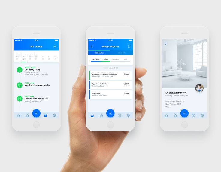
Mobile devices have become essential parts of our lives. We’re always on the go and prefer accessing information right from our phones rather than sitting at a computer after work. As a result, mobile apps have exploded in popularity as convenient companions to websites.
However, a confusing or cluttered interface drives users away. The average app gets only a few clicks before deletion. That’s why user-friendly design is critical when starting an app.
In this article, we’ll walk through straightforward steps for crafting an intuitive mobile UI and elevate user satisfaction with your mobile app design. As a company providing user interface services for over a decade, we know how to create mobile apps that feel intuitive, look modern, and truly serve the end user.
This is your ultimate guide to mobile app UI.
Transform your mobile app with our expert UI/UX design services tailored to your unique needs — contact us today to get started!
Step 1: Consider Platforms And Operating Systems
When designing your mobile app, start by identifying which platform you’re building for: iOS or Android. Each has its own design rules and visual language, and they create very different user experiences.
Apple and Google both offer detailed user interface guidelines to help developers and UX designers create mobile apps that feel native to their platforms. These guidelines shape everything from screen size, layout, and typography to button styles and animations.
iOS apps often follow Apple’s Human Interface Guidelines, which promote clean, minimal, and polished interfaces. They create a smooth, app-like experience that feels seamless across mobile devices.
Android apps, on the other hand, follow Google’s Material Design system. It’s based on the idea of digital surfaces behaving like real-world materials, so you’ll see more layering, shadows, and movement. The goal is to make the mobile app UI feel more tactile and natural.
Want to understand what goes into building and budgeting an Android app? Check out our guide to Android app development costs. Planning to go with iOS? Here’s a helpful breakdown of iOS app development costs and tools to get you started.
iOS vs Android UI Design: Quick Comparison
| Feature | iOS (Apple) | Android (Google) |
|---|---|---|
| Design system | Human Interface Guidelines | Material Design |
| Overall look | Sleek, minimal, app-like feel | Bold, layered, more realistic (paper-like) |
| Navigation style | Bottom navigation bars, tab bars | Hamburger menus, top tabs, or bottom nav depending on the app |
| Typography | San Francisco font | Roboto font |
| Buttons & icons | Simple, clean icons with minimal shadows | Icons often use more color, depth, and drop shadows |
| Animations | Subtle, smooth transitions | Dynamic, often emphasizes movement and touch feedback |
| Mobile device consistency | Fewer screen sizes and resolutions to support | Wide range of devices and screen sizes, requiring more flexibility |
| Back navigation | Gesture-based or top-left “Back” button | Built-in hardware/software back button |
Step 2: Align Design With Business Goals
Your mobile app’s design should serve two purposes:
- Solve real problems for your users
- Support your business goals
That means the mobile app UI should do more than just look good and follow the latest app UI/UX trends. It should also help drive key outcomes like user signups, in-app purchases, brand recognition, or customer retention.
For example:
- If your goal is lead generation, your mobile app design should highlight clear calls-to-action and simple navigation to forms.
- If your focus is monetization, your mobile interface should showcase features that encourage purchases or subscriptions, while keeping payment flows smooth and trusted.
- If you want to boost engagement, prioritize intuitive user flows, onboarding, and interactive elements.
Good usability keeps your users happy and helps your business save time, reduce churn, and increase ROI. That’s why every design decision should tie back to what the app is supposed to achieve for both users and the business.
Want inspiration for your website? Check out these examples of good web design for ideas. 
Step 3: Enable Back Navigation
While users interact with the mobile application, they may want to go one step backward.
Users often move back and forth while interacting with an app, whether it’s to recheck a form, compare products, or fix a mistake. That’s why back navigation is essential for a smooth mobile user experience.
Always include a clear, consistent way for users to go one step back, either through a visible back button, a gesture (like swiping), or the device’s native back function.
Why it matters:
- It prevents frustration and reduces drop-offs caused by lost progress.
- It keeps the flow natural, especially in multi-step forms, checkouts, or onboarding.
- It helps users feel in control, which improves overall user satisfaction and retention.
Be sure to test your app’s navigation thoroughly. Poor navigation design can kill conversions, especially if users are forced to restart a task from scratch after a misstep.
Step 4: Optimize Readability
If users have to squint or zoom in to read your app’s text, they’ll likely leave. Readability is one of the easiest ways to improve the overall user experience, and often one of the most overlooked.
Here’s how to get it right:
Use legible font sizes
- Stick to at least 16px for body text.
- Headings can scale based on hierarchy, but avoid going too small on any device.
- Test your font sizes on different screen sizes. What looks fine on a tablet might be unreadable on a smaller mobile device.
Choose clean, readable fonts
- Sans-serif fonts like Roboto, SF Pro, or Open Sans are great choices for mobile UI.
- Avoid overly decorative or thin fonts. They’re hard to read, especially on low-resolution screens.
Maintain a strong contrast
- Make sure there’s enough contrast between the text and background.
- Use tools like WebAIM Contrast Checker to test for accessibility.
- Dark text on a light background, or light text on a dark one, is usually the safest option.
Keep line spacing comfortable
- Use line-height of 1.4–1.6x the font size to make text easier to scan.
- Avoid packing text too tightly together.
Limit long blocks of text
- Break content into short paragraphs or bullet points.
- Use headings, icons, or cards to help users scan and digest info quickly.
Be consistent
- Use the same font family and sizing rules throughout the app.
- Inconsistency can confuse users and make your app feel unpolished.
If your users can’t read your content easily, they won’t engage with your mobile app, no matter how great the design or functionality is. Readability affects everything from user retention to accessibility and overall trust.
Step 5: Maintain Consistency Within the Mobile App
If your mobile app uses one set of icons on the home screen, another set on the checkout page, and completely different colors on the profile screen… that’s confusing.
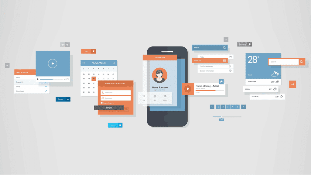
Consistency builds trust. It helps users feel in control, and it makes your product feel polished and professional. Here’s what you want to keep consistent across the app (and ideally, across your website too):
Colors
If your primary button is blue on one screen, it shouldn’t be orange on another (unless there’s a specific reason). Stick to a well-defined color palette.
Think of Instagram: same color gradients, icons, and fonts, no matter where you are in the app.
Fonts and text styles
Use the same font family, heading sizes, and spacing throughout the app. It makes everything easier to read and scan.
Navigation patterns
Don’t shift the menu bar from bottom to top depending on the screen. Keep key actions in the same place, allowing users to rely on muscle memory.
Ever noticed how Spotify keeps its bottom navigation bar the same whether you’re browsing music, looking at your library, or checking out a podcast? That’s no accident.
Icons and buttons
Use the same style of icons: rounded, outlined, filled, across the whole app. And if tapping a button does something on one screen, it should behave the same way everywhere else.
You want your mobile app to feel like one smooth, seamless experience, not like five different designs stitched together.
And if someone jumps between your mobile app and your web version (maybe they browse on their phone but buy from their laptop), the transition should feel natural. Same branding, same layout logic, same tone.
Consistency doesn’t just make your app look better, it makes it easier to use. And that means happier users who come back. 
Explore our UX&UI design services
Step 6: Label All Icons
Icons can be super helpful for your target audience. But only when people actually understand what they mean. The problem is, not everyone interprets icons the same way. What looks like a “save” icon to you might mean something totally different to someone else.
That’s why good UX design always includes clear labels next to icons, especially for key actions like “Buy,” “Share,” or “Delete.”
You don’t want users guessing. Confused users get frustrated, and frustrated users bounce.
A heart icon could mean “favorite,” “like,” or even “save for later,” depending on the app. A paper plane could mean “send” or “share”, but not everyone will know which.
You should add a simple label under each icon to remove the guesswork. It keeps your mobile app more accessible and way easier to navigate, especially for first-time users.
Bonus tip: Use icons + labels during onboarding and early user flows. Once your users get familiar with your app, you can simplify things later, but start with clarity.
Clear icons = smoother experience = better UX design.
Step 7: Provide Visual Feedback
When someone taps a button, adds a product to the cart, or submits a form, they need to know it worked. If nothing happens, they’ll wonder, “Did that go through?” or worse, tap again, thinking the mobile app is broken.
That’s where micro interactions come in.
A tiny animation, a quick checkmark, a button that changes color, these small visual cues instantly confirm the action was successful. They remove confusion and make the app feel responsive and alive.
Mobile UI design examples:
- Tap “Add to Cart”? Show a quick cart bounce or slide-in confirmation.
- Complete a purchase? Display a cheerful checkmark with a “Thank you” message.
It doesn’t have to be flashy. Even simple transitions or subtle vibrations can guide the user and create a smoother experience.
Good mobile apps never leave users guessing. Use visual feedback and micro interactions to create a more intuitive, satisfying flow, especially for tasks that matter.
We worked on this digital banking platform development, and one of the main goals was to create a design that makes it nice and easy to clearly confirm actions like payment submissions or profile updates. Earlier, users often got confused and tapped buttons multiple times.
Our UX/UI team added simple microinteractions and 2D animations, such as checkmarks, button color changes, and pop-up messages, to instantly indicate when actions were successful. This change increased user confidence and cut support requests by 25%.
This example shows how providing clear visual feedback can make your app feel more reliable and easy to use. 
Step 8: Streamline Mobile App Menus
If users can’t find what they need quickly, they’ll get frustrated and might give up altogether.
That’s why clean, logical menu structure is a key part of great UI design for mobile app experiences.
Organize your menu into clear, non-overlapping sections. Group related items together, use familiar labels, and avoid stuffing too many options into one place. The goal is to help users find what they need with as few taps as possible.
Also, keep in mind that users usually open the menu when they can’t find something elsewhere, like through the search bar or home screen shortcuts. So the menu should act as a backup that’s just as reliable, if not more.
Quick app user interface design tips:
- Keep your top-level items to 5–7 options max.
- Use short, clear names like “Orders,” “Settings,” or “Help”, avoid jargon.
- Make sure important features don’t get buried in submenus.
Step 9: Ensure Smooth Browser Integration
Imagine a user visits your website on their desktop and then switches to your mobile app or vice versa, and suddenly everything looks and works completely differently. That’s confusing and frustrating.
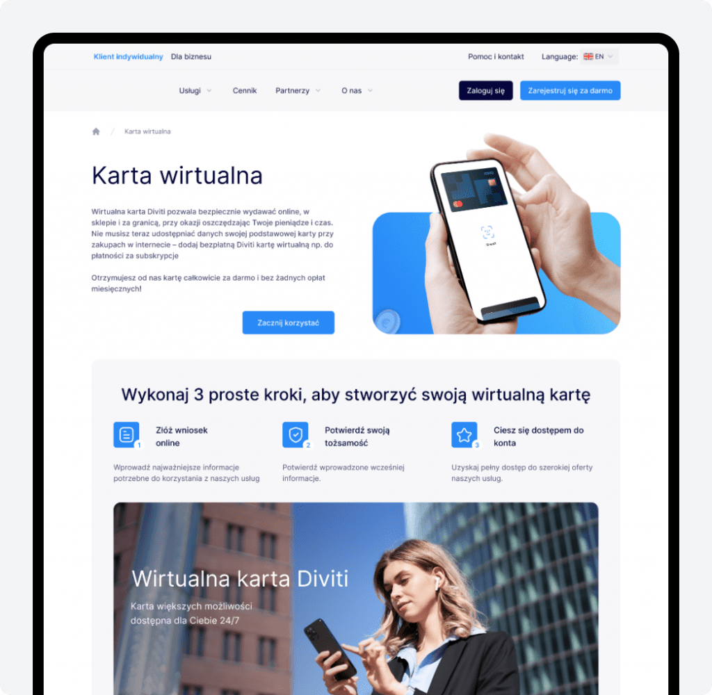
To avoid this, make sure your mobile app and website share a consistent design, layout, and behavior. This helps users feel comfortable and recognize your brand instantly, no matter where they interact with you.
Smooth integration also supports easy reach. Your target audience can switch between devices and platforms effortlessly, without having to relearn how things work or hunt for features.
Consistency here builds trust and keeps customers coming back, which ultimately helps your business grow.
Step 10: Show Input Mistakes Right Away
Imagine you’re filling out a form in an app, like entering your email or phone number. If you fill something in wrong but only find out after clicking “Submit,” it’s frustrating. You have to go back and fix it, which wastes time and causes annoyance.
Instead, your mobile app should check the information as you type and immediately let you know if something’s wrong. For example, if you type an invalid email, a small message should pop up right away saying, “Oops, that doesn’t look like a valid email.”
If you enter the right info, the mobile app should also show a quick confirmation, like a green checkmark, so you know you’re on the right track.
This way, users don’t have to wait until the end to fix mistakes. It makes filling out forms faster, easier, and less frustrating.
Step 11: Simplify Forms
Filling out forms should feel easy and natural. Let users enter information in a way that’s comfortable for them, whether that means typing, selecting options, or using shortcuts.
Make sure form fields don’t overlap with other parts of the screen, so users can see what they’re doing clearly. When users type, the form should automatically scroll so the current field stays visible.
Features like autocomplete (where the app suggests answers), automatic capitalization, and even reading credit card info with the camera can speed things up and reduce errors.
Remember, users decide within seconds if they like your app. Good form design is about creating a smooth, stress-free experience that keeps people using your mobile app.
Today, users need just a few seconds to understand whether they like the application or not, so you need to take care not only of the beautiful “wrapper”, but also of the mobile user experience.
Competent application of design principles will allow you to meet this deadline and present the mobile application in the most favorable light.
Simple Form Features
| Feature | What it does | Why it helps users | Text example |
|---|---|---|---|
| Autocomplete | Suggests or fills in data automatically based on past entries | Saves time and reduces typing errors | When typing “New Yo…” the app suggests “New York” |
| Auto-capitalization | Automatically capitalizes first letters where needed (like names) | Makes data look neat without extra effort | User types “john smith,” it changes to “John Smith” |
| Auto-scrolling | Moves the form up as the user types to keep the field visible | Prevents the keyboard from hiding what they’re typing | When entering a phone number at the bottom, the form scrolls up so the field stays visible above the keyboard |
| Credit card scanner | Let users scan their card instead of typing numbers manually | Speeds up checkout and reduces mistakes | User points camera at card, number, and expiry auto-filled |
| Clear field labels | Labels that stay visible even when typing | Helps users remember what info to enter | Label “Email Address” stays at the top of the field as the user types their email |
Step 12: Design For Accessibility
Accessibility means making your mobile app usable for everyone, including people with disabilities like vision or hearing impairments, motor difficulties, or cognitive challenges. It’s not just a “nice-to-have” feature. It’s essential for reaching a wider audience and creating an inclusive experience.
Here’s what you can do to improve accessibility in your app’s UI design:
- Use fonts that are easy to read and big enough to see comfortably. Avoid tiny text or fancy fonts that are hard to decipher.
- Maintain strong color contrast between text and backgrounds so users with low vision can read easily. Tools like WebAIM Contrast Checker can help you test this.
- Support screen readers by adding descriptive labels to buttons, icons, and images. This helps users who rely on audio cues to navigate your app.
- Make tap targets (buttons, links) large enough and spaced out so users with limited dexterity can easily interact without mistakes.
- Avoid relying solely on color to convey meaning (e.g., don’t use red text alone to indicate errors—add icons or text too).
- Provide captions or transcripts for videos and audio content for users with hearing impairments.
Accessibility design improves overall usability and often makes your mobile app more enjoyable for everyone, not just those with disabilities.
Step 13: Test on Real Devices Early and Often
When you build a mobile app, it’s tempting to test only on emulators or simulators on your computer. But those don’t always show the full picture. Real mobile devices have different screen sizes, hardware capabilities, performance levels, and even unique quirks.
Here’s why testing on actual phones and tablets matters:
- Your mobile app might look perfect on a simulator, but have layout issues or cut-off text on certain screen sizes.
- Performance can vary widely, animations might lag on older devices, or load times might be slower.
- Touch gestures and device sensors (like cameras or GPS) work differently in the real world.
- You can spot usability problems that only happen when people hold and interact with the device naturally.
Start testing early in your mobile app design process and keep doing it regularly. Try different device brands, screen sizes, and OS versions to catch as many issues as possible.
Ready To Design A Great Mobile App UI?
Follow these simple but powerful tips to create clean, user-friendly mobile interfaces, and you’ll be well on your way to a successful mobile app.
Most importantly, keep testing with real users. Superior UI directly translates into more downloads, purchases, and brand loyalty with happy, engaged customers.
Testing is crucial to app success. Learn how to test a mobile app the right way.
Ready to take your mobile user interface design to the next level?
Get in touch for a free consultation on your mobile app. Our UX designers will collaborate with you to build beautiful, functional experiences that users love.
Our journey to becoming a Clutch Leader in Ukraine shows how we put client success at the heart of everything we do.
Before starting your project, explore the detailed breakdown of app development costs to avoid surprises down the line.


