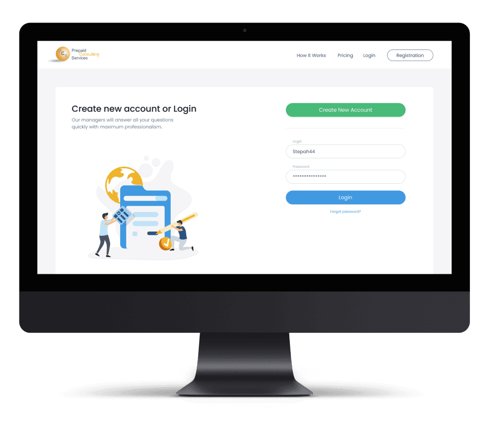
Find out how the cutting-edge innovation in gift-giving that utilizes complex, architect-level solutions works behind the scenes.
- Ukraine
- 8 people
- 8 months
- Mobile and web applications
Custom UX design solutions that deliver intuitive user flows with seamless cross-platform performance
Get a free estimate


 User Journey Mapping
  Rapid Prototyping
  Rigorous Usability Testing
  Ongoing Optimization
 We work hand-in-hand with you to map out your users’ journeys, from their first interaction to their end goal. Our team uncovers pain points and highlights moments of delight that shape their experience. These insights form the foundation of user experience design services that truly resonate with your users and meet your business goals.
Our UX professionals create quick, low-fidelity prototypes to bring your ideas to life and test them with real users. This allows us to gather feedback early, refine designs, and validate concepts without committing to full-scale development. Through this process, we ensure your platform aligns with user needs while staying efficient and cost-effective.
We dive deep into usability testing, working with your target audience to observe how they interact with your product across devices. Combining UX research with behavior analysis, we identify areas for improvement and ensure the design meets your goals. The result is a product that’s intuitive, accessible, and ready to delight your users.
Once the solution is launched, we monitor how your target audience engages with your platform, using data and feedback to refine features and improve usability over time. Our team is committed to ongoing UX research, making sure your product stays relevant, competitive, and valuable to your users.
1
2
3
4
5
6
Transform your website or app with UX designs that engage and delight users every step of the way

Users access products from all types of devices, so we create designs that adjust smoothly to different screen sizes. Whether on a mobile, tablet, or desktop, the experience remains consistent for a seamless and enjoyable interaction.

Consistency makes interactions feel natural. Keeping design elements like buttons, fonts, and layout uniform across the product helps users navigate without confusion and creates a seamless experience from start to finish.

The best designs are often the simplest, they allow users to accomplish their tasks with ease. We aim to eliminate unnecessary complexity and focus on what’s essential for a clean, user-friendly interface.

Focus on accessibility ensures people with varying abilities, such as those using screen readers or with visual impairments, can easily interact with the product and have an enjoyable experience.

We gather feedback and analyze user interactions to refine and enhance the experience, making improvements over time to better meet user needs and keep the design fresh.

We always put the user first, focusing on their needs, goals, and challenges to create meaningful, intuitive experiences.

Find out how the cutting-edge innovation in gift-giving that utilizes complex, architect-level solutions works behind the scenes.

Discover how a startup in HR shapes employee management in enterprise-level companies using complex tech solutions.

In this case study, we show how we helped a non-technical founder create the most user-friendly telemedicine app.

Discover how SpdLoad built a custom platform for Bristol Groundschool, a distance learning leader.

Find out how we created Paystubs, an online platform designed to enhance the convenience and organization of payrolls.
Focus on Users
We dive deep into their world, using a mix of research methods to gather insights that guide every design decision.
User Interviews
We start by connecting with your target audience through user interviews, where we listen to their experiences, frustrations, and goals. These one-on-one conversations give us a real sense of their needs and help us pinpoint pain points and opportunities for improvement.
UX Surveys
We also use surveys to reach a broader audience, gathering feedback from a larger group of users. This helps us validate what we've learned and spot emerging patterns that may not be clear at first glance. The answers we get help us refine the design in a way that truly resonates with your users.
Usability Testing
Next, we conduct usability testing, watching how real users interact with prototypes or existing designs. This hands-on feedback reveals where users struggle or feel confused, giving us the data we need to make the interface more intuitive and user-friendly.


Step 1
Schedule a Consultation
Reach out to us to discuss your project. During this initial conversation, we’ll get to know your goals, audience, and vision for the product to ensure we’re aligned from the start.
Step 2
Define the Project Scope
We’ll work together to outline the project’s objectives, timeline, and budget. This helps us clearly understand your needs and ensures we stay on track throughout the design process.
Step 3
Conduct Research & Strategy
Our team will dive into user research, analyzing your audience and industry to create a tailored strategy. We’ll gather insights through methods like user interviews, surveys, and competitor analysis.
Step 4
Collaborative Design & Development
Once the strategy is in place, we’ll start the design process. You’ll be involved every step of the way, from wireframes to prototypes, to ensure the final design aligns with your vision and goals.


“We engaged SpdLoad to develop and deploy a central business solution. It was the right decision. It was a pleasure to work with the team on all levels!”

“SpdLoad has provided us with an excellent set of engineers who could work on complex problems and provide scalable solutions that will last us for years.”

“Firstly, they’re very proactive in working on custom software development. Secondly, they are transparent about the processes and costs. Thirdly, their designers are amazing.”

“From the first meeting, we realized that we would cooperate. I’ve worked with a custom software development agency for ten years, and the SpdLoad team is one of the greatest.”
“We brought them on to implement two startups. Their skills and professionalism are outstanding. I appreciate that they are engaged and communicative, but most of all, there is no distance between us, even though I am in Chicago and the team is in Ukraine.”

“The people at SpdLoad are highly effective and easy to collaborate with. I am satisfied with their work. They helped us to develop our MVP in six months in a complex and stressful situation.”
“SpdLoad developed the CRM dashboard of the B2B2C marketplace using ReactJS. The team has significantly expanded its functionality, so we also decided to collaborate on other projects.”

“After having a great experience, I plan to use SpdLoad for all future projects, subject to their availability.”

“Throughout the entire process, they were great partners. Working with them was enjoyable, and we were impressed by their professionalism and output during a time of great uncertainty in their home country.”
Drop us a line and we'll get back to you immediately to schedule a call and discuss your needs personally
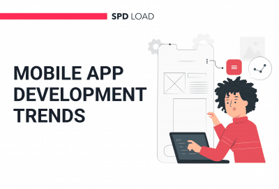
The mobile app industry has come a long way in the last decade. The apps that used to be accessible...
read more
Crafting a strong brand requires more than just a stylish brand logo or website. This article...
read more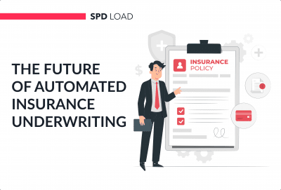
Underwriting is one of the most intricate processes in the insurance industry. It requires...
read more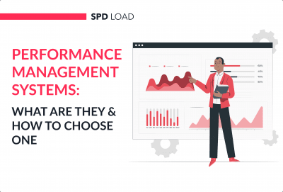
Organizations and teams have finally started to realize the benefits of investing in their people...
read more
Startups and small businesses operate in a crowded marketplace. The Startup Genome 2024 report...
read more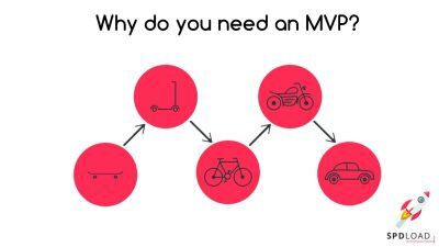
Whether you’re a first-time founder or a seasoned entrepreneur, an MVP is the key to a...
read more


