Website Development Cost in 2025 (Full Cost Breakdown)
- Updated: Mar 18, 2026
- 28 min

CEO
Website development is a complex process, and the final cost will depend on numerous factors.
Among them are the type of website you are building, its structure, design, and size.
Additionally, web development costs often vary depending on the development team’s charges.
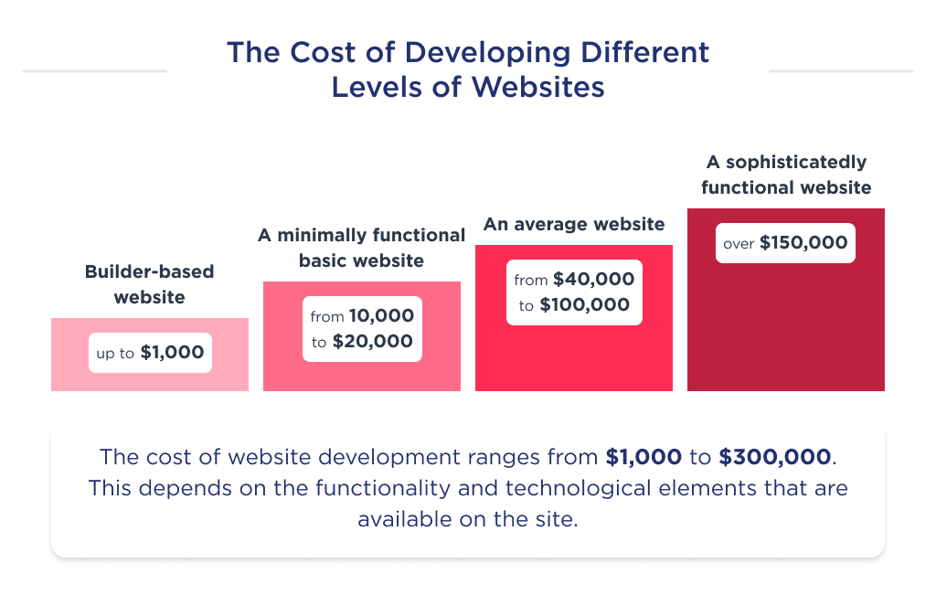
In general, the cost to develop a website can be as much as $30,000 or more than $200,000.
Here’s a breakdown of typical price levels:
- Template-based websites cost up to $1,000
- Basic websites cost $10,000-$20,000 as there is a minimum number of features and simple design
- The average complexity website that offers more advanced functions can cost you approximately $40,000-$100,000
- For a complex, enterprise-level website with multiple high-end functionalities, you may pay over $150,000
Here, we are going to dive deep into website development cost factors and what specialists you need to build a great website.
With cybersecurity risks on the rise, bot attack prevention has become essential for online security.
That is why we also share some tips on picking the best website development company to build a modern, user-friendly, and secure web page.
Prefer visuals? Check out our comprehensive infographic first.
Wondering how long it will take to launch? Check out the average time to create a website for a realistic timeline.
Now, let’s dive in.
Elevate your brand with our custom website development and design services — let's build your dream site together!
How Much Does a Website Cost in 2025?
As mentioned above, website development ranges from $30,000 to over $200,000.
For a precise cost estimate, you’ll need to consider several factors. These include:
- The type of website
- Team type
- Location of the development team.
Let’s break down each point in detail. 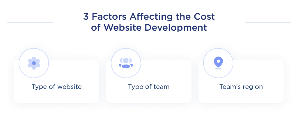
Website Development Price Based on Website Type
Depending on the type of website, web development costs vary.
This is primarily due to differences in complexity, features, and, ultimately, the timeframe required for web development.
Below is a table depicting the cost of developing a website per type:
| Type of Website | Cost to develop, $ | Time, hours |
| Landing page | 5000 | 80 |
| Portfolio website | 6000 | 100 |
| Blog website | 7000 | 120 |
| News website | 7000 | 120 |
| Corporate website | 10,000 | 160 |
| Directory website | 17,000 | 300 |
| eCommerce website | 60,000 | 1000 |
| Web portal | 70,000 | 1200 |
| Educational website | 60,000 | 1000 |
| SaaS website | 75,000 | 1200 |
| Entertainment website | 60,000 | 1000 |
| Marketplace website | 73,000 | 1300 |
| Social media website | 120,000 | 2000 |
It’s important to also know about things like the type of team. 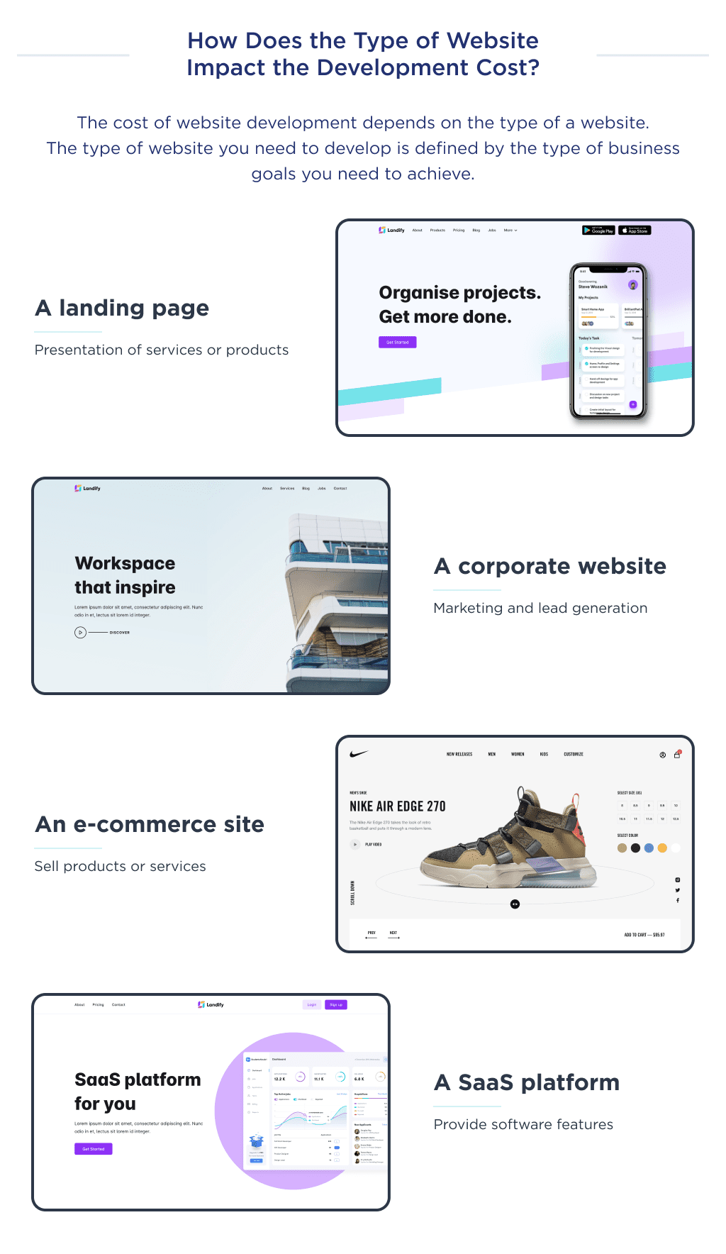
Website Costs Based on Team Size
Another factor determining the cost of website development is the type of team involved.
And if you’ve searched the internet, you’ll notice several choices for hiring developers.
To provide a detailed comparison, we’ll assume you’re creating a website requiring 1000 hours of development time.
| Team Type | Development |
| In-house | $90,000 |
| Local agency | $120,000 |
| Outsource agency | $40,000 |
| Freelancers | $30,000 |
However, if you want a scalable, resilient, and secure online platform, it’s best to emphasize quality over price.
Another factor to think about is the web development fee, which depends on the region. Let’s break down what this entails.
Transform your ideas into reality with our top-tier web developers.
Option 1. Build an In-House Team
Website development costs depend on the size of the team and each new employee you involve. Hiring an in-house team can be costly because you employ a group of people.
The average cost of hiring an in-house team can be around $500,000 annually to maintain your team’s salary, taxes, accounting costs, the office, and maintenance. You can use our startup salary calculator to find out more.
| Pros | Cons |
|
|
Option 2. Hire a Local Website Development Agency
Local agencies either charge on an hourly basis or contractually.
With an agency, you are going to spend:
- $15,000 to $150,000 on design and development
- Up to $60,000 per year on maintenance
- Up to $15,000 on marketing.
Added to these costs, there are various additional expenses you should be prepared for.
| Pros | Cons |
|
|
Option 3. Hire a Freelancer or a Freelance Team
A freelance website developer can charge up to $10,000. The services of a website designer will cost you from $500 to $5000.
Covering these major costs, you can create a complex website for around $30,000.
| Pros | Cons |
|
|
Option 4. Hire an Outsourcing Agency
Since outsourcing agencies have the relevant expertise and experience, they usually charge a little more than freelancers.
However, their rates are much lower than those of the local US agencies.
So, if you pay $100 per hour for a designer in the US, you will pay only $35 for the offshore specialist.
Therefore, the cost of creating the website, which requires approximately 500 hours, will be $17,500.
| Pros | Cons |
|
|
For trusted IT partners, explore the best IT outsourcing companies listed here.
Apart from understanding website development price by team type, we also need to estimate the cost according to its region. Let’s dive in.
Website Costs Based on Team Location
Web development rates differ from country to country. The reason for this difference is the cost of living in varying regions.
For example, the cost of living in the United States is 3X more expensive than in Ukraine.
Consequently, developing a website in Ukraine is way cheaper than doing so in the US.
Below is a table detailing how cost varies from one country to the other.
| The region | The cost per hour |
| Australia | $80 – $120 |
| The USA | $100 – $150 |
| The UK | $90 – $120 |
| Western Europe | $70 – $100 |
| Ukraine | $40 – $80 |
| India | $10 – $40 |
As you can see, the cost of creating a website in the US is extremely high.
On the other hand, Ukraine offers cheaper development, but still higher than in India.
Websites created by agencies in India are often poorly made.
Use our outsourcing cost calculator to predict how much you might be overpaying for in-house vs outsourcing agencies. 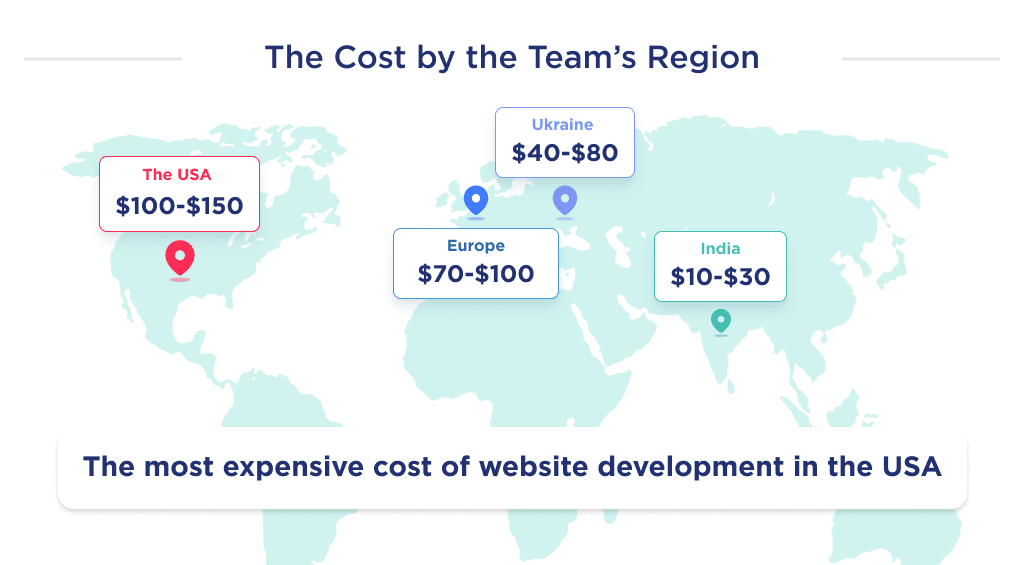
Let’s explore some examples of costs involved in some successful web development projects.
Real-World Website Cost Examples
To help you compare the cost of creating a website, we’ll discuss some popular examples and their development price.
Amazon Clone Site Cost
Amazon holds the title of being the world’s largest player in the e-commerce platform markets.
The company was founded by Jeff Bezos in 1994 as an online bookstore and later diversified by selling literally everything.
It currently has over 310 million customer accounts and sold over $500 billion in products in 2023.
The platform includes such features as:
- Shipping and delivery tracker,
- In-app payment,
- Profile management,
- Goods sorting,
- Reviews and ratings,
- Product description, and more.
The website development cost for a site like Amazon ranges from $50,000 to $150,000.
If you’re willing to start an eCommerce business, you should take a cue from Amazon.
Explore eCommerce startup ideas to find your niche in the online marketplace.
Another popular type to consider is Facebook. Let’s discuss it next. 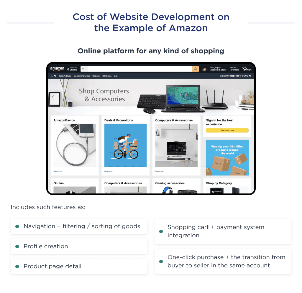
Facebook Clone Cost
Facebook is a social media platform where people can connect, share content, and communicate with others online.
The company, founded in 2004, currently has over $800 billion market capitalization and made over $80 billion as revenue in 2025.
A platform like Facebook usually includes such features as:
- Dashboard
- Site settings
- Themes
- Plugins
- Languages
- Managing users
- Managing groups
- Managing pages
- Managing reports
- Scheduled Posts
- Site statistics
- Advertisement
The average cost for developing a social media website like Facebook ranges from $50,000 to $80,000.
Those features mentioned above are the primary ones your social media site needs to function.
What’s next? Let’s discuss the cost of developing a website like Airbnb. 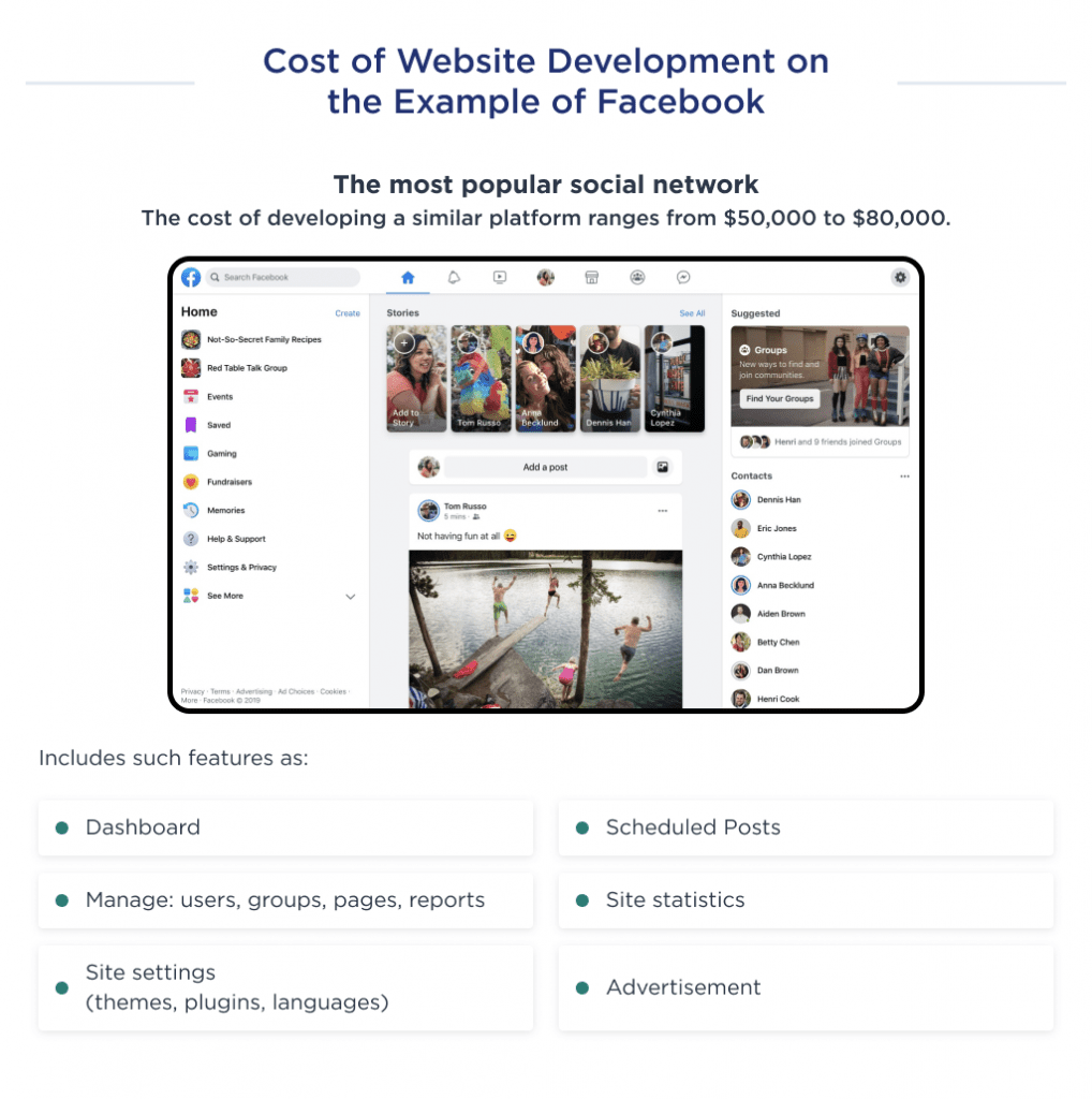
Airbnb Clone Website Price
Airbnb is a platform where individuals can rent accommodations from hosts around the world for short-term stays.
The company was founded in 2008 in San Francisco, and in 2022 its revenue reached $15 billion revenue.
A platform like Airbnb includes the following features:
- Google Maps API
- Third-party integrations
- Built-in payment system
- Search and filtering options
- PostgreSQL database management system
- Switching user profiles
- Property listing
The average cost for developing a platform like Airbnb ranges from $100,000 to $150,000.
Another example we’ll consider is Fiverr. 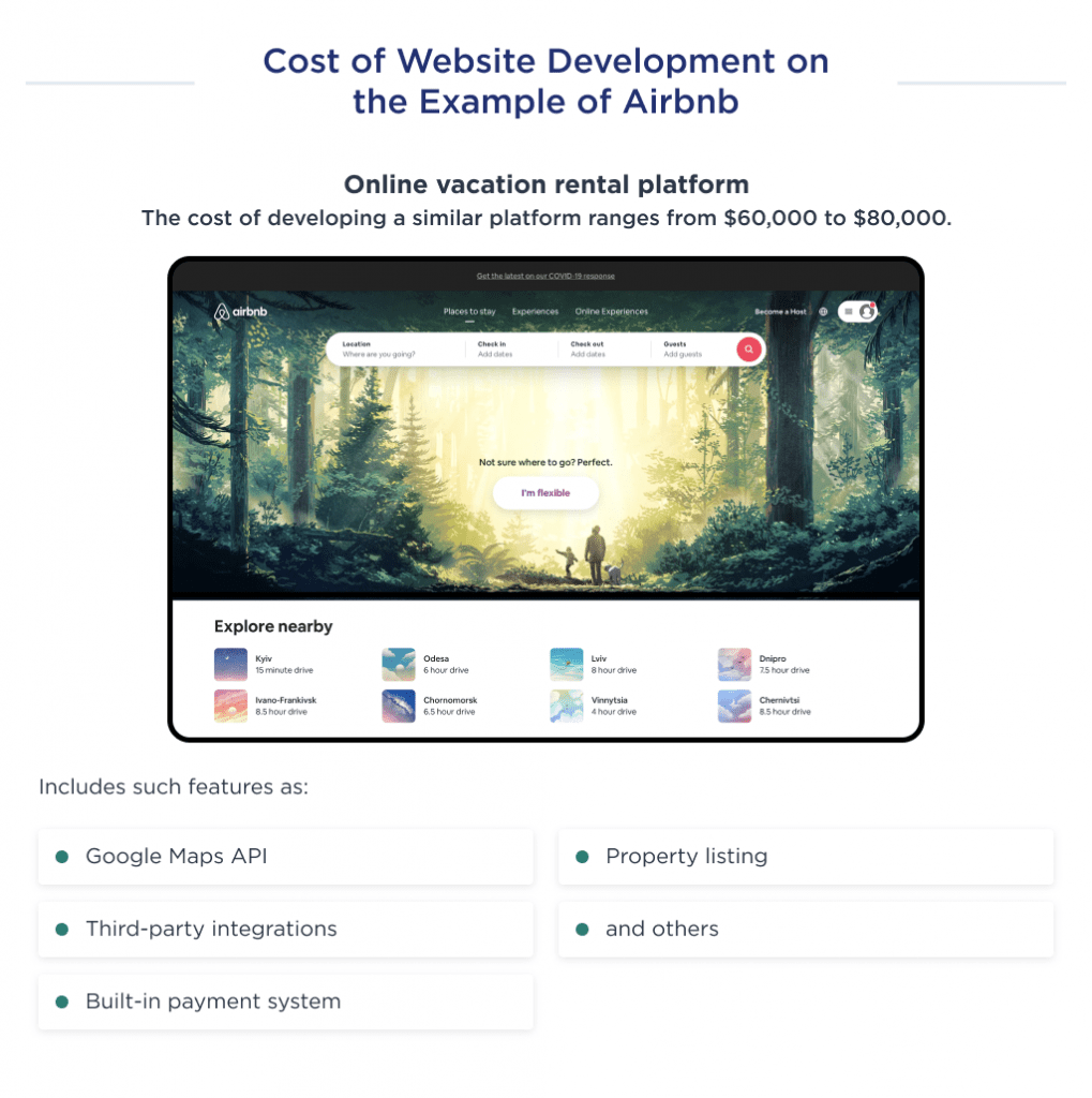
Fiverr Clone Site Build Cost
Fiver is an online freelance platform where clients can hire services for as low as $5.
The company was founded in 2010 and currently has over 2.5 million freelancers on the platform.
A platform like Fiverr includes features such as:
- Sign-up/sign-in
- Switching user profiles
- Time tracking
- Order tracking
- Payment gateways
- Reviews listing
- Search and filtering
- Dashboard
- Social media integrations
The average cost for developing an on-demand platform like Fiverr ranges from $50,000 to $70,000.
The next noteworthy example is Zillow. Let’s discuss this. 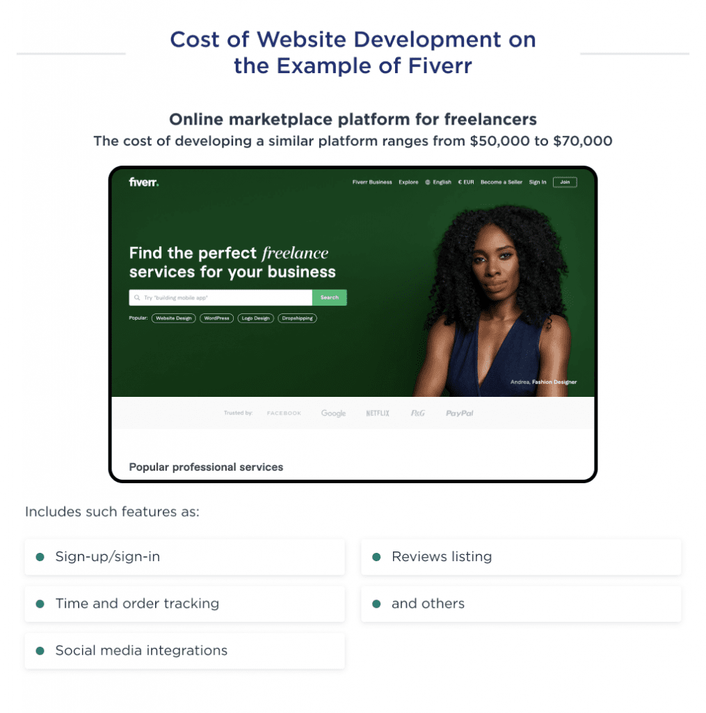
The Cost to Build Zillow Clone Site
Zillow is an online real estate marketplace that allows users to buy, sell, rent, and find information about properties.
Founded in 2006, the company currently has a market capitalization of about $12 billion and revenue of over $10 billion.
A platform like Zillow has the following functionalities:
- Authorization process
- Filtering options
- Map integration
- Load speed optimization
- Search & Filtering Algorithms
- Listing profiles
- Registration and Authorization
- Push notifications
The web development cost for a website like Zillow ranges between $60,000 to $80,000.
Another website development cost example we’ll consider is Udemy. Let’s discuss this. 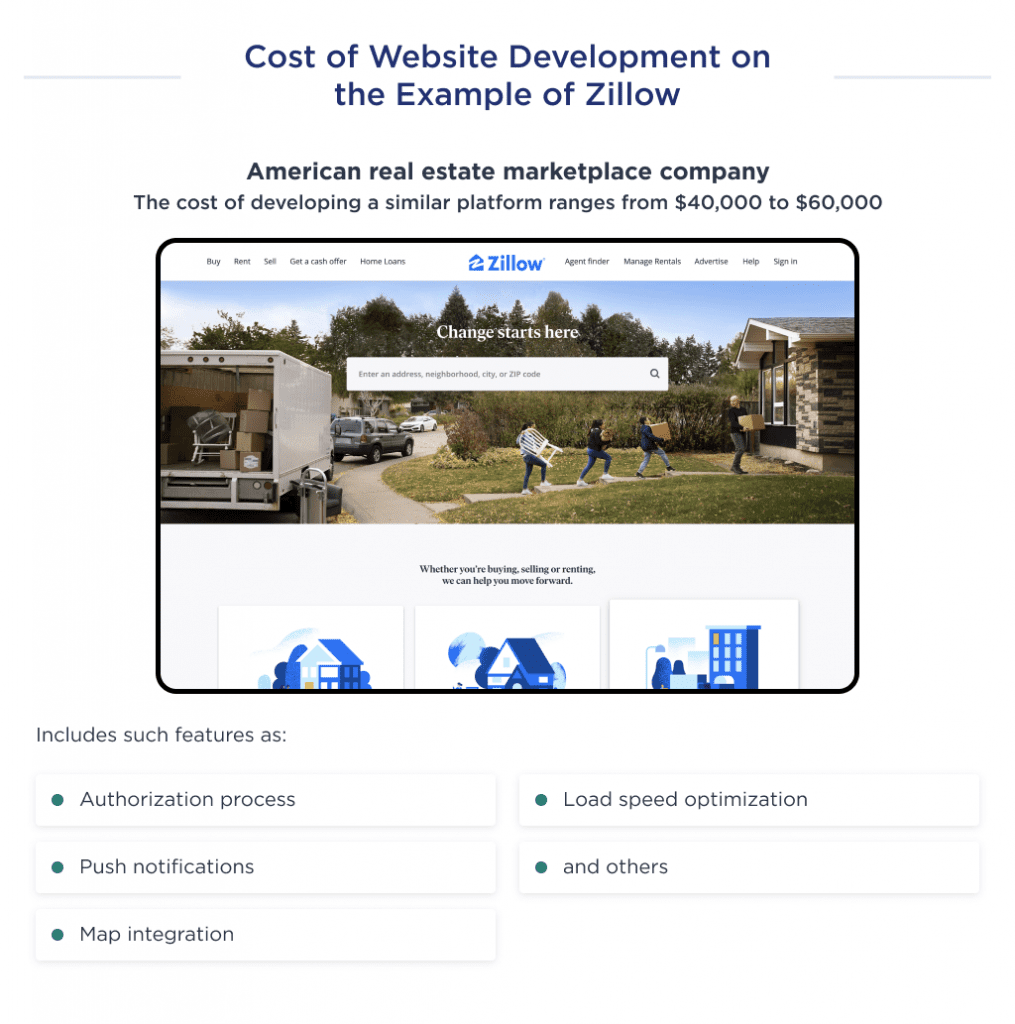
Cost of Building Udemy-Like Website
Udemy is an online educational platform with over 57 million students and over 200,000 courses.
The company currently has a market capitalization of over $2.0 billion and a revenue of $518 million.
A platform like Udemy has the following functionalities:
- Cross-platform support
- Lecture control
- Payment gateways
- Auto-generated captures
- Note-taking
- Filtering
- Switching users’ profiles
- Dashboard
The average cost for developing an e-learning platform like Udemy ranges from $60,000 to $100,000. 
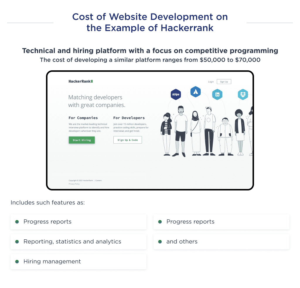
HackerRank Clone Website Development Price
HackerRank is a platform that lets HR teams and tech executives interview developers through live coding assessments.
The company currently has over 7 million developers, 25% of the world’s programmers.
Platforms like Hackerrank include features like:
- Third-party integrations
- Assessment management
- Customizable tests
- Progress reports
- Activity dashboards
- Reporting and statistics
- Analytics
- Recruitment management
The website development cost for a platform like Hackerrank ranges between $80,000 to $100,000.
You should keep in mind that these are examples of big platforms, and their development usually demands patience as well as time and money investments.
That’s why if you’re a startup founder, you’d consider the cost of MVP development first.
Get a strategic MVP to mitigate risks
Here’s a detailed breakdown of the costs involved in creating a business website.
We’ll first discuss the parts of web development that affect cost.
Website Development Cost Factors
Web development is split into two distinct parts: the backend and the front end. Each has its differences, and both must be considered to understand website development costs.
Let’s discuss both parts:
| Name | Explanation | Tech stack required |
| Frontend | Involves the creation of the visible part of the platform that users directly interact with. |
|
| Backend | Backend development refers to creating server-side features that bridge user controls and database response. |
|
| Full-stack | This process involves creating all backend and front-end features required for a website to be fully functional. | Tech stacks for both front-end and back-end development. |
Now that you’ve understood web development parts, let’s discuss the factors affecting the given cost.
Factors Impacting Small Business Website Costs
Several essential factors influence the final web development cost. These are:
- The complexity of website structure and UX/UI design.
- The complexity of website development.
- Tech stack and professional level of developers.
- A number of 3rd party integrations.
- Location of development partner.
- And hidden factors: marketing and maintenance.
Every startup needs a marketing strategy. Check out how to set marketing objectives correctly to reach your audience.
Let’s begin by uncovering the type of website and how it impacts development costs.
Website Type and Complexity
When estimating website development costs, the type of website usually plays a key role.
Some things that impact a website’s complexity include:
- Number of screens
- Number of roles
- Number of features
- The complexity of business logic
- Number of third-party integrations
Due to these individual website differences, the web development complexity levels also differ.
A website can cost over 300% more to make because of complexity-driven differences in development processes.
Type 1. Landing Page
A landing page is a one-page site where a business promotes its product or service. Such a site is ideal for micro or small companies.
The cost of the landing page varies from $0 made with the constructor to $3,000 for the implementation of complex animations.
Startup landing pages are used for a presentation of particular services as a part of a large website, or as idea validation tool.
There are a few examples of custom landing pages with great animation: Surprise and Agora. 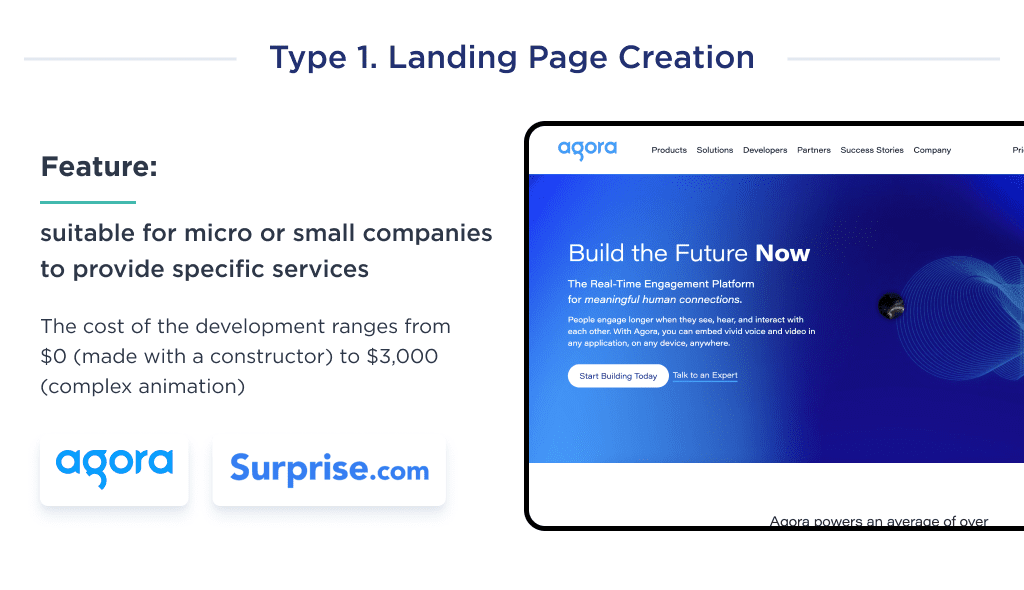
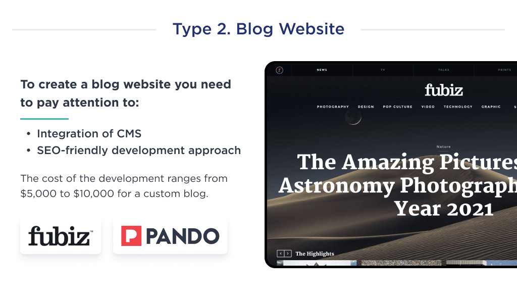
Type 2. Blog Website
A blog website is an online platform where people or organizations share regular updates, opinions, or information on specific topics.
The cost of blog website development ranges from $5,000 to $10,000 for a customized journal.
Blog websites have a lot of content. Due to this, they require integration with a content management system.
One good thing about these websites is that they are not complex. Bloggers can do this with a minimalist design and save costs.
However, it should not compromise the website’s content and quality. They should take special care on the SEO side of site design and development.
You can find good examples of blogs on websites like Microsoft Stories, Pando, and Fubiz.
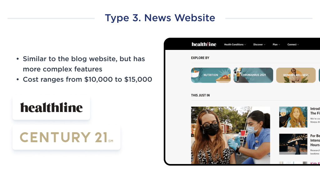
Type 3. News Website
These are mostly simple websites made primarily to share products, news, and advice with potential users.
How much does it cost to make a simple website, you may ask?
The answer varies based on the founders’ structure and business model.
However, costs may gradually increase with site size and additional pages due to recent NEWS that is updated frequently.
Furthermore, as a business grows from the seed stage to the mid-level, the site is bound to increase in size and volume.
The cost depends on the simplistic structure and ranges from $10,000 to $15,000.
Good examples of simple websites are FindLaw, Starbucks, Healthline, and Century21.
Type 4. Corporate Website
A corporate website usually has more than 50 web pages because it has to cover a lot of information.
The cost of the development ranges from $15,000 to $20,000. Read our in-depth breakdown of SMB website development.
The common structure of such a website includes a homepage, sets of product or service pages, a blog, about us, and contact us. In blogs, services, and products, there could be an unlimited number of pages.
The database, hosting provider, and other maintenance systems need to be even more sophisticated in corporate websites.
Good examples of corporate websites are Pixar, Apple, and BMW. 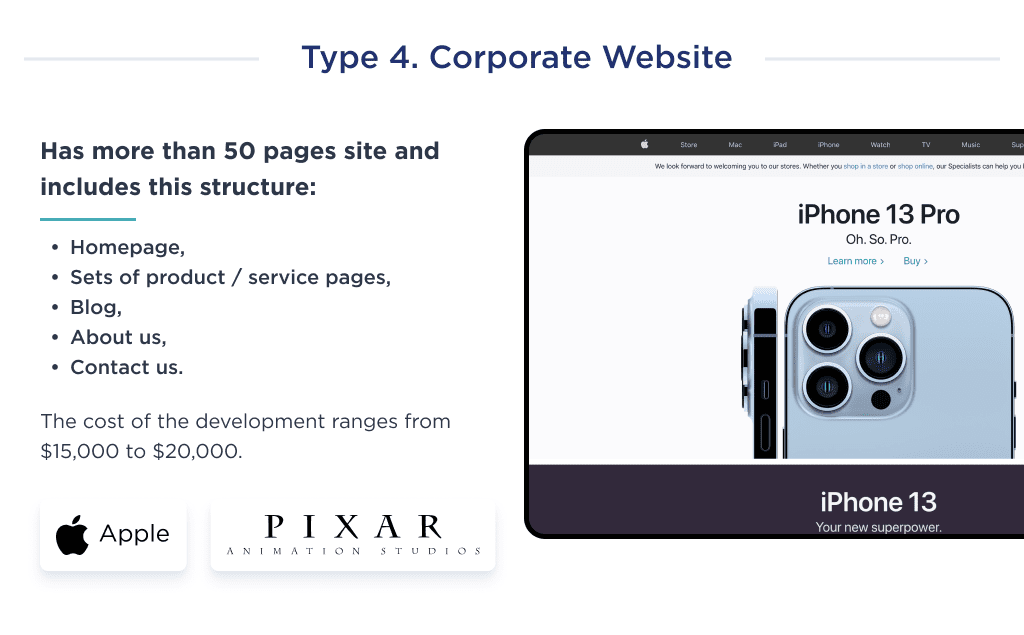
Type 5. eCommerce Website
An e-commerce website is an online platform where businesses sell products or services to customers over the Internet.
The cost of the development ranges from $30,000 to $65,000.
The main components of the eCommerce website are:
- Payment system integration
- Security certificates
- Choosing between pre-built templates or custom-creating
- Target audience-specific ad campaigns
- Mobile compatibility
Here, too, the structure and volume depend on business size and product inventory.
Good examples of eCommerce websites are Farfetch and Shopify. 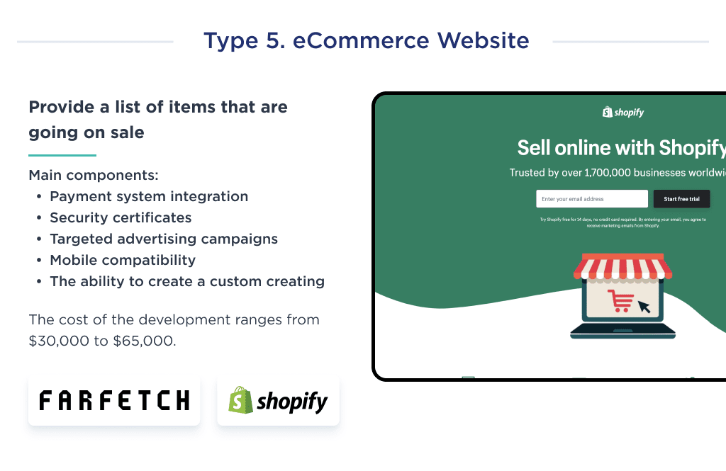
Type 6. SaaS Website
SaaS platforms have specific goals and objectives that are conducive to their marketing goals.
The cost of the development ranges from $40,000 to $100,000.
These websites require powerful design and robust cloud systems.
The main components of the SaaS website are:
- One-step sign-in
- Subscription or membership-based model
- Data and application security
- Multi-tenancy model
- Elastic infrastructure
Cloud software products are complex and require a better infrastructure too, which is why SaaS development costs are higher.
Good examples of SaaS websites are Trello, Slack, Figma, and Dropbox. 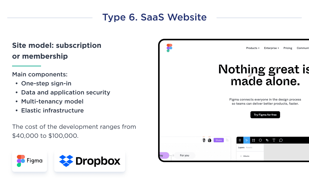
Type 7. Marketplace Website
The major difference between a marketplace and an eCommerce website is product listing and the sellers.
In a marketplace, multiple sellers have an inventory of their goods.
An eCommerce website has products from a single seller segregated into different categories.
The cost of the development ranges from $70,000 to $200,000
The main components of the marketplace website are:
- Quick seller onboarding
- Efficient product management
- Fast order processing and payment confirmation
- Promotional listings and campaigns
- Communication tools and services
- Robust product search
- Seller-oriented checkout system
Good examples of marketplace websites include eBay, Facebook Marketplace, and Amazon. 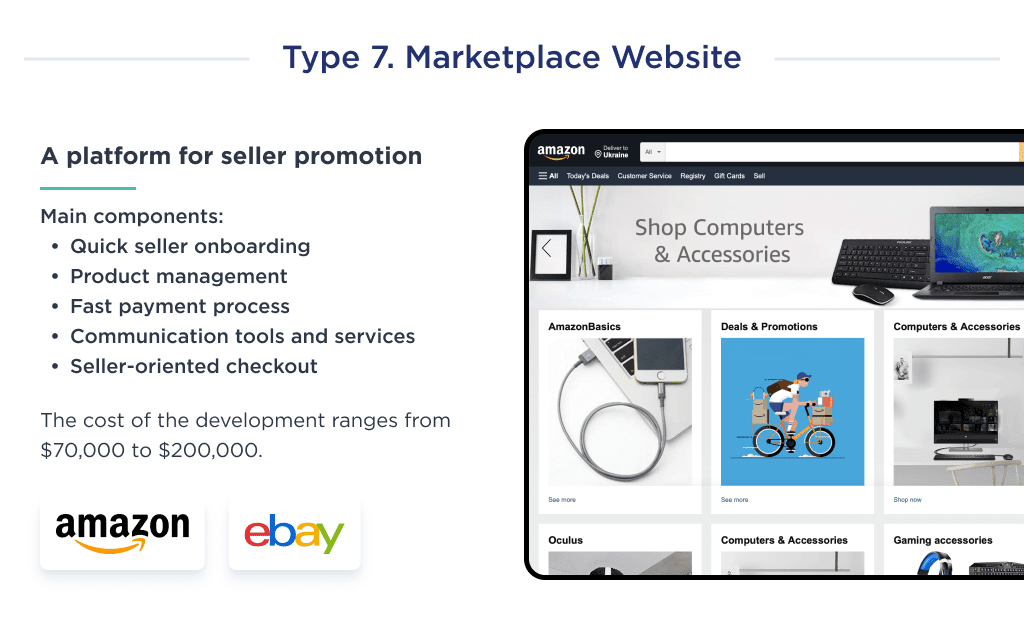
However, these examples of website development cost by type do not represent the cost of custom web application development.
The reason is that the final price is unpredictable before the detailed estimation of the scope of work.
The complexity of a website is the next factor of cost-making we’d like to cover. Let’s continue.
Comparing Simple vs Complex Websites
The complexity of the website determines the price of the development.
It can be a basic website with simple functionality or a complex multi-integrational website with many features.
If you are not sure which type to choose, you can find the description of each one below.
Basic complexity
The basic complexity usually works for corporate sites with simple functionality and costs from $5,000 – $30,000.
It’s a website of up to 15 pages, with custom UX/UI design, CMS integration, a simple database on the backend, and custom animations on the front end.
This type of complexity usually requires a minimum number of specialists: a project manager, WordPress or full-stack developer(s), UX/UI designer, and QA engineer.
Examples of basic complexity websites are landing pages, blogs, and portfolios.
The time to develop is about two months. 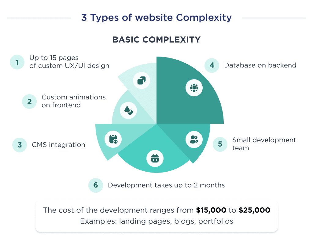
Average complexity
Such websites generally engage between 500k – 1.5m visitors monthly, are quite complex, and produce regularly changing content.
The cost of the development ranges from $30,000 to $80,000.
The average complexity of the website includes up to 50 pages of custom UX/UI design, a complex database, 3rd party integrations, a custom front-end with advanced animations, and search engine optimization.
To build a website of this type of complexity, you will need a project manager, business analyst, UX/UI designer, seniors on backend and front-end development, 2 QA testers, DevOps, also support specialists, and a marketing team: SEO manager, copywriters, link builders.
Examples of websites with average complexity are large corporate websites and cloud software products.
Development time is about 4-6 months.
Sites in this category are NEWS and corporate websites, such as Spdload. 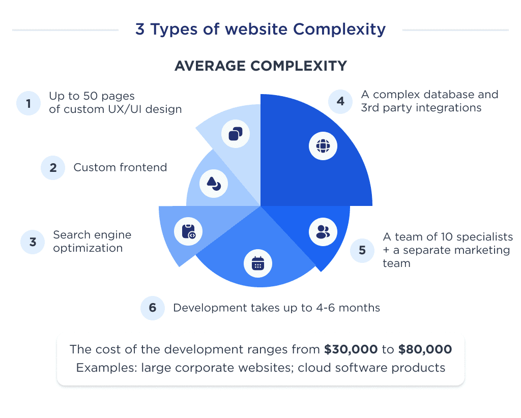
Difficult complexity
Complex websites require robust design, cloud systems, multifunctional integrations, and higher infrastructure. The average cost of the development is from $80,000 to $300,000.
The complex website includes top-notch UX/UI design, work with multiple and huge databases, complex front-end interactions, and a huge maintenance team.
Long story short, complex websites require the best professionals to deliver optimum value.
Websites like Canva, Reddit, or LinkedIn are good representations of such development complexity.
More features mean more hours put into its development, hence the higher cost.
The time to deliver such a project is about 6-12 months. 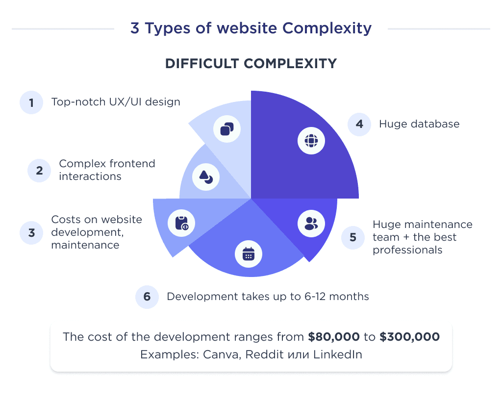
Not only will the website development costs increase, but maintenance and upkeep charges will also rise.
Due to these complex features and roles, other aspects also change.
For instance:
- The complexity of network protocols.
- System and network management plus initiation.
- Navigation and web page layout.
- Privacy considerations.
So, how much does it cost to make a business website? It mainly depends on the types of development.
Custom vs Template Site Cost Differences
Your website creation procedure and the tech stack also influence the cost.
There are three types of platforms that you can utilize to create a website:
- Website constructors – for basic websites
- A template-based CMS – for basic and average websites
- Custom development – for all types of development, especially complex websites
So How Much Does It Cost to Build a Website for Small Business?
Constructor-Based Website Development
These constructors allow you to DIY a website using free tutorials.
With the use of a drag-and-drop editor, you can add, edit, remove, and manage the landing elements, items, layouts, plus other things.
All you have to do is pick up the elements you want on your website and then add the relevant content.
Based on the constructor’s functionality and approach, building a website costs between $1000 to $5000 annually.
The main cost is getting the subscription and accessing the premium plugins and features.
The features and other aspects associated with constructors are:
- Ease of use
- SEO
- Customer support and friendliness
- Value for money
- Ability to modify the design
- Customer support
- Free plugins in a starter pack
Looking at their low-cost operation and accessibility, constructors offer a cost-effective way to build landing pages and blogs.
These platforms require fewer functions.
Based on their functionality and approach, the cost of building a website with them ranges between $1,000 to $20,000.
SEO has a significant impact on the success of a website. Hence, it is essential to work with an SEO-friendly website builder, as it will help you climb up the SERP rankings.
The primary benefit of using constructors like Wix, Zyro, Squarespace, GoDaddy, Weebly, and others is the inbuilt SEO-friendly features.
Looking at their low-cost operation and accessibility, the constructors are favorable to building landing pages, portfolio websites, and blog websites. 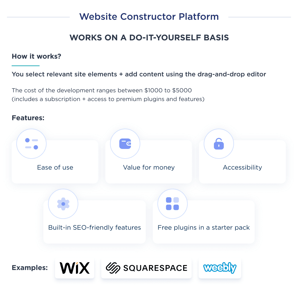
Now, let’s move to template-based website development.
Template-Based Website Development
Landing building software is different and more sophisticated than simple constructors. In 99 out of 100 cases, we’ll talk about WordPress websites.
The best cost-effective template-based website builders and their cheapest subscription costs are:
| Site Builder | Cost, per month |
| WordPress |
|
| Joomla |
|
| Drupal | Free |
| Weebly |
|
| One.com |
|
| Ucraft |
|
| Webnode |
|
| Wix | Wix plans are divided for showcasing professional sites:
For business and e-commerce:
|
| Jimdo |
|
| Templatetoaster |
|
Overall, the website builders do have the necessary elements and items, but you can also rearrange the layout to customize the design of your own website further.
59.9% of CMS websites are made using a WordPress website builder, Like Elementor. These platforms provide a code-free user experience, similar to the mentioned website builders.
They offer:
- Cost-effective plans
- Ease of use
- Professional premium themes
- SSL certification
- Shopping cart integration
- Store management
- Customer profiling
- Large community with open-source projects
However, it is important to note that you can work with theme-based website builders if the theme suits you.
Another option is to involve a team if you need to customize the theme. This can make a big difference in price.
It depends on the final goal: launch an online store using WooCommerce or just a simple blog website.
If you’re interested to read more about it, feel free to check our up-to-date guides on how to develop a custom WordPress website and an overview of the cost of developing a custom WordPress site. 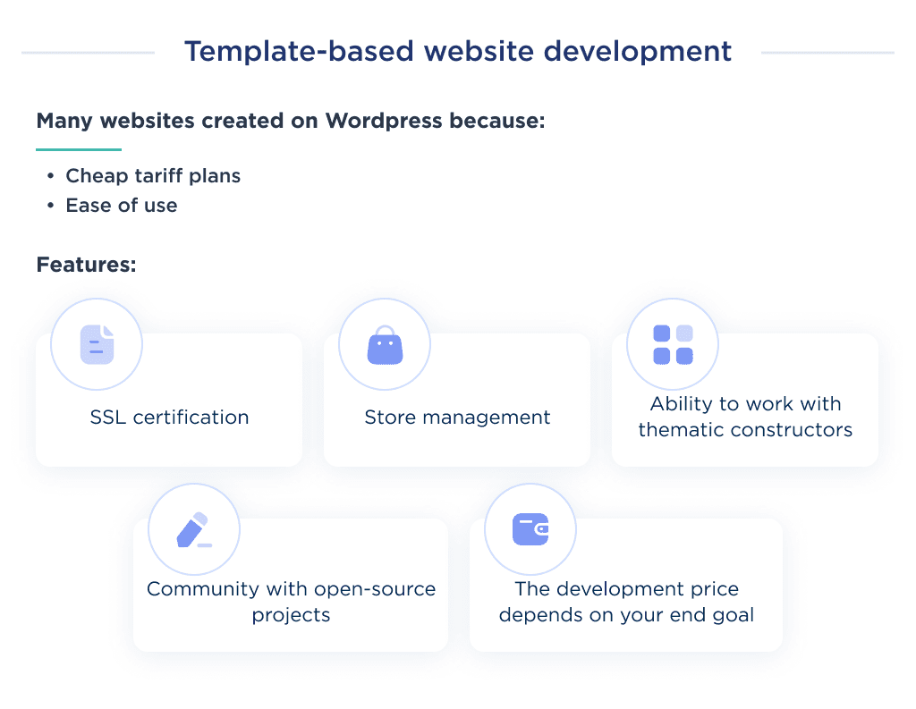
Now, let’s move to custom website development.
Custom Website Development
Custom development is suitable for corporate sites and landing pages, SaaS, marketplaces, and eCommerce stores as it can offer unlimited customization.
Every type of website requires exclusive features and integrations, so the cost of building a customized website is usually higher.
The cost of custom web development could vary from $30,000 to $300,000 depending on what you’d like to build and what the team will cooperate with you.
We talked about it earlier. 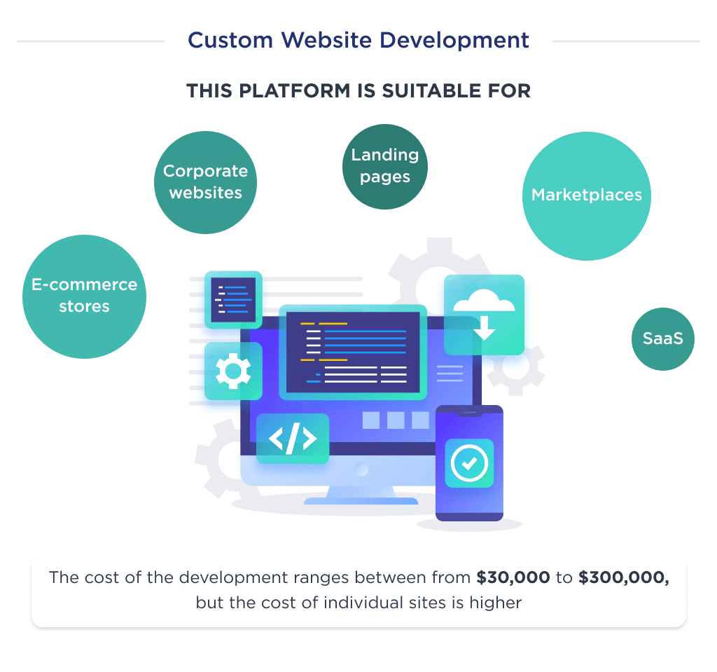
However, the website cost depends on the team’s level and technology development.
UX/UI Design Cost Considerations
Another major aspect to include in your cost estimation of website development is UX/UI design.
The 2020s web designs are about simplicity coupled with an easy user experience.
Now, when it comes to the cost of building a website, designs can also be based on templates or customized.
The templates can be cost-effective, but the cost will be higher if you create a design from scratch.
Below, you can find the main aspects of web design complexity and their impact on the final cost.
Explore our web design services
Impact of UX Design
User Experience design defines how the website and its elements interact with visitors or customers.
To ensure better UX, the designers create wireframes.
They’ll also develop a practical layout and structure and identify the informational hierarchy.
Then we have to look at how the features will engage, followed by strategies to save time to complete a task.
Creating user personas before designing the website can help a lot.
The cost of implementing these design structures depends on how much work you put into them.
Impact of UI design
For the User Interface, you need to create mockups.
This helps identify how the user navigates through the website.
Wherever the word “Custom” is involved, you can expect the cost to rise. This is because customizations require specialists.
And web designers can take up to 100 hours to create bespoke designs. However, customizations can help build a better end product.
It enhances speed, usability, and experience.
Ready to take your web design to the next level? Learn how to make an interactive website that connects with your audience. 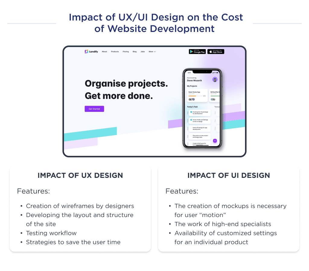
There are a few options for how custom UI design runs.
Option 1. Use of component libraries
You can go ahead in two ways here:
Either create your custom library or use existing libraries associated with the frameworks.
Dedicated web developers mostly choose to employ libraries connected with frameworks like React, Vue, and others.
The different types of websites are made with various libraries.
For instance, Shopify provides access to Polaris for eCommerce sites.
GitHub’s Primer is another example of a great web design component library with multiple elements.
Get a clear picture of the cost of hiring a software developer to budget for your next project.
Option 2. Use of Ready-made Templates
To get a lower cost estimate for a business website, use templates.
WordPress and many other organizations provide templates and ready-made themes.
The cost to buy a theme depends on the type of design you want to install.
However, note that you won’t be able to get exclusivity with the design following this method.
The theme that you want to choose is usually available on a public platform, and anyone can also download it.
To sum it up, the cost of building a website from the design perspective depends on your choice.
We looked at what aspects of design and development and how much does it cost to design a website. 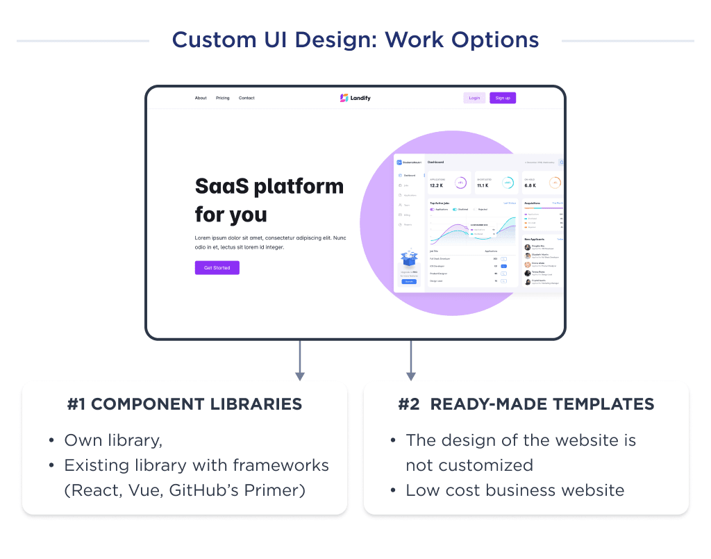
Now, let’s talk about the direct relationship between time and cost.
How Project Timeline Impacts Cost
Apart from understanding how much it costs to make a website, we need to identify the development timeline and how it impacts website development price.
As said previously, it varies with the complexity of the design.
Details in this section are especially important if you hire an agency that provides end-to-end solutions hourly.
Let’s discuss the timeframe for developing a corporate website with ten unique pages, a blog section, and a few features.
We’ll compare it with a service website of advanced complexity.
| Development Step | Time required for site of average complexity | Time required for site of advanced complexity |
| Business Analysis and Market Research | 40 | 80 |
| Competitor Research | 40 | 40 |
| UX/UI Research | 40 | 100 |
| Creating Wireframes and Mockups | 60 | 100 |
| Designing Prototypes and MVP | 60 | 100 |
| Front end Development | 100 | 250 |
| Backend development | 60 | 180 |
| Project management | 40 | 90 |
| Review and feedback | As required | As required |
| Iteration and maintenance | As required | As required |
| Sum Up | 440 | 840 |
A team that builds corporate websites would take approximately one calendar month to build your business platform.
Let’s talk about the team and its role.
Team Skillsets Needed
Your team composition is a crucial factor to consider in answering the question: how much does it cost to make a website?
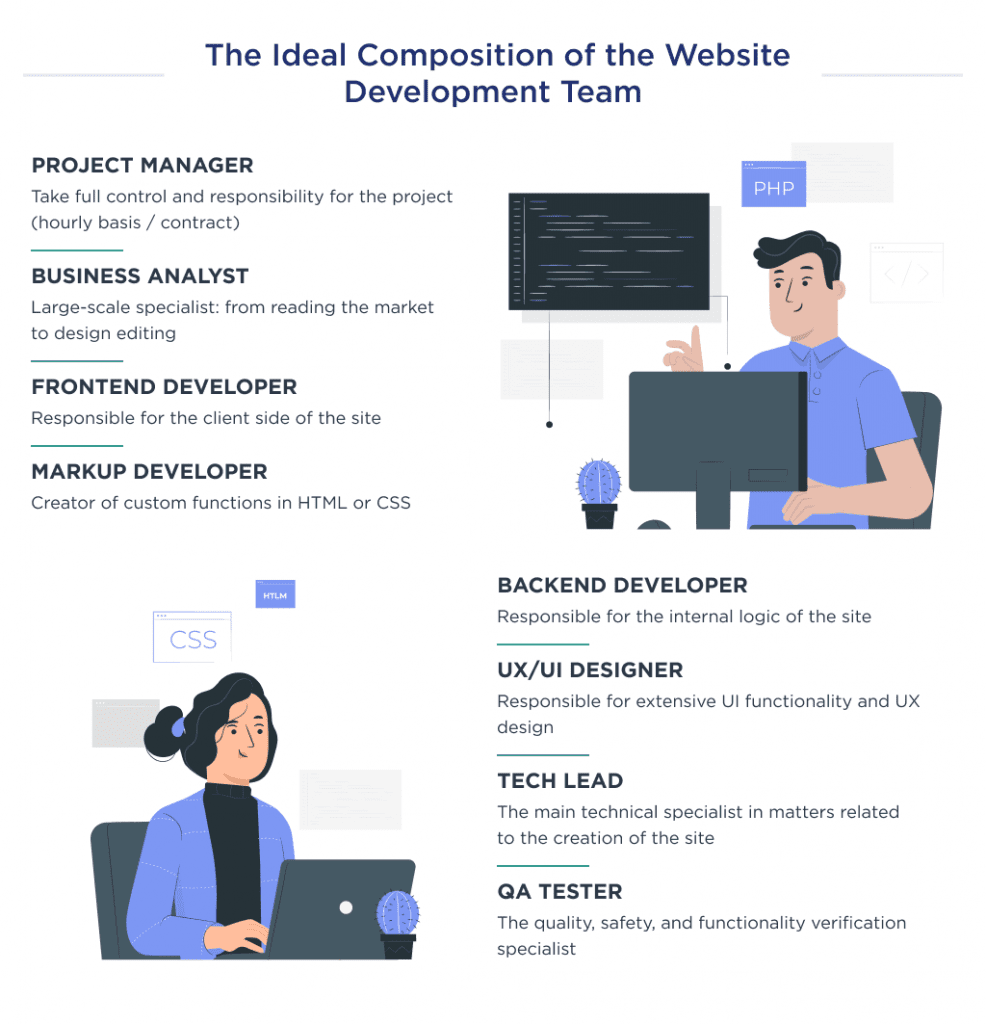
Here’s an ideal custom website creation team for guaranteed quality and performance.
| Member | Purpose and Cost in the US |
| Project manager | Project managers oversee the operations and development process. They help with team collaboration, communication, and conveying information to all team members. You can hire a project manager on an hourly or contract basis. You expect to spend between $3,000 to $20,000 for the right skill set. The exact amount depends on the robustness of the solution being created. |
| Business analyst | To be competitive and fight for your market share, you need to have a business analyst. Not only to help you make the right product, but an analyst is instrumental in avoiding design and development mistakes. Furthermore, the role of a business analyst is transitionary. They start by reading the market and creating appropriate functionality. Then, you can expect them to help create sketches and identify the specifics of successful development. The cost to hire a BA for your project ranges between $1500 to $15,000. |
| UX/UI designer | A designer assures that your product has an effective UI and UX, and its success can only be measured vis-a-vis the project’s scope. Website development cost here depends on the number of pages, functions, features, images, visuals, illustrations, animations, etc., designed on the site. The work cost will also rise if you keep adding elements to the design. Then, we also have the branding aspects like logo making. You can hire different people to work on these or get a single person to work on everything. However, getting experts to deliver the graphics, layouts, mockups, wireframes, illustrations, animations, etc., will be beneficial. However, the website development costs with this approach can soar. To sum it up, you will invest (not spend) $5,000 to $25,000 on these things. Here’s everything you need to know about building a brand from scratch, from concept to execution. |
| Tech lead | The tech lead is the person you call when the other technical team members are cornered. Here, you are looking for an experienced person to handle all the web tasks associated with website creation. And for a tech lead to work on your project, you can spend somewhere between $20,000 to $30,000. |
| Backend developer | A backend development cost will depend on the number of third-party integrations and data processing tasks. Backend and front-end tasks will take up the majority of the costs set for the website creation. Depending on the backend developer and designer’s experience level, you can spend $50 to $250 per hour. |
| Frontend developer | Due to the complexity and functions of a website design, the work scope of a front-end developer may differ. Furthermore, customizations also influence the answer to how much it costs to make a website for a business. Also, the number of pages, roles, and user interactions impact cost. Users interact with a lot of aspects of a website. Some examples are profiles, chat, notifications, posts, comments, likes, analytics, CMS, emails, service pages, etc. Plus, these features can also change based on the type of website. To hire a front-end developer, you’ll spend $7000 per month. |
| Markup developer | A Markup developer creates user-facing features in HTML or CSS. They are also good at building reusable codes and component libraries. Based on the hourly rates of $80 to $116 per hour, hiring a markup developer costs between $44,000 to $54,000 for development. |
| QA tester | This is the crucial step in ensuring that you have a high-quality product. Thus, you should factor it into figuring out how much a website costs. The quality assurance tester checks the performance, security, and functionality. Since the tester’s job is intricate, you can expect to add some time to the overall project completion. They combine manual and automatic testing with tools like JMeter, Selenium, and Swagger. Wonder how much it costs to hire a tester to build a business website? For a simple website, the cost can be around $5000. But for a complex website, you can expect to spend more than $50,000. |
Ready to test your startup idea? Learn everything about how to launch an MVP successfully.
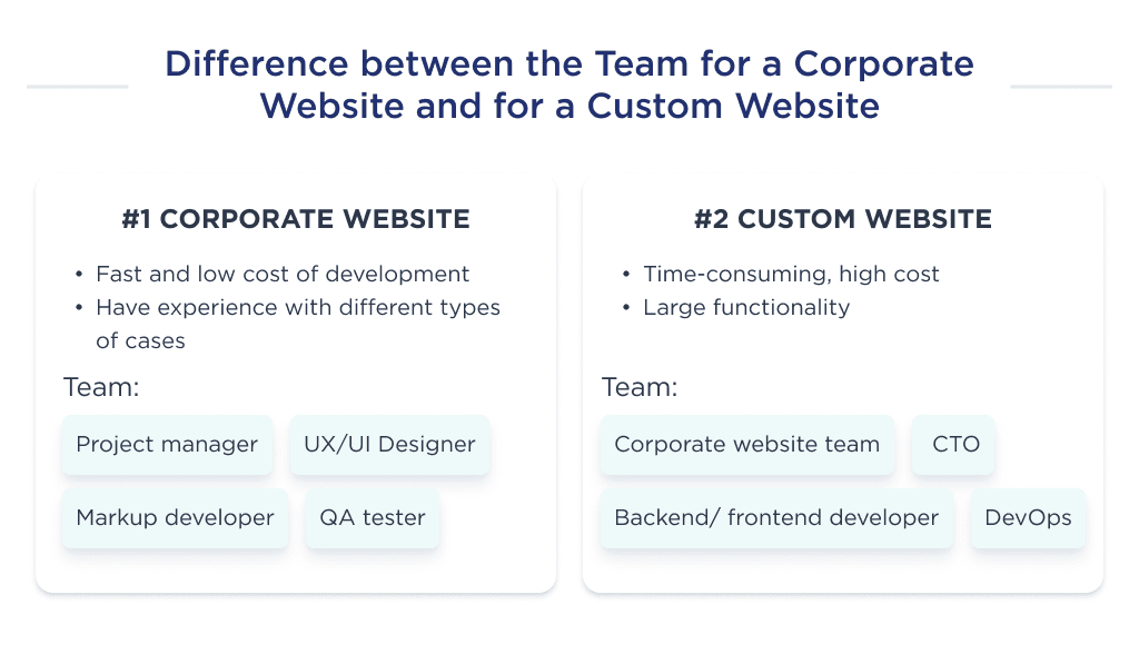
SMB Website Team
You must have a corporate website if you have a big business and want to attract more customers. There are several reasons your business needs a corporate website apart from customer acquisition. For startups, using a CAC calculator is essential to monitor customer acquisition costs.
Its purpose defines a corporate website, the number of pages, and its features.
Corporate websites usually have a pre-set customer pool. So they understand what their current and potential customers will like.
Hence, building corporate websites does not require a business analyst. Other than this, the team to build a corporate website consists of:
- Project manager
- Designer
- Marketer
- Markup Developer
Custom Website Team
Building a custom website is time-consuming and expensive.
If you are serious about your business, then you need to go for custom website creation.
It is because you cannot compromise with:
- Performance
- Scalability
- UI and UX
- Customer personas
- Target audience
- Business needs
- Functionality
Here is your dream team for custom website creation:
- Project manager
- Business analyst
- UX/UI designer
- CTO
- Backend developer
- Front-end developer
- Markup developer
- QA tester
- DevOps (explore emerging DevOps trends to see how they can benefit your development cycle)
Besides the main costs of web development, some of the charges also impact the final cost of the web development process. These are hidden costs.
Hidden Website Development Costs
When developing a website, you should also consider the hidden costs that every web development process faces.
They consist of:
- Maintenance
- Marketing
For example, the website cost would be estimated at $15,000.
Website maintenance will cost x2 to the initial price, i.e., $30,000 annually.
When website marketing will cost x2-x3 to the initial price, i.e., $30,000-$40,000 annually.
Let’s take them up one by one.
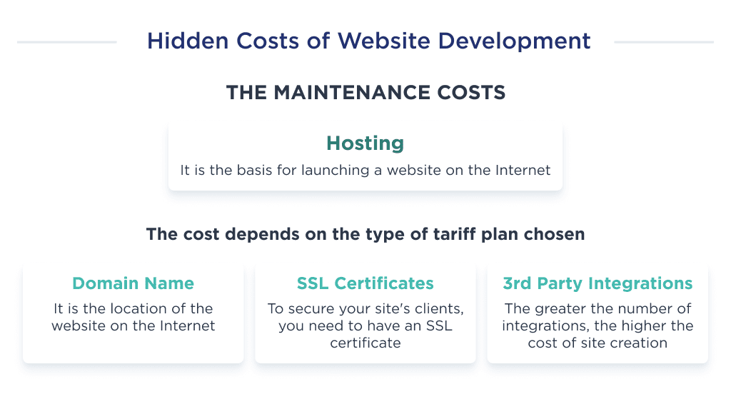
Maintenance Costs
The cost of resources required to ensure the website’s speed, uptime, and protection is an ongoing maintenance cost.
The complexity of a website can also influence the maintenance cost.
The maintenance costs of the website include:
- Website hosting
- Domain
- SSL
- 3rd party integrations
- Infrastructure costs
- Cloud maintenance
- Storage costs
- Servers
Let’s take a look at detailed descriptions of each point.
| Factor | Description |
| Hosting | Web hosting is imperative. Without a hosting plan, you cannot run the site on the web. The hosting costs under website creation depend on the kind of plan you choose. The shared hosting service is budget-friendly. However, we recommend dedicated server hosting for complex and corporate websites. It ensures that your website does not lag or face any downtime, seriously affecting the customer experience. However, if you want both performance and cost-effectiveness, go for cloud hosting. |
| Domain Name | The website domain is also a recurrent part of the website creation cost. Different domain names include .com, .org, .net, .io, .store, .global, and many more. The costs to acquire these domains are different. There are free domains. On average, you can spend around $10 to $30 per year on a domain. |
| SSL Certificates | eCommerce websites and marketplaces require top-notch security. To help prevent any attacks and unwanted threats disturbing your website customers, you need to install SSL certificates. Websites with these certifications had an added ‘s’ after HTTP to ensure authenticity. There is free SSL. However, on average, the cost of SSL certificates ranges between $10 and $300. |
| 3rd Party Integrations | 3rd party integrations help enhance the website’s functionality. With the number of integrations, the cost of making a website also increases. |
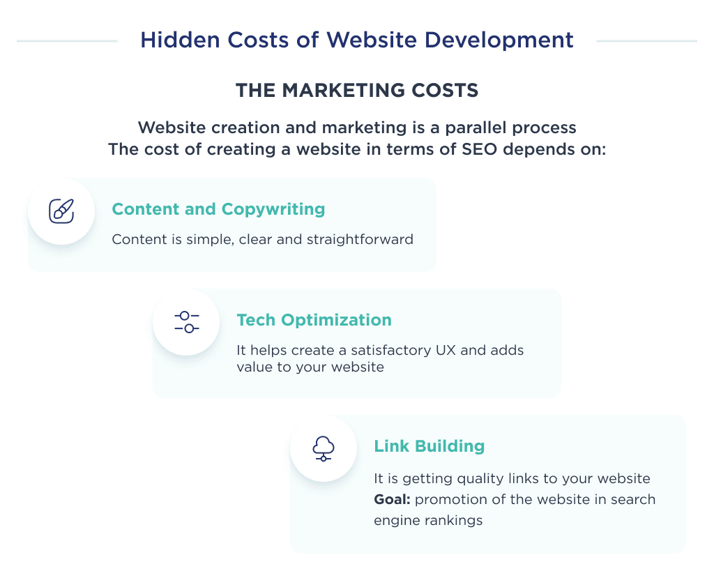
Marketing Costs
The marketing for your business begins even before the website launches.
Some founders create landing pages, Facebook pages, and Instagram accounts to begin getting attention.
Website creation and marketing go hand in hand.
There are various aspects of marketing, including SEO, content, and link building.
Search engine optimization means preparing the website according to the norms and regulations set by the search engines.
The motive for implementing SEO strategies is to get a better rank on Google.
Getting top ranks on Google matters because the users do not visit the second page of the SERPs. They will most probably find what they are looking for on the first page.
All these activities add up to the website development costs.
To get a better answer to how much it costs to make a business website, from the SEO perspective, we must include:
- Content
- Link building
- Technical SEO optimization
| Marketing Activity | Purpose and Cost |
| Content and Copywriting | This entails the cost of writing, editing, and publishing content on the website. This content may include UX writeups, blog posts, whitepapers, product category descriptions, landing pages, etc. Professional copywriters are available to work at $15 to $80 per hour. Once the web content is ready, you need to hire someone for the blogs, guest posting, social media, emails, and forums. After the initial cost, the expenses can be $500 or less per month. |
| Link Building | Link-building is an effort to get redirected links from other websites to you. It involves working on getting authentic references for your website. Google gives more weightage to the platforms with links from authority and high-ranking websites. There are several link-building strategies that you can follow. The typical link-building cost for a website can be between $2500 to $3500 per month. |
| Tech Optimization | Technical optimization includes steps to help search engine spiders crawl and index your website more effectively. Technical optimization ensures:
Most importantly, tech optimization is also helpful in creating a satisfying user experience. |
Not only do the marketing activities incur a cost, but the tools you use to execute the strategies are also an expense.
There are multiple tools and SaaS software that provide a free version, but the accessible version of these tools is not very efficient or productive.
Here are the tools that add to the website development costs.
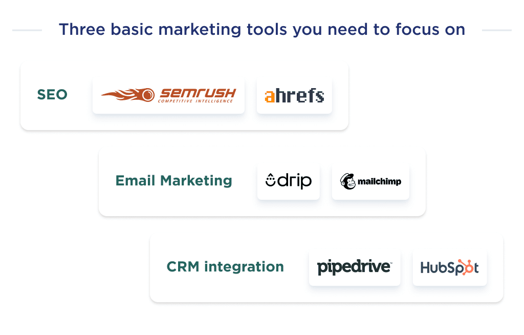
Marketing Toolkit
The marketing cost for your business is the budget required to publicize your website to the required target audience.
Every effort here aims to compete against other websites and gain better search engine ranks.
Your marketing cost should be x2-x3 of the overall development cost for top-notch effectiveness.
If the overall development cost is $100,000, your marketing budget should be $200,000.
Within marketing, various aspects and tools exist for optimum results.
- SEO tools
- Email marketing software
- CRM
| Activity or Function | Motive and Ideal Tools |
| SEO or Search Engine Optimization | Search Engine Optimization is an umbrella term for various functions essential to increase your website’s rank, performance, and authority. You can use Ahrefs, SemRush, or MOZ. |
| Email Marketing | Email marketing is the act of sending messages to a target audience within your niche of interest. Emails sent here are aimed at advertising, soliciting donations, or sales to your enterprise. You can use MailChimp, Drip, or Snovio. |
| Customer Relationship Management or CRM | Customer relationship management entails coordinating interactions with potential and current clients using various technologies. The primary aim is to improve feedback and retention rates through intuitive consumer relationships. You can use HubSpot, Pipedrive, or Zoho. |
That is all you need to understand about how much it costs to make a website.
Next, let’s discuss the ideal way to choose a development partner.
How to Choose a Reliable Web Development Partner?
There are multiple factors to consider when choosing a reliable website development partner.
Poorly written codes and architecture can result in multiple downtimes, poor user experience, bad performance, and a low retention rate.
Thus, it’s imperative to choose a web developer with verifiable experience and knowledge. So tips for choosing a reliable web development partner are:
- Hire a partner with web development experience in your area of interest.
- Ensure experts have expertise in required technical skills.
- Choose a development partner that has an effective communication model.
- Opt for an agile development methodology.
- Vet prospective partner’s portfolio.
- Ask for references from past clients.
- Consider the rate, but ensure the agency can build to requirements.
Use our guide to find the most suitable team to build a new website and achieve online business success.
Need help building a robust website? Learn how to outsource web development efficiently. 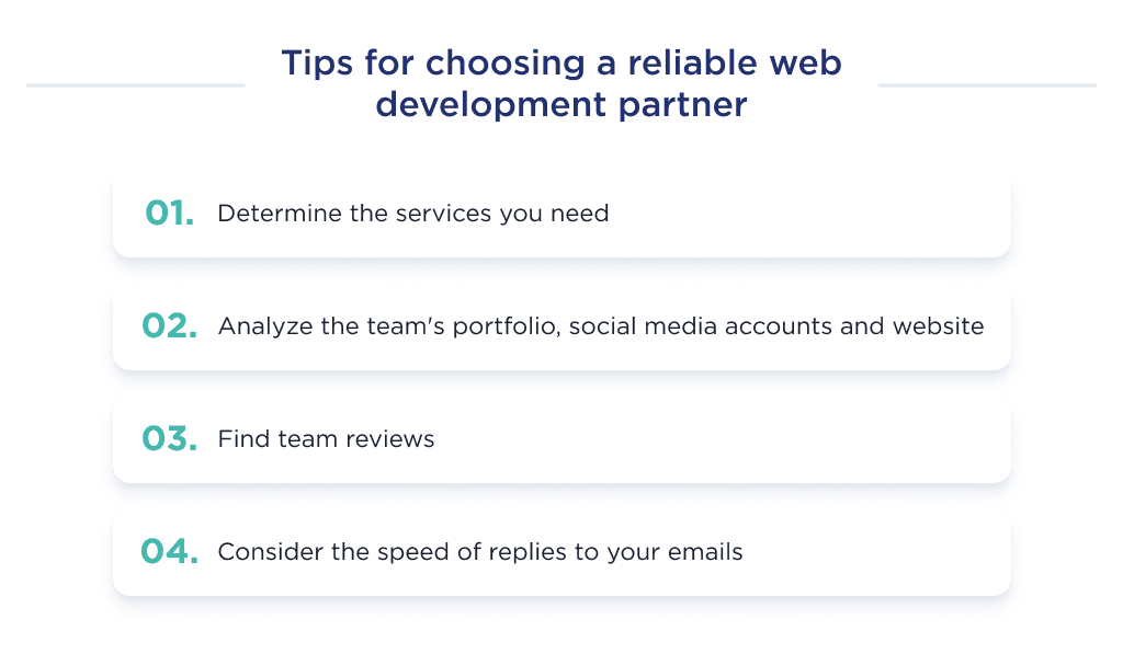
If you are building a web app from scratch, check out the step-by-step process in this guide on how to develop a web application.
Need a Web Development Agency?
At SpdLoad, we can build a custom website tailored to your business goals while maximizing ROI.
Ready to get started?
Request a free quote today, and we’ll provide a personalized estimate and discuss any questions you have.
We move quickly from first call to launch, with robust sites delivered in just months.
Want to learn more first?
Check out our portfolio and reviews on Clutch to see how we’ve helped businesses like yours grow with custom web solutions.
For first-time founders, these business startup tips can make all the difference.
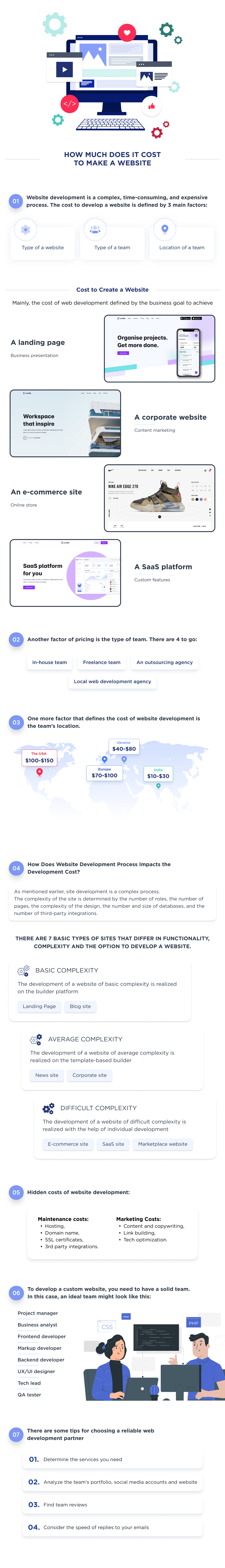
Bonus Infographic
The cost of creating a website ranges between $5,000 to $500,000.
Those figures aren’t constant as they differ according to the type of website, location of the development team, and team type. Here’s how these factors impact cost:
- Cost by Type of Website
Here, website development costs differ by type:
| Website Type | Cost, $ | Hours |
| Landing page | 5,000 | 80 |
| Portfolio website | 6,000 | 100 |
| Blog website | 7,000 | 120 |
| News website | 7,000 | 120 |
| Corporate websites | 10,000 | 160 |
| Directory website | 17,000 | 300 |
| eCommerce website | 60,000 | 1,000 |
| Web portal | 70,000 | 1,200 |
| Educational website | 60,000 | 1,000 |
| SaaS website | 75,000 | 1,200 |
| Entertainment website | 60,000 | 1,000 |
| Marketplace website | 73,000 | 1,300 |
| Social media website | 120,000 | 2,000 |
Another factor that impacts website development costs is location. Here are more details on that:
- Cost by Location
Due to differences in cost of living from country to country, service fees also differ. Here’s a table showing that:
| Country | Cost, $ |
| The United States of America | 150,000 |
| Australia | 120,000 |
| The United Kingdom | 120,000 |
| Western Europe | 100,000 |
| India | 40,000 |
| Ukraine | 70,000 |
The type of development team is another crucial factor that impacts web creation costs.
Here’s a table showing the price differences:
| Team Type | Development |
| In-house | $90,000 |
| Local agency | $120,000 |
| Outsource agency | $40,000 |
| Freelancers | $30,000 |
Here you’ll find a summary of our in-depth guide. Learn the highlights of a web development cost and factors that define pricing.
Wondering do I need a website for my business? Find out why the answer is almost always yes.